How to make blue from yellow. How to get purple color when mixing paints, gouaches: step by step instructions, tips, photos

Read also
»We touched upon the basic provisions of drawing - what you need to do to draw approximately what you want. And they did it using the example of a pencil and paper. Why? Because it is easier than learning to paint with paints, because in the case of using paints, in addition to the problem “ How do I draw it? " the problem "" appears - so that what is obtained is very similar to what is intended. And in this article we will try to give an exact answer to this question.
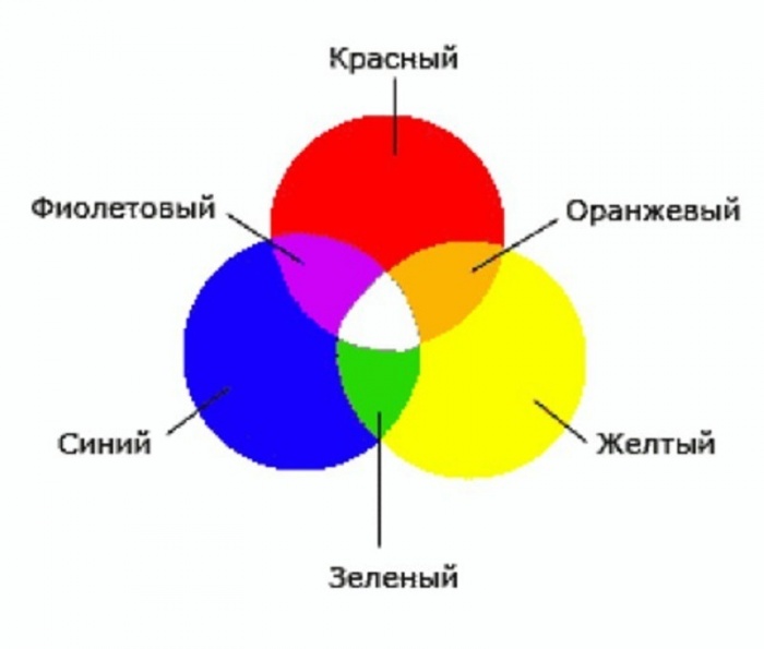
How do I get the color I want? There are two ways. The first is traditional, using the color wheel known to many:
So, there are basic colors:
- yellow
- blue
- Red .
Which, when mixed, give
- Orange
- green
- purple
- Brown .
Moreover, the shades of mixed colors depend on the proportion of the primary colors. And, using the color wheel, you can get the desired color like this:
- Take some amount of the main color (for example, blue )
- Add some amount of a second base color (e.g. yellow )
- Compare the resulting green with what you wanted to get
- Add one or another base color to correct the hue.
- Or simply take the desired shade of green from the tube jar.
Why does the last point arise - take the desired shade from the jar? Because getting the color you want by mixing basic sometimes happens hard.
Basically, to start, you can get the desired color using such a color wheel. However, as skill grows, so does the need for more accurate color matching. Indeed, with the help of the described principles, quite often it turns out dirt... For example, it is very difficult to get a good purple color by mixing red and blue... Or is it hard to get necessary shades green , orange, brown flowers. That is, the principles do not take into account any factors that affect the result when mixing colors.
We are happy to tell you that these factors really exist, and, moreover, they can be used to cope with the problem of "dirt" and still learn to get the colors you want not by intuitive mixing, but by using the usual simple sequence of actions... This sequence and the reasons for the "dirty" of the standard color wheel were not surrounded by us, but by Michael Wilcox. Who wrote the book " ... How to get the color you really want". By the way, you can download this book by Michael Wilcox by following the link Blue and yellow do not give green.
Naturally, it will not be possible to present all the material of the book in one article, so we will restrict ourselves to the main points, and we recommend that you glean the details from this very book by Michael Wilcox "Blue and yellow do not give green".
So how do you get the exact color you want reliably and accurately?
For this it is necessary to take into account an important theoretical point. Why do we see color? Because different items (including paint pigment) have different surface which reflects light differently from the sun or other light source. That is, the surface of a bath, for example, has such a structure that it reflects all colors and does not absorb anything. And all the colors of the rainbow, as we know, form white. Accordingly, the bathtub appears white. On the other hand, the surface of the soot is structured in such a way that it absorbs all light incident on it. And the soot doesn't reflect anything. As a result, we see black soot.
What happens if you mix white and carbon black? It will turn out beautiful Gray Colour. Why? Because the light reflects off the pieces of white completely, as white. And then it is partially absorbed by soot particles. The more soot in whitewash, the darker gray is obtained - due to the fact that more and more white light reflected by the particles of white is absorbed by the soot particles.
The exact same principle works for colored pigments. Thus, red paint is red because it primarily reflects Red Colour. Blue looks blue because the pigment in its composition absorbs all colors except blue. Similarly, it "works" and yellow color - the pigment absorbs most colors except yellow.

Next, let's move on to mixing colors. So, for example, you take blue paint and red paint. You mix them up and get dirt... Why? Because the reflected red ABSORBED blue pigment in the same way as the entire falling color. Accordingly, the red pigment absorbs all blue radiation - because the nature of its surface is so arranged that it reflects mainly the red pigment.
But you may ask: “What nonsense, because mixing blue and yellow we still get green, and according to your theory, you should also get dirt? " Well, if there were really pure colors in nature, then we would see the formation of dirt. But there is one but, which makes it possible not only to mix colors, but also to carefully and reliably select the really desired shade of color.
So, pigment reflects more than just one light. Light of one wavelength is reflected in greater least. So, the red pigment mainly reflects Red Colour. But nevertheless, all other colors are also reflected (for example, purple or Orange). The exact same can be said about yellow color - pigment predominantly reflects yellow, but nevertheless in sufficient a large number can be reflected Orange or green... WITH blue the same thing - it can carry additional "harmonics" green or purple .

So there is not three primary colors. There is six primary colors:
- Mostly reflective paint Red and to a lesser, but significant, degree Orange .
- Paint that reflects mostly Red and to a lesser (but significant) degree purple .
- Pigment reflecting predominantly yellow and in addition green .
- Pigment that predominantly reflects yellow and plus additive orange .
- Reflective material mainly blue and partly purple .
- Material that predominantly reflects blue and partly green .
Well, have you already understood the principle of color formation?
It's very simple: you take yellow from point 3 and blue from point 6, mix these colors. The blue pigment neutralizes the yellow color, the yellow pigment absorbs the blue color. Which color remains? Right, green! And not just green, but beautiful, bright and juicy green.
Likewise: by mixing the blue from point 5 and the red from point 2, you neutralize the blue and red colors, and the juicy and rich appear purple Colour.
And finally: by mixing yellow 4 and red 1, you get Orange due to the fact that the red pigment absorbs radiation from the yellow, and yellow - the reflected radiation from the red pigment.
The result was NEW color wheel of six primary colors:

The colors have arrows that indicate the path for optimal blended color development. Respectively, variety of shades is born as a result of one or another combination of these SIX primary colors... "Wrong" combinations (for example, blue 6 and red 1) produce dull shades of colors (for example, dirty purple). The combination of one "correct" paint and one "incorrect" (for example, blue 6 and red 2) produces more pronounced shades (for example, a brighter purple). Finally, the combination of the "right" colors (eg blue 5 and red 2) produces a pure and bright color (bright and beautiful purple).
Naturally, reading the article is not enough to master the obtaining of the desired color. It is best to read the book " Blue and yellow don't give green»Michael Wilcox plus do practical exercises on the selection of colors described in the book. Nevertheless, the answer to our question has been received.
Knowing about color mixing options can come in handy for more than just professional activity artists. The individual design of the living space often poses the question of how to achieve this or that interesting half-tone before the designer. The suggested combination options and the color mixing table will help you get the desired effect.
Everyday life is filled with the widest range of all kinds of colors. To get the right one, you need to know the subtleties of combination.
Blue, red and yellow paint are three whales that support a wide palette of halftones. It is impossible to form these colors as a result of mixing other paints. At the same time, their combination with each other gives an unusually many combinations.
Important! You can create a variety of shades by mixing only two colors by changing their proportions.
Depending on the volume of one part of the paint added to the other, the resulting result approaches one or another of the original color. One of the most famous examples is a mixture of blue and yellow, resulting in the formation green color... The result obtained when adding new portions yellow paint will gradually change, as close as possible from green to yellow. You can return to blue by adding more of the original element to the green mixture.
Mixing chromatic colors located close to each other in color wheel, give a paint that does not have a pure tone, but has an expressive chromatic shade. Combining colors on opposite sides of the chromatic circle will result in an achromatic tone. An example is a mix of orange or magenta with green. That is, a mixture of paints closely spaced in the color wheel gives a rich chromatic hue, the maximum removal of colors from each other when mixing leads to a grayish tone.

Separate paints, when interacting, give an undesirable chemical reaction, which can result in cracking of the decorative layer. In some cases, the resulting background may darken or gray. An illustrative example serves as a mixture of white lead and red cinnabar. Attractive pink color darkens over time.
It is optimal when the impression of multicolor is achieved by mixing the minimum number of colors. It is important to take into account which paints, as a result of mixing with each other, give a lasting result, and which ones are unacceptable to combine. The knowledge gained allows us to exclude from the work fading or further darkening paints.
The table of undesirable mixtures below will help to reduce the risk of mistaken combinations:
Having tried the given examples in practice, future painters and designers will gain valuable professional experience.
Methods for obtaining red and its shades
Red is one of the three primary colors and is always present even in the smallest sets. But for mass printing, the tone of magenta is used. The answer to the question of how to get red is quite simple: mix the proposed magenta with yellow in a 1: 1 ratio. There are other options for getting red when mixing paints:

In the center is the main red. The following are the mixing options. The next circle is the result of combining the first two colors. Finally, color options are presented when added to last result red, black or white paint.

Blue and its shades
Blue refers to primary colors, therefore, blue paint is required to form all its shades.
Attention! No combination of other colors gives a shade of blue, so the presence of this paint is mandatory.
Even having a set of 12 colors available, the question periodically arises of how to get the blue color. The classic tone is called "royal", and in a set of acrylic paints, the main color is often ultramarine, which has a bright dark shade with a purple undertone. A lighter effect is achieved by mixing blue and white in a 3: 1 ratio. Increasing white results in a lighter tone down to sky blue. If desired, achieve a moderately rich result, dark blue paint mixed with turquoise.
What colors need to be mixed to get shades of blue, consider further:
- The effect of a dark blue-green tone is achieved by mixing blue and yellow colors in equal proportions. Adding white paint will result in a lighter shade with a simultaneous decrease in brightness due to the combination of 3 elements.
- The creation of "Prussian blue" is carried out by mixing 1 part of the basic blue and adding 1 part of the composition of bright green and light green. A rich and deep shade can be thinned with white without changing its clarity.
- Combining blue and red in a 2: 1 ratio produces blue with a tinge of purple. The addition of white can lighten the dark and saturated tone.
- The royal blue is distinguished by its brightness, a similar effect is achieved by mixing the main blue with the Mangent pink in equal parts... Admixture of white traditionally lightens the result.
- Combination with orange gives a gray mass. Replacing orange with brown in a 1: 2 composition to the base creates a dark color with a complex gray-blue tint.
- Dark blue is formed using an admixture of black in a ratio of 3: 1.
- To create a blue tone on your own, you can mix the base color with white.
A small table of combination options is presented below:
Palette green
It is quite simple to solve the problem of how to get green color if it is absent in the set: combine yellow and blue. A rich palette of green halftones is created by altering the proportions of the original components and adding additional elements, performing the function of dimming or lightening. This role is played by black and White paint... The olive and khaki effect is achieved by mixing two main elements (yellow and blue) and a slight admixture of brown.
Comment! The saturation of the green depends entirely on the quality of the constituent elements: the intense tones of the sources guarantee a bright result.
If the green is obtained by mixing, then all subsequent halftones will be duller. Therefore, it is better to experiment with the gamut of green, having the primary color initially ready. There are many combination options:
- A combination of equal proportions of blue and yellow gives a grassy green.
- Increasing yellow to 2 parts with the addition of 1 part blue results in a yellow-green effect.
- Experimenting in reverse with a 2: 1 blue-yellow ratio will produce a blue-green tone.
- If you add ½ part of black to the previous composition, you will achieve a dark green effect.
- A light green warm tone is formed from yellow, blue and white paint in a ratio of 1: 1: 2.
- For a similar light green shade, but a cool tone, you need to take yellow, blue and white bases in a ratio of 1: 2: 2.
- Dark olive color is formed by mixing equal parts of yellow, blue and brown paint.
- A gray-brown tone is obtained from similar elements in a 1: 2: 0.5 ratio.
The expressiveness of the green color is in direct proportion to the original elements, respectively, the brightness of the halftones is repelled by the saturation of the green. A visual representation of the mixing options is given by the graphic palette:

As in the case of the red circle, the main paint is located in the center, then the mixing options follow, then the result of the experiments. The final circle is the shades of the previous level when adding base, white or black paint.

Other combination options
There are many other techniques to create the desired effect by adding some color to the base color. The answer to the question of how to get the ivory color is multifaceted and depends on the surface where the paint is planned to be applied. The easiest option is to mix a snow-white base with a yellowish one. For example, yellowish ocher or a minimum amount of strontium is added to whitewash. To tint paper, a small amount of potassium permanganate is diluted in water. A light pink tint indicates a properly diluted solution. A cotton swab, brush or sponge is moistened in the resulting composition, after which the surface of the paper is processed.
Advice! For double-sided tinting, the sheet can be lowered for a couple of minutes into a container with a potassium permanganate solution. After drying, it will acquire the desired ivory effect.
There are also several ways to get black:
- by mixing three basic colors red, blue and yellow;
- when combining cyan, magenta and yellow;
- a combination of green and red, but the result will not be 100% clear, but only close to the desired effect.

We will try to answer the most popular questions about mixing options:
- How to get a raspberry color: the base is blue with the addition of red, white and brown tones.
- Receive turquoise, the second name of which is aquamarine, is possible by mixing blue and green. Depending on the proportions, the tones of the new shade range from soft pastels to intense and vibrant.
- How to get the yellow? It belongs to the main ones and it is impossible to get it by combining other paints. Something similar to yellow can be created watercolors when green and orange or red are combined. But it is impossible to achieve purity of tone in this way.
- How to get the brown tint? To do this, you need base paints: red, yellow and blue. First, a small amount of yellow is added to the red (in an approximate ratio of 10: 1), then the volume is gradually increased until an orange tone is obtained. After that, they proceed to the introduction of the blue element, 5-10% of the total volume will be enough. Minor adjustments to the proportions will give a wide variety of brown effects.
- The combination in different ratios of black and white element gives a varied range of gray tones.
As you can see, the options to achieve the desired effect in creative process the design is innumerable. A table with color mixing options and a video will complement the information presented:
Have you ever wondered how professional artists work with various paints creating paintings? Do they stock up on every possible shade of color for their work? Of course not. As a rule, they have in their arsenal several basic colors and with the help of an entertaining science - coloristics - they get hundreds of the desired shades.
Purple in the palette of colors
This article focuses on purple, the very last color in the rainbow.
It is not base on the palette. The main colors are blue, yellow and red. What does it mean? By mixing them, you can get a huge variety of colors and their shades. Two more colors are worth mentioning. It is black and white. They cannot be obtained by mixing. So in essence, artists use five colors to create their magnificent masterpieces - these are the three base colors plus black and white.
A bit of history
Violet (aka purple) is considered a cold and deep tone.

Its history is interesting and shrouded in mystery. Purple has always been considered a mystical and "royal" color.
In Byzantium, purple was called blattion and was considered imperial. Purple was very often used in stained glass windows in cathedrals during medieval times. Purple smalts can be found in Byzantine mosaics in Ravenna.
In Russia, the purple color bore the name yubagr. And in England in the second half of the 16th century, only members of the royal family or reigning persons.
The color magenta has special meaning and in Christianity. He personifies the seventh day of the creation of light and is considered a day of rest. This is spiritual meaning of this color.
Christian Catholics traditional clothing the clergy is a cassock - this is a floor-length slit dress. Such a purple robe can only be worn by bishops, for ordinary clergy it is prohibited.
How do I get purple? The easiest way
Coloring is a very entertaining and interesting science. All children love to watch how, with the wave of a magic wand, two or three colors form a completely different, fourth. It really looks like mysticism.
For example, in order to get Brown color, on the palette, you need to mix blue, red and yellow.
For orange - red and yellow, green - yellow and blue.
But how do you get purple? You only need to mix two colors - red and blue.

The depth and brightness of the resulting magenta will depend on a number of factors:
- the tones of the original colors;
- the amount of this or that paint, their proportion.
How to get different shades of purple?
But after all, artists are not content with just one shade of purple when painting their paintings. It would then not be art, not magic. Yes, they can create dozens of different tones of this mysterious color.

How to get a deep purple color?
There are two ways.
- Add a few drops of black to the red color.
- Mix red and blue, adding more of the latter, and also adjust the intensity by adding black. The result will be a very dark, muted, but exactly purple color.
How do I get a magenta hue?
It is necessary when mixing red and blue paints, put more red. If there is more blue in proportion, then purple will turn out to be brighter and more pronounced.
How to get a light purple hue?
You need to mix pink and blue paints on a palette.
How to make the resulting color lighter?
In this case, you just need to add white to the mass.

Features of working with gouache and watercolors
The above methods are ideal if you are wondering: "How to get purple color with gouache?" This type of paint is thick and well pigmented; the artist will have no problem adjusting the color intensity. But there is one pitfall that should not be forgotten: when it dries, the gouache brightens by several tones. This is always worth remembering when getting the desired purple hue.
In some ways it is easier, but in some ways it is more difficult to work with watercolors. It does not have the same rich texture as the same gouache. How to get purple paint color and desired shades using watercolor?
The way of working is exactly the same. But if there is no white, then the pallor or saturation of the desired shade must be adjusted with the help of water (diluting the paint with it). And, of course, it is quite clear that you cannot achieve the same color saturation from watercolors as from gouache.
Methods for staining mastic in purple

When preparing their delicious masterpieces, confectioners very often paint mastic. And just like artists, they don't have to have all the shades and colors of dyes in their arsenal. To answer the question: "How to get the purple color of mastic?", You need to determine - how did this delicious "plasticine" get into the hands of the master?
If the mastic is homemade, then there is nothing easier than adding two dyes - blue and red - to the still liquid mass during its preparation. They can be either dry or gel type.
If the mastic is purchased and white, then the easiest way is to first paint two balls in different colors- Red and blue. And only after that mix them in different proportions, eventually getting the desired shade.
Human exposure to purple
There is such a science - chromotherapy. She studies the effect of different colors on the human condition. So purple has a very beneficial effect on almost all organs and senses.

- Promotes a more rapid production of priceless hormones of joy - endorphins.
- Rejuvenates.
- Has a calming effect on insomnia and migraines.
- It has a tonic effect on the pituitary gland and eyes.
- Boosts immunity.
But you need to use this color wisely, without overloading your space with it. In excess, purple can lead to melancholy.
Now you know how to get purple. You know how it affects the human body and you can successfully apply the knowledge gained in practice, whether it be a color treatment or the creation of a confectionery or artistic masterpiece. So multifaceted, from pale purple to almost black, this color personifies everything sensual, mysterious and mysterious.
Red and green combine to give a dark brown color. But its shade and intensity depends on the selected proportions. the main role in this combination belongs to green. The darker it is and is used in a greater proportion, the more intense the brown color is obtained, up to black.
If you mix blue and green, what color you get
Blue and green - we get the color of turquoise or sea wave... The more intense blue tone, the more it will prevail in shade, approaching turquoise. The predominance of green makes the aqua greenish tint. With equal proportions of colors, a rich blue tint is obtained.

If you mix yellow and green, what color you get
Combining yellow and green - we get a light green or light green tone. In order for it to work, the proportions of the colors must be the same. By adding green to yellow, we get an olive shade, if there is very little yellow, we get a deep green with a blue tint, that is, it all depends on the proportion.
In addition, primary colors can produce many other shades. For example, when you combine red with blue, you get a purple color. Which, depending on the proportion we use, can be from a light, almost transparent lavender shade to a deep purple. Yellow and red give a bright orange hue.

Advice! If you try to mix all three basic shades at the same time, you get an indefinite dirty brown with a blue tint, it is called complex.
By experimenting with basic colors, taking into account the basic rules of colorism, you can achieve any desired shade.
How to mix colors - video
Acrylic paints are versatile: they can make amazing stained-glass windows, paint the walls of a house, or just paint a picture. They are easy to work with, hold firmly after drying, but if required big variety colors, the drawing will be expensive due to their price. It is not necessary to purchase all the colors - you can buy the basic palette, and get the desired shades by mixing acrylic paint.

What colors of dyes need to be purchased
Even at school, in drawing lessons, they taught tinting lessons, when they said that mixing red with yellow turns out orange, and mixing blue and yellow, you can get green. It is on the mixing of various colors that a special artistic table for obtaining additional colors is based. According to this table, to create the required palette, it is enough to purchase acrylic dyes in 7 colors:
- red;
- pink;
- yellow;
- brown (burnt umber);
- blue;
- black;
- white ().

These paints are quite enough to obtain the required color by mixing. It is enough to use the artistic table and,.
How to work with a table
Working with the table is not very difficult, it is enough to find the desired color in it, and next to it it will be indicated which paints must be mixed to obtain the desired color scheme. For example, you need olive paint. If you look at the table, then to get this color, you need to mix yellow and green.
Everything seems to be simple. But the table does not indicate the ratio of dyes, only the names of the colors required for mixing are given. Then how to be? Like everyone who works with different colors paints, you will have to develop your own color perception, which helps to choose the color scheme in the required proportions.
 Acrylic Mixing Chart
 For beginners, there are the following tips:
- To create the desired tone, add tint color to the base in small portions and check the resulting result on an unnecessary surface.
- Even if the color shade as a result of tinting seemed correct, you should not immediately take up the main drawing when the paint that has ended in the process of work is added. It is better to wait until the control smear dries. When dry, the color may change slightly, and then it will be necessary to carry out additional tinting of the color mixture.
When drawing, you can use a universal table suitable for working with dyes on any basis, or you can use a scheme developed by masters who prefer to work with acrylic paints... But whichever method is used, only the experience of mixing will help develop the necessary color perception, which helps in choosing the color ratio.
Features of working with acrylic dyes
Craftsmen preferring to create artistic masterpieces work with acrylic dyes, developed a special mixing scheme. This scheme can be conditionally divided into parts for creating the desired tones:
- light;
- dark.
By mixing different tones, it is possible to obtain the following color shades:
- green;
- lilac and purple;
- orange;
- earthen.
Enough for drawing? It is worth now considering the rules for mixing different colors to create each tone.
Light
Titanium whitewash is taken as a basis, color is added to them in small portions. The less tinting paint is added, the lighter the shade will be. In this way, you can get all the light shades of the palette.
Dark
Dark tones are created a little differently: black in small amount added to the main palette. Any dark tone can be obtained in this way. One has only to carefully add black, otherwise, instead of the desired dark brown color, you can create a dirty brown. However, even if the first result is unsuccessful, the second and subsequent ones will be much better, because experience comes with practice.

Having created the necessary tones, you can use mixing different shades create the necessary color scheme.
Green gamut
There is no green color in the palette necessary for the acquisition of paints, it will first have to be made by mixing blue and yellow, and the shade and further result of tinting will depend on the initial ratio of the dye. What proportions to take can only be found out empirically by mixing colors. It is even difficult to describe all the options for color combinations, there are too many of them. You can find them in the artistic color chart, which should become best friend every artist and decorator.

Lilac and purple
These cool tones can be obtained from blue dye by mixing it with light pink (purple) or red (purple). In the resulting compositions, you can add black or white tone to obtain a variety of shades.

Orange
If you mix red and yellow in different proportions, you can get an orange color scheme, and its saturation will depend only on the original color ratio. If you add white to the result, it is possible to create shades such as melon, peach or coral.

Earthen
Burnt umber, mixed with all the components of the color palette, allows you to get a wide range from beige (a mixture of white and brown) to dark woody (brown and black).

How to work with the palette correctly
How to create the required scale? There is nothing complicated about it. To work you will need:
- basic color range;
- brushes;
- container with water;
- an artistic palette for mixing colors (you can take the one that students use in drawing lessons).
- Place whitewash in the middle of the palette, because they are most often used for lightening and creating various halftones.
- Place the necessary dyes in the remaining cavities.
- It is necessary to mix carefully, adding color in small portions and checking the result with a smear.
- After each stirring, the brush must be rinsed in a container with water.
Mixing acrylics is easy, and with a little practice, you can learn to achieve a wide range of color shades with just seven primary colors.