Mix blue and blue. How to mix colors to get pink
Work with paints is a fascinating process. Remember how you played in childhood with watercolor, mixing paints. You can also play now. Mixing colors can be useful when repairing, in a hobby, etc.
Basic and optional colors
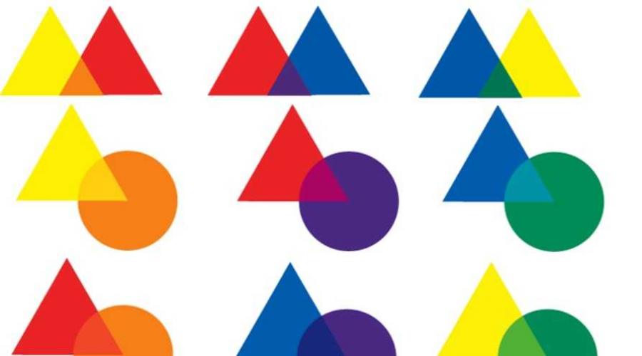
As you know, there are three main (red, blue, yellow) and three additional colors (purple, orange, green). This is basic colors. Connecting them, you can get all the other colors and their shades (theoretically, yes, in practice a little different situation). In the figure, the main colors are represented by circles, and the additional form is formed at the place of intersection of steam. These couples show how the mixing of the colors of the main row gives additional.
In practice, mixing colors is an interesting process, but often the result is difficult to predict. We work with paints, and they are a mixture of coloring pigment and base-binding. That is, they have their own properties due to the presence of the very basis. After all, paints are different - oil, acrylic, aniline, etc. Accordingly, the result will be slightly different. When you have been working with the paints of one company for a long time, you can almost accurately predict what happens if you add one or another component.
It is also worth remembering that if you mix do not paint, and the light, the result will be different. Paints - only the display of light and not all laws work with them equally.
Receiving additional colors: orange, purple, green, their shades and brown
The pairs of the main colors gives us additional shades:
- Orange get mixed red with yellow.
- Purple will work out if you add blue in red.
- Green can be obtained if you mix yellow and blue.
Mixing colors should be equal proportions. In this case, we get a "neutral" tone. If the result is not satisfied with you, you can add one of the components, "shifting" the shade in one direction or the other.

Please note that the red with blue does not always give purple. Often, such mixing of colors gives "Mud Color". This is because your red contains yellow, that is, is not the main, but only one of the shades. To get purple, instead of red should be pink or purple. On the other hand, mixing pink and yellow, I will not get blue. So to get some specific color, first spend an experiment on a small amount of paints. Make sure as a result, you can repeat in the desired volume.
If you add more basic to the received additional colors, which are already present in them, we get the same color, but another shade. We did not make new colors, simply changed the concentration of one of the available. So we get mixed colors: yellow-orange, red-orange, red-purple, blue-violet, blue and green and salad.

What will happen if adding additional colors to add one that is not in it? It will be a mixture of all the available main colors, and it will give us a brown color (when working with the light will be gray, but with paints - either brown or very close to it). So, to get brown, it is necessary to mix all the main colors: yellow + red + blue. Or to one of the additional add "missing":
- to purple add yellow;
- to green - red;
- orange supplement blue.
That is, to get brown, you can mix three main colors or add the missing from the main one. Interestingly, if you mix the same light waves, we get gray light. But the paints are only the display of light, so there are certain differences.
Color circle - how to make it
If the colors are basic and additional - to position in a circle, according to how they turned out, we get a traditional color circle. Circle divide on 12 parts. In the vertices of the triangle, the sectors fill in the main colors.

Their derivatives obtained from equal shares of neighboring colors in the center of the sector. They are called "additional colors of the first level". On the right and to the left of them, we have shades, which received by adding another part of the corresponding component. So we get your own color circle.

Please note: mixing the paints of different firms, gives different shades. Therefore, creating a color circle is useful if you are going to work with certain paints for a while. Looking at the result, and knowing how you got it, you can understand what you can add to get the desired shade.
Obtaining shades
All colors that are in nature are called chromatic. This is all the variety of colors and their shades. In nature, do not occur in pure form three colors - white, black and gray. They are called achromatic. By adding achromatic colors to others and get different shades.

For example, pink get added to red white paint. For blue - in blue add the same white. And so with all the colors that are present in the color circle. The lighter want a shade, the greater the white paint. Sometimes - for very bright shades - it's easier to get it, adding the desired dye into white paint. Such, bright shades, called pastel.
To obtain pastel shades with a "accomplished" effect, gray is added to the primary colors. Please note that you can add several achromatic colors. For example, we received the necessary "degree" gently purple, then a certain amount of gray was added to it. Received a tone slightly more muted.

If you need to make a dark from a saturated color, black is added to the base color. Here it should be very neat, add a little, thoroughly stirring.
How to mix paint to get the right color
Everything described above is easily implemented in practice, if you need "simple" colors that are obtained from the mixing of the main and additional. Add Achromatic Labor to them will not be. Already experimenting with the number of "additives", in the end, to get exactly the shade you wanted. By the way, try to find your color on a small quantity, mixing on the palette. At home, the palette can be replaced with a plastic plate. If you mix the paint to use it in the interior (on the walls, for example), having received the color that you like, apply it to a small plot and let dry. You will see that the color has become a couple of tones lighter. And it must be considered creating your shade.

How to get shades of red
Remember that the red color is one of the three main. It is impossible to get it mixing it. It can be obtained as a pigment from natural sources. Using it as a basis by adding other tones, and we get different shades. How to mix paints to obtain the desired colors (chestnut, raspberry, plum, pink, etc.), indicated in the table.

Please note some shades on the basis of red - plum, for example, it is difficult to attribute to its shades. However, it is in red that the remaining components add. As opposed to him, the raspberry, which we used to consider one of the red shades, are made on the basis of blue. Here are the color games.

Separately, it is worth saying how to get a burgundy color. His base is blue, add yellow and red. By changing the number of different components, we obtain different shades. To produce dark tones, add brown or black, for brighter variations - more red.
Shades of green palette: mixing colors for shades
As we remember, green is not basic. This is the primary color that we get by mixing yellow and blue paints. And this is the complexity: a different number of components gives different colors. Get the same is most extremely difficult. If you do not have a basic green, and you get it by mixing, it should be enough to complete all the works.

Note, in the color mixing table, somewhere the basis goes green, somewhere registered yellow with the addition of blue. The difference is in the amount of color. If the main color is yellow, it should be more.
There is no mint color in the table, and it is quite popular. In fact, the mint is a clarified tint of turquoise. Turzu is getting out of blue by adding green. Mixing white to him and get different graduation. They can be added to them gradually (very little bit) yellow, blue, green. All this will be the color, but with different "sound."

But the colors are a strange thing. You can try other options. It all depends on what you mix - paints, clay, plasticine ... So, for light mint, that's what options you can try:
- white + blue + green + Tholik emerald or brown to muffle;
- white + Emerald + Blue (Blue);
- beezh + turquoise + white + a little light green.
There are many options, since already "shadowing" colors are used. If you have (in paints, for example), then why not. You can go in stages - create the same emerald or turquoise, and then add others. In general, beginners in color, it is easier to work with basic colors. Then the experience and flair will come. And so you can log on the experiments.
Blue and its shades: mix colors
As I remember, the blue refers to the main one is one of the three basic colors, on the basis of which we get all the wealth of the palette. Moreover, "blue" - may be dark or bright. Accordingly, the result is different. This is the case when depending on the basis, there are really different colors.

The table includes not all options. Add some:
- Light blue we get adding white paint.
- Vasilkova - we get, if we add red-brown and drow on a drop of blue and black.
- To get blue-green, mix yellow (1 part) and green (2 parts).
- Classic blue we get mixing purple with blue in equal proportions. If you add another part of the white, there will be light blue (or blue-white).
From the blue palette, the turquoise is of particular interest. It is obtained by connecting blue and green. Shades must be "clean", then the result will be spectacular. This color stands on the verge of blue and green. Some shades have the prevailing blue, some - green.

To get a dark tint, add brown or gray. The result will be different. For a warmer and light shade, you can try to introduce beige.
Mixing colors: how to get purple
As they wrote at the very beginning, mixing blue and red, we get purple. In theory, everything is fine, but when you start, mixing colors gives at all the result. And the thing is exactly what shades of red and blue take.
For example, if the blue is dark, the result will be very saturated, almost black (in the figure below the first line). If you add white to it, it will be brighten, but as a result we get gray-violet. Even if you add more red, it will "clarify" only to the eggplant. But we won't get brighter.

If besides red, add blue, we get medium-violet. And again, he is neuropy, and dark, rich. Entering more red, we get a plum. If it is blossomed by white, it will be warm, but still a hatched shade. This is a little more interesting, but still not that.
More cheerful light lilac get, if mixed pink and blue. Double portion of red gives amethyst. These colors are well diluted with white, it turns out a whole range of pastel shades.
But how to get bright shades of purple? Mixing the basic colors of this is difficult to achieve. Based on the bright lilac, to which different colors are added.

Blue-purple or cornflower will succeed, if you add a blue (extreme left) to lilac. In a pair with Indigo, we get a cold option, adding pink, we have amethyst. By adding red, we will have a berry. All these colors can be made lighter by adding white paint.
What should not be done, it is to add to purple yellow paint. We get "Color of Mud" - Nepny and incomprehensible. Very neat with the use of black. It quickly reduces all the shades of dark gray. If you need a darker shade, please add a dark indigo.
How to Get Gray Color Mixing
One of the very necessary colors is gray. It is added to bright colors to produce less saturated shades, it is used as basic, as it is neutral and serves as an ideal tone. But "gray" is not one color. They are also a whole gamma. First of all, we get gray, if we add some black paint to white. But this is not the only way to get gray. Mixing the colors of the additional level also gives it, and with different "backlight".

And that is not all. Gray has no less shades than blue or red. They are not as bright as others, but the difference also has and quite tangible.

Obtaining gray on the basis of white
Similarly, there are neutral, warm and cold tones. If you want to have warm shades, add orange or pink into gray. If only hardly catchy shade is needed, the colors should not be much. By adding it more, get "accumulated" or pearl shades. Such is called gray-blue, gray-pink, etc.

The resulting colors can be made lighter by adding white paint. Such "mixing" colors will be a good background to create an interior. In a lighter version, they can be used as a base, adding accents combined with samples.
Mix the paints to get yellow and orange colors
Yellow is one of the main colors, but it can be obtained mixing green with orange. But usually yellow goes in the set, it is almost always. In his palette there is another very popular color - orange. It lies on the border of two colors - red and yellow. Mixing these paints in different proportions, we get the entire gamut of shades. By adding white, lighten it to the required level.

To obtain darker shades, it is necessary to add brown in orange or yellow. Not black and not gray - they quickly quench the color, turning it into incomprehensible something. Sometimes get a darker shade, you can add dark red paint. Interestingly, you can get bright light orange by adding yellow in pink.

By the way, orange also often goes "included". It is usually brighter than one that can get mixing basic colors. If you need bright shades, use it. For example, coral. It refers to a red group, but the mixing of colors spend on the basis of red-orange. It is added pink and white to it. All paints take about equal amounts. The second version of the production of coral color is easier - to Aloma add white. But it turns out not as bright.
Such a difficult brown
Brown can be obtained by mixing three main colors in equal proportions. We get a "medium" brown. It can not be attributed to the warm or cold.

But mixing colors of the second and third level can also give one of its shades.
- When connecting red and green, we will get almost the same shade.
- Orange and blue in equal proportions give reddish brown.
- Almost the same color, but coolest getting out of gray and orange, mixed in equal amounts.
- Chocolate, if you add a dark indigo into light brown.
- Ride-brown, we get, if in equal shares weigh green and bright orange, add a little less lilac.

Dark brown can be obtained by mixing yellow and red, and adding a drop of black. So that it was not too dark, add a bit white.

Interesting shades can be obtained if brown, obtained by mixing the main colors (red, blue and yellow), increase the "presence" of one or two components. By adding white, we get interesting options.
The reasons for green searches can be a lot. For example, I want to paint the kitchen, draw a landscape or make leaves from plasticine for a plant, and it is not possible to buy the necessary material. Then you have to seek the answer to the question of how to get
Farms of color
Science called color scores color, their features and combinations. Any artist, even a beginner, has an idea of \u200b\u200bhow to get one or another shade by mixing paints, and naturally knows how to get green.
You can not believe, but all the items around you are painted in just 3 colors. They are called basic. This is red, yellow and blue. When mixing these colors and using black and white, you can create thousands of shades: brown, purple, pink, orange and many others. Studying these foundations, future artists will learn about how to get green.
The color ring is used for visual examination of color. It is convenient to determine on it, what color with which you need to mix in order to get more complex shades. Moreover, the change in the proportions of the source colors changes the final. Paints of different firms may differ slightly in color - this also needs to be considered when mixing.

What do you need to mix?
We figured out that any color can be obtained by mixing red, blue and yellow. It remains only to understand what colors to mix to get green. Over the answer we turn to the color ring. It clearly shows that the color we need is between yellow and blue. It means that they need to be mixed to get green. If you take paints in equal proportions, it turns out the usual color, which one can be found in the jar with the inscription "Green". But what will happen if you change the amount of one of the paints?
Many shades
Above we have already talked about shades, it remains to figure out what it is. Artists are so called colors, very similar to the main, but modified by adding other paints. Let's see how it looks in practice.
We have already found out how to get green - mixing blue and yellow in equal proportions. If the proportions change, then the color will become different. For example, the addition of blue in green will make the second more "cold". So called shades that can be found to add yellow makes the color "warm", for example, salad. And if yellow paint add a lot, it turns out the lemon.
How to change the color?
Often in front of the artists get up more complex task - how to get green, which will be much more interesting than the standard one. To do this, you can experiment. For example, add black - it will make green more gloomy, similar to a marsh or coniferous, but in some cases it is necessary. It is necessary to work with black very carefully. Even the smallest droplet can make the color dirty, so add it to a little. And Belil will make a shade lighter. In this case, the brightness will become less - green will be as if in the fog. These same recommendations concern other colors.

In pursuit of interesting shades, some begin to add to green all the paints in a row. Do not do this. Colors located on the other side can easily spoil everything. That is, if you mix yellow and blue, try not to add red and its shades in them. It is only for those who have sufficient skills in painting.
Psychology of green color
Knowledge of how to get green can come in handy in many areas of life. But before you actively use it in the interior, decide whether he will suit you from a psychological point of view.
Experts have long paid attention to the fact that furniture can greatly affect the mood of man. For example, a red causes passion or aggression, a gentle pink is suitable for frivolous pastime, and orange adds energy and positive.

As for the green, it depends here much on its brightness and saturation. Lighter tones allow relaxing and pleasant to relax after a hard work day, and juicy emerald shades or lettuce will give vigorous. At the same time, dark tones make the interior more serious. But all psychologists lean to one opinion - green is the most relaxing and quiet color of all. If this is exactly what you need - actively use green in the interior.
How to get other colors?
Whatever your goals, you can hardly do in one color. Green can be successfully combined with many other shades, because in nature the leaves of this color serve as a background for irises, dandelions, forget-me-not poppies. Moreover, it looks all very harmonious. So green, if desired, can be successfully combined with any shades. But how to get them?
Red, yellow and blue are basic, we figured out higher. They are complemented black and white. And what colors can be obtained by mixing, prompts a simple table.
The article gives a complete and detailed answer to the question of how to get green, mixing paints. So now you can easily cope with this task and create many amazing shades that are not in your palette of paints.
How to get an orange color and its shades on 10-photo + table of all possible derivatives. How to get coral, peach, terracotta and redheads? The effect of white, black and brown when drawing up a color.
Orange color is obtained when mixed red and yellow, however, you can get a shade of this color (soft and fairly light) adding in yellow paint - pink. Subsequently, all major rich shades of orange are somehow connected with red, yellow, pink, white. More complex and dark tones are obtained with the participation of violet, brown and black.
How to get orange color, mixing paints: red and yellow right tone?
Everyone knows that the main gradient of orange lies within the red-orange and yellow-orange. Since the color is obtained or two colors, then depending on the percentage of each color goes shift in one direction or another.
Of course, all the resulting shades from the primary colors (in our case of red and yellow) will be paler. However, orange consists of 2 warm tone, whose waves are not widely different (the opposite will be blue and yellow to create green), and even in the second order it looks enough.
Mixing acrylic paints for drawing:
How to get yellow-orange and red-orange color?
It is believed that to obtain a classic orange, you need to take 1-well part of the yellow and 1-well part of the red. However, in practice it turns out that the yellow has to take more than red. In the palette, you can always choose the desired tone by adding yellow or red into the mixture.
How to get a light orange color?
This tone exists a wide range of pastel shades. They are built using white color, but there is an alternative: mix pink and yellow, the resulting shade - a soft orange tone related to the light range:
Another option will be adding yellow and white.
Usually in the palette of 12 colors there is already an orange shade, which is significantly brighted by the mixing of color, so when building shades, we will use already existing.
In my palette of glossy acrylic paints there is a bright red-orange tone. To get bright orange tones from it, I will need to mix red-orange, yellow and white:

How to get a coral color?
At least this shade closer to pink, its construction is completely tied in orange, and there are 2 scenarios for obtaining it:
1) Complex: We take red-orange, pink and white about equal parts (when you mix, then adjust the shade to the eye, the main thing is thoroughly mixing the paint).
2) Red-orange close to the scarlet, and the scarlet - the shade of red. The red color mixed with white gives pink, and the coral can be called a bright shade of pink with orange subtock.
In this case, the coral will be closer closer to orange, but nevertheless remain a luxurious tropical tint.
How to get a peach color?
Another light and thin shade of the primary color. The peach refers to a soft pastel range., Holding out of her with his sophistication, he has long been loved and entrenched in our presentation. Its construction consists of 4-color colors:
1) red + yellow + pink + white
2) orange + yellow + pink + white
3) coral + yellow + white
How to get terracotta color?
We turn to the dark shades of orange. One of the interesting options is terracotta: medium-dark, but saturated complex red-orange shade is obtained by mixing purple and red-orange:
Make a shade lighter will help add white droplets.
How to get red color?
Redhead color has orange subtock. If you take a brown and mix it with red-orange, then the resulting shades will be dark, but saturated. You can adjust the tone by adding yellow.

How to get a dark orange color?
You can adjust the brightness of the shades of orange using black: both to the complete dimming, and simply seduce the brightness. This is necessary to create contrast.
If you want to seduce bright shades: Mix white with black to gray mass and make it in the work tone.

Table of producing orange shades when mixing color:
Practice in flower science is indispensable, but the theory will be able to give you an understanding of how one or another tone is built.

In the center - the main color from which color is being built. The first circle of colors - shades with which is mixed with color in the proportion of the specified below. The third circle form the tones that turned out as a result of mixing the primary color and the first circle in a smaller proportion than the third one. On the sides of the color on the end of the beam, the same color with the addition of black (darker) and white (lighter).

How to get other colors and their shades: theory and practice. Jim on the icon.
Sienna burned, ultramarine, cadmium yellow - these words sound like mysterious spells for the uninitiated ear. In fact, it is only the names of the colors, although certain magic in them, of course, is present. It is worth only to take a brush and put a few drops on the palette, as the imagination comes life. And all that remains the artist, it is properly mixed in paints to create real wonders.
Beginner artists sometimes it is difficult to navigate in the choice of colors for their painting, especially if in the set of its watercolor a lot of colors. That is why it is recommended to buy paints with a smaller variety of shades, because much more interesting and, most importantly, it is more useful to mix paint yourself. Finished colors are often quite sharp, distant from natural muted tones. But the personally created palette will not only help find what is needed for the desired image, but will also serve as a source of imagination and useful knowledge.
All shades of paints are divided into warm and cold. These names are completely speaking, warm colors are more solar, summer: orange, red, yellow. Cold, respectively, winter, refreshing: blue, blue, purple.
Paints on the palette interact with each other, forming completely incredible variations. However, there are general trends that are reflected in the so-called Circle of Ytten. This is a model for connecting primary and secondary colors.

The circle not only shows how secondary colors are formed from primary, but also visually divides them to warm and cold, respectively, one right, others on the left. It is important to understand that we are talking about basic colors, and not shades. After all, in comparison, they will be warmer, others are colder.

Here is a small table to mix basic colors.


Rules of mixing paints
To properly mix watercolor paints, you need to know their some features and be sure to take them into account when applied to paper. It is not only about dividing on warm and cold tones, but also about the covers of some colors, i.e. Ability to overlap previous layers. Various shades are obtained not only by mixing two colors, but also by varying their quantity, as well as the amount of water used. For example, mixing the classic combination of yellow and green, when adding more yellow, it will gradually change to lighter salad, and even it can return to the original element.
Colors close to each other during mixing will not give pure tone, but with their help you can get a very expressive shade, it will be called chromatic. If combining the colors located in the opposite sides of the color circle, then you can get a achromatic, grayish tone. For example, such an effect will give a combination of orange with green and purple.
Some paints with mixing give a unwanted reaction. This is not just about dirt in the figure, it can lead to cracking of the paint layer, as well as to its dying when drying. The combination of zinc blees with a cinnaber has a beautiful bright pink tone, but in the future such a combination darkness becomes inexpressive. Therefore, the optimal, of course, is considered to achieve brightness and multicolorism by mixing the minimum number of colors. Remember that some combinations give a persistent effect, and some are unacceptable at all.

How to get yellow color when mixing paints
Yellow color is one of the three basic, so it is impossible to get it by mixing in pure form! However, it is possible to achieve some result by playing with its close on the palette with shades. For example, to get gold, you need the usual yellow and drop of red or brown. A good option can also be removed yellow with red and adding it.

How to get orange when mixing paints
Much more productive is the mixing of yellow paint to obtain orange. It is formed from the kneading yellow and red. When adding a small amount of brown and red, you can make a mandarine shade or gold, depending on the number of ingredients. Bright orange color is obtained from classic orange with brown and white.

How to get a mint when mixing paints

How to get black color when mixing paints
In each set of watercolors there is a black color, but if for some reason you did not have it, or you need a very dark shade, you can mix it yourself. It will take to connect in equal proportions red, yellow and blue. Great color is obtained from blue and brown. Also suitable for mixing red, green, yellow, purple. Soft black color will give yellow cobalt, blue cobalt and pink garnet.

How to get green when mixing paints
Green color is obtained from yellow and blue. However, in watercolor in its pure form it is used infrequently. The color of sunny green or olive green, midnight green, their connection and other options are much more popular. In green sunny, ultramarine and yellow cobalt are used, olive prepare from the same colors with the addition of Sienna Luzheny, and the midnight - from the blue FC, yellow and droplets of black.

How to get turquoise color when mixing paints
Turquoise is more famous under a different name, Aquamarine. On the color spectrum its place between green and blue. It became for mixing, they will be needed. It will take a little greater amount of blue cyanovoy, rather than green. However, it depends on the required color intensity. For a more delicate turquoise, you can add a drop of bleel or light gray paint. For saturated aquamarine, you will need to take a bright shade of blue, green and a little yellow.

How to get a burgundy color when mixing paints
Burgundy color is obliged to its name to the same name French guilt. This color is a solemn, deep, you can mix it with the help of three parts of the red and one blue. For a warmer shade, you can enter a little yellow, or combine bright scary in half with brown. A colder tone will turn out of red, brown and black, it comes out so rich that it is necessary to dilute with water.

How to get a blue color when mixing paints
Blue color in watercolors get very easy, it is enough to dilute ultramarin water, and the case is in a hat. However, for those who do not seek easy paths, there will always be a couple of interesting ways. One of them is used: on 2 parts of ultramarine, one piece of white paint will be required. Dilute blue color needs to be gradually to adjust the saturation of the tone. For bright blue, it will take all the same blue, a droplet of red and white. Another shade can be obtained by adding one part to this mixture not red, but green paint.

How to get raspberry color when mixing paints
Bright and energetic raspberry color has a whole range of shades. The main one can be obtained by connecting red, blue and small white. For muffling, a little black is added too catchy. Instead of black, you can apply brown, and instead of blue - turquoise or blue, or violet, the results will be very extraordinary.

How to get a brown when mixing paints
Get brown in various ways. The easiest is mixed with red and green paints. It can also be made from purple and yellow, the more yellow, the lighter will turn out to be tone. Another way is the use of red, blue and yellow, but they need to mix it gradually, adding new portions of paint to adjust the shade, otherwise black color may form, especially if red and blue will prevail. A good otenok gives mixing orange and blue.

How to get purple color when mixing paints
From the school program it is known that purple is obtained from red and blue. However, in fact it is not quite so. Get a high-quality bright shade is quite difficult, and what it turns out from two of these colors rather similar to the unborn burgundy. So, in order for a bright rich purple color in the company from red and blue should prevail the last. At the same time, the shade of red need to take as cold as possible, otherwise the probability of mixing brown, and not purple. Blue also has its own requirements - there should be no greenish notes in it, take it only in pure form, for example, blue cobalt or ultramarin. To lighten the final tone, you can use a little bit. An important nuance is that after drying the color is a little pale.

How to get blue color when mixing paints
Blue is basic, it is impossible to mix it from other colors. But with the help of blue paint and auxiliary you can get a lot of its shades. For example, from a bright ultramarine with Bellyli, you can get heavenly blue. For a saturated blue tone take ultramarin with dark turquoise. Beautiful blue-green is obtained from blue with a small amount of yellow. More pale this shade will make a white color. Famous Berlin Azure turns out of the kneading blue and green in equal shares. If you take 2 pieces of blue and 1 red, then it turns out a blue-purple. And if you take not red, and pink, then the Royal Blue will turn out. Complex gray-blue color, perfectly suitable for drawing shadows, can be obtained from blue with brown. Saturated dark blue will come out of blue and black, connect two to one.

How to get pink color when mixing paints
Usually pink color is obtained from the red and white compound, its shade will depend on the proportions. But it is possible to experiment with various types of red. The wonderful effect gives bright scarlet, pink color is very clean. Brick red gives peach shade. And bloody alizarine with a white form of Fuchsia. By adding a drop of purple or yellow, you can get unexpectedly interesting results. Not everyone accepts the use of white in watercolor, then you can get pink simply by diluting with water of any red. In a low concentration - it will be what you need.

How to get a beige color when mixing paints
Beige or body color is needed by an artist for the image of people, people, portraits, etc. Gentle beige can be obtained from Belil with the addition of ocher, the cadmium of yellow and red, Sienna and sometimes Urachny in meager quantities, for easy stencil. The ocher ratio in comparison with the rest of the components will be higher, all ingredients need to be administered gradually, adjust the required color intensity. Unfortunately, there is no accurate recipe, each artist has its own vision of this issue.

How to get a lilac color when mixing paints
Lilac color is quite close to purple, they are even called relatives. They both are cold shades and stand in a color circle close enough. Actually, the main recipe for lilac color is the dilution of purple leaks or water.

How to get gray when mixing paints
In watercolor paintings, never meet black shadows, they usually draw the same paints as the other parts, but with the addition of a darker element, for example, gray. This color in watercolors can be obtained by connecting black with plenty of water or ledges. Interesting shades are obtained from the blue cobalt with the addition of Sienna Luzhenya or Umbra Luzheny.
Mixing oil paints, mixing technology
Mixing oil paints has somewhat different specifics, unlike watercolor. Although the main recipes for obtaining certain colors, of course, are common. Basic mixing techniques acrylic paints:
- Compounding colors on the palette, i.e. Physical, to obtain a new tone or shade in order to apply to the drawing. If one of the paints are brighter, then it is applied with small strokes on the dark, provided that both paints have the same undermined properties. When mixing transparent paint with a covering event, it turns out a lifting one. If two transparent paints are taken, then the result will be transparent. With this method, a decrease in the purity and intensity of the tones is inevitable.
- The method of applying paints, in another it is called the lescing, is to impose transparent paints on each other directly in the image. Of course, the previous layer should be absolutely dry.
- Method of color adjoining. If brushing brush strokes are very tight with each other, then visually mixing these colors, like a certain illusion.
Oil Mixing Table


Mixing acrylic paints, technology
Acrylic paints are an excellent option for beginner artists and painting lovers. They are universal suitable for both paper and fabric, glass, wood, etc. The only minus is rather high cost, and therefore in the sets acrylic, as a rule, not too rich palette. But nothing prevents it from expanding it using mixing technology. It is necessary to have 7 colors: red, pink, yellow, blue, brown, white and black. And then with the help of a special table you can easily mix acrylic yourself.
Acrylic Color Mixing Table

Mix Color Color Gouache
When choosing Guaashi, you should not focus on large sets, they look very impressive and presentable. But in essence will have to overpay for completely unnecessary colors. Where it is better to focus not on the number of jars, but on their volume. After all, when the main colors are completed, it will still have to buy new paints, and the unused so remains to lie in a dead cargo. Moreover, to get new colors and shades of Guaasi is very easy, just just how to keep a brush in your hands. There is no special rules here, except that the color alignment table needs.
Gouache Mix Color Mixing Table

When you need to mix basic colors and get your favorite purple, green, orange shades, the method of obtaining them depends on many factors. The question is whether you mix pigments or light? We will tell you how to work with any materials, and share ways to get all the colors of the rainbow!
Steps
Color mixing: subtractive colors
- Note: Black can be obtained by mixing the colors. Black pigment, of course, exists, but its use is too striking. It is better to get dark colors by mixing transparent main colors: the shadows also have shades that depend on the time of day and other factors.
- Read the "Other Tips" section below to obtain recommendations for the choice of the best Madzhenta and Ciana.
-
Mix red and blue. Everyone knows that red and blue with mixing give purple color, isn't it? Indeed, but this is not the bright, living violet. Instead, they form something like this:
- Not very pleased with the eye,? This is because red and blue absorb more, but reflect a smaller spectrum, giving a dark, dirty violet instead of living and bright.
-
Now try the following: Mix Madzhenut with a small amount of Ciana - and you will see the difference. This time you get something like this:

- Majer - a tincture of purple, cyan - blue-green shade, often called bright blue or turquoise. Along with the yellow, they are the main colors in the CMYK model based on the subtractive color formation scheme (color obtaining by subtracting individual components from white). This scheme is used in printing, including in color printers.
- You can see that the use of real primary colors - Madzhentes and Ciana - as a result, gives a much stronger and lively shade. If you need a more rich purple, add more blue. To get a dark purple, add black.
-
Mix the pigments to get basic and secondary colors. There are 3 main color pigments: cyan, Majer and yellow. There are also 3 secondary colors obtained by mixing two main:
- Cyan + yellow \u003d green
- Cyan + Majer \u003d Blue
- Majer + Yellow \u003d Red
- Cyan + Majer + Yellow \u003d Black
- At subtractive mixing of colors, the combination of all colors gives black.
-
"Familiarize yourself with the information below. In the "Mixing of Paint" section, more detailed recommendations for obtaining a wide variety of shades are given, including bright, dark and grayish. The "Tips" section presents an extensive list of colors and combinations that can be used to get these colors on the palette.
Mixing Light: Additive Colors
-
Take a look at your monitor. Look at the White Areas on this page and close as much as possible. Even better if you have a magnifying glass. Climbing the eye to the screen, you will see not white color, but red, green and blue dots. Unlike pigments that work, absorbing color, the light is additive, that is, it works, folding light streams. In the movie screen and displays, whether it is a 60-inch plasma TV or a 3.5-inch Retina display in your iPhone, an additive method of mixing colors is used.
Mix light to get basic and secondary colors. As in the case of subtractive colors, there are 3 basic and 3 secondary colors obtained by mixing the main. The result may surprise you:
- Mixing red + blue \u003d Majer
- Blue mixing + green \u003d cyan
- Green mixing + red \u003d yellow
- With additive mixing of colors, the combination of all colors gives white color.
- Please note that the main additive colors are secondary subtractive, and vice versa. How can it be? Know that the action of the subtractive color is a combined process: it absorbs some colors, and we perceive what remains, that is, reflected light. The reflected color is the color of the light stream, which remains when all other colors are absorbed.
Modern color theory
-
Undertaking a subjective nature of color perception. The perception and identification of a man in color depend on both objective and subjective factors. While scientists can determine and measure light to a nanometer, our eyes perceive a complex combination of not only tone, but also saturation and brightness of color. This circumstance is also complicated by the same way as we see the same color on different backgrounds.
Tone, saturation and light flows - three color measurements. It can be said that any color has three dimensions: tone, saturation and lightness.
- Tone It characterizes the color position on the color circle - red, orange, yellow, and so on, including all intermediate colors, such as red-orange or orange-yellow. Here are some examples: Pink refers to the tone of the Majer or Red (or something average). Brown belongs to orange tone, because brown is dark orange.
- Saturation - This is what gives rich, bright color, like on a rainbow or color circle. Pale, dark and muted colors (shades) are less saturated.
- Svetlota Shows how close is close to white or black, regardless of color. If you make a black and white photo of colors, it will be possible to say, which of them are lighter, and which is darker.
- For example, bright yellow is relatively light color. You can brighten it even more by adding white and making it pale yellow.
- Bright blue in nature is dark and is low on the light scale, and the dark blue is even lower.
Mixing paints
-
Follow this instruction to get any color you need. Majer, Yellow and Cyan are the main subtractive colors, which means that you can get any other color, but they themselves cannot be obtained from other colors. The main subtractive colors are used when mixing pigments, such as ink, dyes and paints.
Colors with low saturation (inadequate colors) are three main species: Bright, dark and muted.
Add white to get bright colors. Any color can be lit by adding white to it. To obtain a very light color, it is better to add the main color to white to add the main color to not spending excess paint.
Add black to get dark colors. Any color can be darkened by adding black to it. Some artists prefer to add complementary (optional) color, which is opposite of this color on the exact color circle CMY / RGB. For example, green can be used to darken Madhenu, and Madzhenu is to darken green, because they are opposite each other in a color circle. Add a black or complementary color in a little bit, not to overdo it.
Add white and black (or white and color, complementary source) to get muffled, grayish colors. By changing the relative amount of added black and white colors, you can get any desired level of lightweight and saturation. For example: add white and black to yellow to get a light olive. Black darkened yellow, turning it into olive green, and white brighten this olive green. Various olive-green shades can be obtained by adjusting the amount of the added paints.
- To obtain an unsaturated color, such as brown (dark orange), you can adjust the tint in the same way as to obtain a bright orange - adding a small number of colors near the color circle: Madgents, yellow, red or orange. They will make brown brighter by simultaneously changing his shade. But since the brown is not a bright color, you can also use colors located on other sides of the triangle, such as green or blue, which darken brown, at the same time changing its shade.
-
Get black. This can be done by mixing any two mutually complementary, as well as three or more equal to each other in the color circle of colors. Just do not add white or any color containing white if you do not want to get a gray shade. If the resulting black is too inclined to some color, neutralize it, adding a little complementary color to this color.
Do not try to get white. White cannot be obtained by mixing other paints. Like the three main colors - Madzhenut, Yellow and Cyan, - they will have to buy, if, of course, you do not work with materials like watercolor, for which Paper itself serves instead of blell, if necessary, the paper itself serves.
Develop an action plan. Think about tone, lightness and saturation of your colors and the colors you want to get, and make appropriate changes.
- For example, the shade of green can be closer to cyan or yellow - its neighbors in a color circle. It can be lit, adding white. Or darke, adding a black or complimentary color to it, namely purple, mandgeni or red, depending on the shade of green. It can be muffled by adding black and white, or make an unsaturated green little brighter, adding (bright) green.
- One more example. You mixed red and white to get pink, but pink came out too bright and warm (yellowish). To adjust the warm shade, you will have to add a little mandgen. To muffle the bright pink, add white, complementary color (or black) or both. Decide whether you want to get a darker pink (add only complementary color), grayish pink (add white and complementary color) or just lighter pink (add only white). If you plan to adjust the shade of Majsenty and muffle the pink green or cyan (complementary madzhen and red), you can try to combine these actions using the color located between the Maj Centr and Cyan, such as blue.
-
Mix the paint and start to create a masterpiece! If all this seems to you impossible, you just need a little practice. Creating a reference book for your own needs is a good way to practice in the use of the principles of color theory. Even printing it from a computer, you will provide you with useful information for the time you have no practice yet and you cannot work at an intuitive level.
Samples of colors and methods for receiving
- Select the color you want to get and follow the instructions below. Each sample gives a number of possibilities; You can adjust the amount of paint used to get exactly the color you need. For example, any light color can be lit or darken, adding more or less than white. Complementary, or optional, colors are colors located opposite each other on the RGB / CMY color circle.
- Red: Add a little yellow or orange to Madzhente.
- Light red (salmon pink, coral): Add to red white. Use less white and more red to get coral.
- Dark red: Add to a red little black (or cyan). Cyan complementary red.
- Muted red: Add to red white and black (or cyan).
- Yellow: Yellow can not be mixed by other colors. You will have to buy it.
- Light yellow: Add to yellow white.
- Dark yellow (olive green): Add to yellow little black (or purple blue). Violet blue complementary yellow.
- Digid yellow (light olive): Add to yellow white or black (or violet blue).
- Green: Mix cyan and yellow.
- Light green: Add to green white.
- Dark green: Add to green some black (or mandgenis). Majer is complementary green.
- SERO GREEN: Add to green white and black (or mandgenis).
- Cyan (turquoise blue): Cyan can not be mixed by other colors. You will have to buy it.
- Light cyan: Add to white cyan.
- Dark cyan: Add some black (or red) to cyan. Red complementary cyan.
- Gray-blue: Add to the cyan of white and black (or red).
- Violet blue: Mix Madzhenta with Cyan or Blue.
- Light purple blue (lavender): Add to purple-blue white.
- Dark purple blue: Add a little black (or yellow) to violet-blue. Yellow complementary purple.
- Serious purple blue: Add to purple-blue white and black (or yellow).
- Purple: Mix Madzhenut with a small amount of cyan, blue or purple blue.
- Light purple: Add to purple white.
- Dark violet: Add to purple little black (or green lime). Green lime complementary purple.
- Digid violet: Add to purple white and black (or green lime).
- The black: Black can be obtained by mixing any two complementary colors or three equivalent on the exact color circle CMY / RGB colors, such as red, green and blue. If instead of the pure black you got a dark color, correct it by adding the complementary color to it.
- White: White cannot be obtained by mixing other colors. You will have to buy it. To get a white warm shade (such as cream), add a little yellow. To get a white cold shade, add some cyan.
- Grey: Gray is a mixture of black and white.
- Mixing paints, add them a little to adjust the color. You can always add more. This is especially true when working with black and blue, which are inclined to dominate other colors. Add software to a little more than once until you reach the desired result.
- To find out the complementary color, resort to help your own eyes. This is an old reception: look closely on the color, then remove the look at the white surface. Because of the "color fatigue" of the eye you will see the opposite color.
- The choice of basic colors when buying can be difficult. Look for Madzhent not containing white and blue pigments (PW and PB). The best purple and red pigments, such as PV19 and PR122. Good cyan PB15: 3. Also good PB15 and PG7. If you need art paints or glazes, you can try to choose a color using the printer. Print the sample from the computer on the printer to take it with you to the store, or find the main colors on the walls of packaging with flakes or cookies.
- You need one color triangle of colors that provide a picture of a visual balance, and another color triangle - to determine colors, which neutralize each other, as complementary colors for these tasks differ slightly. So, ultramarine is well combined with lemon yellow and other beautiful yellow shades, but to darken these yellow, use purple. Additional information on this issue can be found on the network.
- How many tubes with different colors actually need to write a picture? In the book of Jean-Louis Morella about watercolor painting, it shows how, using the Cyan-Yellow-Majer's color triangle, get almost any desired color of everything from four or five, but this can be done with the help of listed three plus white (as white in watercolor Painting is the paper)!
- The best spectrum of shades can be obtained when mixing colors close to the main colors of CMY, but to get a darker shade, one - and even better two - should be darker than these basic colors, for example, Persian blue or cobalt blue, raspberry alizarine.
- What are you writing? The necessary colors are completely dependent on what you write. For example, ultramarine, neapolitan yellow, Siena Luggy and Belil will be useful for remote landscapes, if not needed bright green and yellow colors.
What you need
- The palette is well suited a disposable paper.
- Mastichein (any size)
- Watercolor paper or used canvas (they can be bought with the nearest artistic store; ready-made canvas fit well)
- Capacities with water or solvent for washing of brushes
- Synthetic brush to your choice (well suite №8 round or number 6 flat)
- Bottle with sprayer so as not to give water soluble paints dry
- Paper towels for removing pollution and brushes cleaning
- Color circle
- Paints
- Bathrobe or old shirt, which is not sorry to doll
- Gloves
-
Take paint. Any kind of paints is suitable - even those that are painted furniture or walls - but best (and the final) will exercise with several small oil or acrylic paint tubes. For a start, let's see what happens if we mix only two colors - red and blue.