How to mix green color from the paints. Features of mixing colors: acrylic and oil paints
How to get an orange color and its shades on 10-photo + table of all possible derivatives. How to get coral, peach, terracotta and redheads? The effect of white, black and brown when drawing up a color.
Orange color is obtained when mixed red and yellow, however, you can get a shade of this color (soft and fairly light) adding in yellow paint - pink. Subsequently, all major rich shades of orange are somehow connected with red, yellow, pink, white. More complex and dark tones are obtained with the participation of violet, brown and black.
How to get orange color, mixing paints: red and yellow right tone?
Everyone knows that the main gradient of orange lies within the red-orange and yellow-orange. Since the color is obtained or two colors, then depending on the percentage of each color goes shift in one direction or another.
Of course, all the resulting shades from the primary colors (in our case of red and yellow) will be paler. However, orange consists of 2 warm tone, whose waves are not widely different (the opposite will be blue and yellow to create green), and even in the second order it looks enough.
Mixing acrylic paints for drawing:
How to get yellow-orange and red-orange color?
It is believed that to obtain a classic orange, you need to take 1-well part of the yellow and 1-well part of the red. However, in practice it turns out that the yellow has to take more than red. In the palette, you can always choose the desired tone by adding yellow or red into the mixture.
How to get a light orange color?
This tone exists a wide range of pastel shades. They are built using white color, but there is an alternative: mix pink and yellow, the resulting shade - a soft orange tone related to the light range:
Another option will be adding yellow and white.
Usually in the palette of 12 colors there is already an orange shade, which is significantly brighted by the mixing of color, so when building shades, we will use already existing.
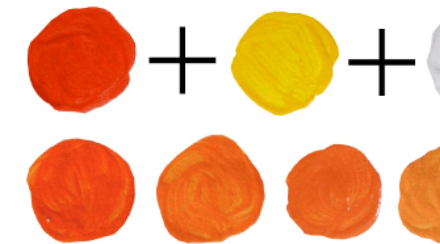
In my palette of glossy acrylic paints there is a bright red-orange tone. To get bright orange tones from it, I will need to mix red-orange, yellow and white:

How to get a coral color?
At least this shade closer to pink, its construction is completely tied in orange, and there are 2 scenarios for obtaining it:
1) Complex: We take red-orange, pink and white about equal parts (when you mix, then adjust the shade to the eye, the main thing is thoroughly mixing the paint).
2) Red-orange close to the scarlet, and the scarlet - the shade of red. The red color mixed with white gives pink, and the coral can be called a bright shade of pink with orange subtock.
In this case, the coral will be closer closer to orange, but nevertheless remain a luxurious tropical tint.
How to get a peach color?
Another light and thin shade of the primary color. The peach refers to a soft pastel range., Holding out of her with his sophistication, he has long been loved and entrenched in our presentation. Its construction consists of 4-color colors:
1) red + yellow + pink + white
2) orange + yellow + pink + white
3) coral + yellow + white
How to get terracotta color?
We turn to the dark shades of orange. One of the interesting options is terracotta: medium-dark, but saturated complex red-orange shade is obtained by mixing purple and red-orange:
Make a shade lighter will help add white droplets.
How to get red color?
Redhead color has orange subtock. If you take a brown and mix it with red-orange, then the resulting shades will be dark, but saturated. You can adjust the tone by adding yellow.

How to get a dark orange color?
You can adjust the brightness of the shades of orange using black: both to the complete dimming, and simply seduce the brightness. This is necessary to create contrast.
If you want to seduce bright shades: Mix white with black to gray mass and make it in the work tone.

Table of producing orange shades when mixing color:
Practice in flower science is indispensable, but the theory will be able to give you an understanding of how one or another tone is built.

In the center - the main color from which color is being built. The first circle of colors - shades with which is mixed with color in the proportion of the specified below. The third circle form the tones that turned out as a result of mixing the primary color and the first circle in a smaller proportion than the third one. On the sides of the color on the end of the beam, the same color with the addition of black (darker) and white (lighter).

How to get other colors and their shades: theory and practice. Jim on the icon.
How to get a blue color when mixing paints for writing pictures, in printing house and computer graphics? Blue enters the triad of the main colors, where the other two are red and yellow. In natural conditions, it is impossible to get the color when mixing two others. All features are determined by many conditions.
It is impossible to get a truly basic color in the process of writing pictures. It is false to assume that blue is obtained as a result of the mixing of green and yellow, on the contrary, comes out olive. How to get blue? Achieve the goal is simple: it is enough to mix blue and white in equal proportions.
In the visual arts often enjoy the finished palette, where the proportions and the ratios of the paints are painted. But with her, you can only get the shades of blue:
- Blue - produced by the method of mixing paint aquamarine and white in proportion 2: 1.
- Royal Tint - It turns out in the process of mixing aquamarine and pink.
- Dark blue - reproduced when combining two parts of standard blue and one part of black.
- SERO-BIAN - is made when combining the base colora and brown. It is brown that will create a dimming effect.
Variants of proportions and ratios, a lot of shades combinations. In the standard set, the analogue of blue paint can be obtained by mixing the color of aquamarine with pink.

On video: how to mix oil paints.
Synthesis in typography
This method is used in modern printers. It is believed that in the printing house, blue can be obtained, if you mix green and one of the shades of purple - fuchsia. Naturally, the basic basic will fail, but only an analog close to the original.
In the field of typographic work, the lack of quality of the color of the color is modified artificially, using the game of shades and contrast. With the help of a standard color circle you can recreate and shades. How to make a high-quality analogue, a highly qualified specialist will be able to respond using the method of trial and error. In any case, the base tone must be present, which, when mixed, becomes the base to create its interpretations.
Not only the palette is taken into account to create a color, but also the features of the surface on which the tone will be applied. First you need to take the sample and test it.

Computer graphics and main palette
Create blue in the so-called "artificial conditions" can be without problems. Even if it is basic, you can find a specific condition. Software provides the ability to synthesize any color using a correctly prescribed binary code.
Unlike typography and artists to get this base, programmers do not face the problem of obtaining the main color. The main thing is to choose the appropriate software environment.

Natural dyes
Natural dye is valued much more expensive than synthetic options. Such paint can be used to dye textiles and food items. Get blue can be obtained from:
- grapes;
- blueberries;
- blackberries;
- eggplant peel;
- cauliflower sheets.

There are more exotic options for obtaining the base. They are too expensive, complex in relation to the cooking technology. The above are actively used when creating food dyes, watercolor paints and guaishes. But the resulting paint is completely safe for health and life. There are also cons in the use of natural dyes: quickly lifted, unsaturated base, leaves traces on the skin and surfaces.
Red and green in combination give a dark brown color. But its shade and intensity depends on the selected proportions. The main role in this combination belongs to green. What it is darker and is used in a greater proportion, the more intense is brown, right up to black.
If mixing blue and green, what color will
Blue and green - we get the color of turquoise or sea wave. The more intense the blue tone, the more in the shade he will prevail, approaching the turquoise. The predominance of green makes the shade of the sea wave in greenish. With an equal proportion of colors, a saturated blue shade is obtained.

If you mix yellow and green, what color will
Combining yellow and green - we get a light green or salad tone. With that it turns out, the proportions of the paints should be the same. By adding green to yellow, we get olive shade, if the yellow will be very small - it turns out a deep green with a blue tint, that is, it all depends on the proportion.
In addition, the main colors can give many other shades. For example, with a combination of red with blue, purple color is obtained. Which, depending on the proportion, which we use can be from a light, almost transparent lavender shade to a saturated purple. Yellow and red give a bright orange shade.

Tip! If you try to mix all three main shades at the same time, it turns out an indefinite dirty-brown with a blue tint color, it is called complicated.
Experimenting with basic colors, given the basic rules of color, you can achieve any desired shade.
How to mix colors - video
Making the first steps in working with the decor, most artists face the problem of the absence of many shades in standard sets of paints. Yes, and in everyday life, the need to obtain various tones arises quite often: from choosing a color for painting walls in a house to selection of an ideal eye shadow option. However, it is not necessary to be upset if there is no necessary element in the existing Arsenal of the Arsenal. Remember, in the presence of only three basic colors: yellow, blue and red, you can get any existing shade in nature. So to obtain an orange color you just need to mix two basic colors: red and yellow, and also familiarize yourself with some nuances that artists use when mixing paints.
To begin with, we will prepare everything you need. You need to bring:
- surface for mixing (for example, palette);
- paint yellow and red shades;
- brushes;
- canvas or other working surface on which the material is planned to be applied (watercolor paper, pastel paper, etc.).
In order for the final color to be perfect, before starting work, make sure that the surface is cleaned from extraneous particles (pile, dusty, hairs brush, etc.). You also need to immediately decide how the methods you plan to get the desired orange tone. If mixing is performed on paper, the final shade is obtained by overlapping the tone after the overlay of one layer of composition on another. If you mix the colors on the palette or b banks, as a result you get a separate new tone.
Process of receipt
To obtain an orange color, connecting shades on paper, you must first decide what you want to get in the end. Since if you apply yellow on top to red, the final tone will be darker than when applied red. It is also important to provide that the brush for mixing is cleaned from foreign shades, because The presence of a color paint brush with a different color can give a completely unexpected result.
In the same rule, it is necessary to be guided if they thought to get the necessary orange color in dry painting. Just apply a red-litter red about yellow on top of each other, and then scroll. The resulting shade will depend on whether the layer of which color was applied from above: if the last layer was yellow, then orange will be lighter if the red-orange tone is formed.
When mixing paints on the palette, the situation is somewhat simpler. You need to apply a few single database of paints and the other, and then mix with the help of a mastichene (special small spatula). An ordinary brush is suitable, but again, do not forget to make sure that the brush is cleaned from other paints.
Completely different mixing rules need to be guided if you are working with oil paints. To make the final color orange, it is necessary to apply yellow and red strokes very close to each other, then by going to a short distance, you will see what has achieved the desired effect.
Right proportions
The proportions of red and yellow paints depends solely on what shade you want to get as a result. So when mixing paints in the same proportions, as a result, you will get a classic orange color. In order for the final orange to be more golden or yellow-orange, yellow paint must prevail. While to obtain a fire-orange saturated, red should be added more. You can also soften the resulting shade of orange by adding a little white paint, then you will get a lighter, pastel tone. But to darken the tonality, it is better to use a black color, since it does not dimensionally darken how much the color spectrum flies. To obtain a darker shade of orange, it is recommended to apply a little dark gray.
 Names of orange spectrum
 Conclusion
The principle of obtaining orange paints is pretty simple, it is enough to know the RGB model and the principles of mixing to make the most resistant composition. From the type of work, whether it is drawing or decor of the room, the method of obtaining orange colors does not change.
Consider the color circle already known to us.
All colors are divided into:
Main (yellow, red, blue) - the inner part of the circle - from these colors we get the rest.
Minor colors (purple, orange, green) - middle part of the circle.
Three-heel (sophisticated) colors - an external circle and a combination of shades from different parts of the circle.
Components will be indicated on sectors within the desired color.
When mixing the colors located opposite each other in equal proportions, we will get dirty dark gray color. Such pairs of colors are called additional.
This effect is used when you need to "muffle" the shade, "polluting" it.
For example, that blue becomes darker - a bit of orange, brown in it, "drows out" light green. The main thing is to understand the principle of working with the color circle, and find a more complex and convenient option in the network and download - not difficult.
I will give a few color mix recipes:
yellow + brown \u003d ocher
red + yellow \u003d orange
red + Oh + White \u003d apricot
red + green \u003d brown
red + blue \u003d purple
red + blue + green \u003d the black
yellow + white + green \u003d citric
yellow + blue or blue \u003d green
yellow + green + white + red \u003d tobacco
blue + green \u003d sea \u200b\u200bwave
orange + brown \u003d terracotta
red + white \u003d coffee with milk
brown + white + yellow \u003d beige
salad.\u003d (green + yellow, more yellow) + white \u003d light salad
lilac\u003d (blue + red + white, greater than red and white) + white \u003d light Siren
lilac\u003d red with blue, and red prevails
the black\u003d brown + blue + red in equal proportions
the black \u003d brown + blue.
gray and black\u003d Blue, green, red and yellow mixed in equal proportion, and then one or another is added to the eye. It turns out more blue and red
black \u003d.it turns out if you mix red, blue and brown
the black\u003d Red, green and blue. You can additionally add brown.
bodily \u003d red and yellow paint .... The smallest. After mixing, if yellowing, then add a little red, if it pose a little yellow paint. If the color is strongly saturated, it turned out to put a piece of white mastic and wash again
dark cherry \u003dred + brown + a bit blue (blue)
strawberry\u003d 3 parts of pink + 1h. red
turkiz \u003d 6 hnebezno-blue + 1h.zhet
silver gray \u003d 1ч. HERE + 1ч
dark red \u003d1h. red + little black
rust color\u003d 8h.Onzhevy + 2h. red + 1 hp
greenish\u003d 9h.newable blue + a little yellow
dark green\u003d green + little black
lavender\u003d 5h.-transition + 1C. SEREEN
nautical\u003d 5h. Blue + 1C. Green
peach\u003d 2h. Orange + 1h. Dark yellow
dark pink\u003d 2h. Red + 1Ch.Cyrian
dark blue\u003d 1h. Blue + 1h. Serenevian
avocado\u003d 4h. yellow + 1h. agriculture + slight black
coral\u003d 3h. torque + 2h.zhet
gold\u003d 10h.zhet + 3h.Onzhevy + 1h. red
plum \u003d.1h.Fiolet + a little red
light green \u003d. 2h.piolet + 3h.zhet
And this table contains classic colors recipes
| Pink | White + add a little red |
| Chestnut | Red + add black or brown |
| Royal Red | Red + add blue |
| Red | Red + white for lightening, yellow to get orange-red |
| Orange | Yellow + add red |
| Gold | Yellow + drop of red or brown |
| Yellow | Yellow + white for clarification, red or brown to get a dark shade |
| Pale green | Yellow + Add Blue / Black for Depth |
| Herbian-green | Yellow + Add Blue and Green |
| Olive | Green + add yellow |
| Light green | Green + Add White / Yellow |
| Turquoise-green | Green + Add Blue |
| Bottle-green | Yellow + add blue |
| Coniferous | Green + Add Yellow and Black |
| Turquoise-blue | Blue + add a little green |
| White-blue | White + add blue |
| Maddlewood blue | White + add blue and black |
| Royal blue | |
| Dark blue | Blue + add black and a drop of green |
| Grey | White + add a bit black |
| Pearl-gray | White + add black, little blue |
| Middle brown | Yellow + add red and blue, white for clarification, black for dark. |
| Red-brown | Red & Yellow + Add Blue and White for Lightening |
| Golden brown | Yellow + add red, blue, white. More yellow for contrast |
| Mustard | Yellow + add red, black and a little green |
| Beige | Take a brown and gradually add white to a beige color. Add yellow for brightness. |
| Not quite white | White + add brown or black |
| Pink-gray | White + drop of red or black |
| Gray-blue | White + add light gray plus drop blue |
| Green-gray | White + Add Light Gray Plus Green Rail |
| Gray coal | White + add black |
| Lemon Yellow | Yellow + Add White, Little Green |
| Light brown | Yellow + Add White, Black, Brown |
| Color of green fern | White + Add Green, Black and White |
| Forest greens | Green + add black |
| Emerald green | Yellow + add green and white |
| Salad | Yellow + add white and green |
| Aquamarine | White + add green and black |
| Avocado | Yellow + add brown and black |
| Royal Purple | Red + Add Blue and Yellow |
| Dark purple | Red + add blue and black |
| Tomato-red | Red + Add Yellow and Brown |
| Mandarin, Orange | Yellow + add red and brown |
| Redhead-chestnut | Red + add brown and black |
| Orange | White + add orange and brown |
| Color of red burgundy | Red + Add Brown, Black and Yellow |
| Crimson | Blue + add white, red and brown |
| Plum | Red + add white, blue and black |
| Chestnut | |
| Money color | White, Yellow and Dark Brown |
| Dark brown | Yellow + red, black and white |
| Copper-gray | Black + add white and red |
| Team of eggshell | White + yellow, little brown |
We use
As you understood from the tables - the darker and dirtier color, the more recipe options exist. Perhaps not all and will not immediately succeed, you need a certain skill, but it is produced very quickly and your favorite and unloved combinations and recipes will appear. It seems to me that the most economical way will get acquainted with the mixture of flowers, not afraid to spoil something - to practice with ordinary watercolor paints.
As you have confidence in what happens in the end - you can try and enamel with acrylic. In any case, if not sure as a result - try first in watercolor or guashi.
I recommend starting with small - using purchased shades, by simple additives will learn how to make gradients of camouflage shades for color modulation, for example, for flush liqueness.
As mastery grows, you can, buying a ready-made color and making painting, as it is spent, cook colors yourself.
Always prepare a color with a small margin - if necessary, it will be necessary to repeat it.
I do not argue that, buying ready-made shades is often easier and faster, but I am preparing a color yourself when:
1. The color you need is not available in the store - there is no desire and time to wait for the supply.
2. It often happens that I disagree with a particular interpretation of the shade by the manufacturer of paints.
3. The desired color does not produce manufacturers (as an example - Polish khaki, moreover, the paint 4 shades were used during one and a half of the pre-war years 1938-1939.)
4. It is assumed that the prototype, due to the conditions of operation, the color was strongly modified.
5. So that my collection of models does not look like one green-blue spot, I try each next model to paint a little more than another tint. The difference will be visible only if you put two models in the same color nearby.
These knowledge applies and will be useful in everyday life - for example, it is impossible to erase colored things of additional colors at the same time - they will gradually acquire gray shades :))
Now, having studied the foundation, it will be possible to return to model technologies and practices.