Unreal reality. Black and white still life and its specific features Still life in black white tones
Decorative still life in a Art School Students are performed according to the following procedure:
1. Layout layout in the sheet.
2. Transformation (shape stylization).
3. Overlay or braid silhouettes among themselves.
4. Filling up silhouettes with texture and decorative solution.

As you know, still life is a formulation of inanimate objects. In the easel painting, still lifes are written traditionally: they make the volume of items, transmit lights, linear and air perspective, space ... In the decorative still life it becomes unimportant. The form of the depicted objects becomes flat and conditional. Light absent. Instead, each silhouette is being worked out decoratively.

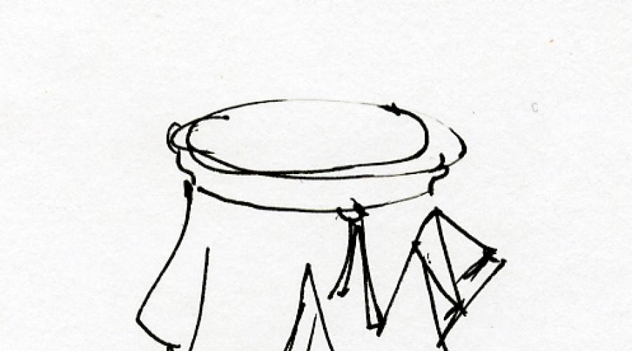
On the transformation of the form you need to stop separately. Its essence is to transform the initial form of the subject in conditional. That is, the drawing is simplified, deprived of unnecessary parts. The form is reduced to the conditionally geometric, i.e. it is based on simple geometric figures (circle, rectangle, triangle ...). For example, a jug can be made from a circle and cylinder, and from above and bottom to complete circles or ellipses. Thus, only the nature of the subject remains. He must be recognizable. And the contours will already be transformed and are shown to the general style.

Silhouette Overlay - This is a reception in decorative art and designer business. The imposition of silhouettes to each other is understandable by definition - these are subjects obscure each other and the image becomes like multi-layer. But stuffing is more difficult. For example, when a part of the jug is blown around with an apple, then intersecting parts of the jug and apple can be displayed by an artist completely different color. Items become as it were "transparent" and their intersecting parts are visible to the viewer. Silhouettes of objects are intertwined so intricate that in the end, they sometimes it is difficult to distinguish. And it gives a decorative work special attractiveness.

Filling out contours of objects texture - It does not represent much difficulty. You can do paint spray, you can lay the paint with chaotic strokes, etc. But fill the silhouette with a decorative solution is more complicated. The artist comes up with a certain "ornament", although this word is not quite suitable here. This "ornament" he fills the silhouette. This "ornament" is created based on the line forming. The forming line is a line that forms an outline of the subject. For example, the contour of Greek amphora will be graceful curved. Therefore, the internal decoration of the silhouette will be based on the lines curved in this way. Separate parts of such decoration of objects, as well as the items themselves can be braided. Also, between them you can skip literal ornament. Therefore, such decoration is not just filling the silhouettes only with texture or abiding. This is a more complex process. But also more spectacular on which the essence of decorative still life is based.
Like any other genre of photography, still life is impossible without composition. Moreover, still life is exactly the genre where the composition plays a paramount role and requires close attention from the photographer. After all, the reportage frame can be forgiven, if the author caught a really good time. And homemade pictures - you noticed how moms are died, seeing in the photo, albeit a talentless, their child? It is unlikely that we will wait for the same condesception from the audience, photographed the orange with a bottle. To have a positive effect, you will have to try. And start, of course, follows from the composition of the conceived frame.
Conditionally speaking, the composition in still life is a harmonious combination and interaction of objects in the frame. Through the composition, you can consistently show the viewer all that you wanted to create a mood, pass the idea and even tell the story.
The composition in the still life can be divided into several types:
- geometric
- spatial
- color
Geometric composition
It is no secret that all objects have a geometric (or approximate to the geometric) form. It is also not a secret that a person is characteristic of associated every figure with something characteristic of her. For example, the angles are subconsciously associated with pointers. When you look at a square or a rectangle for a long time, a feeling of stability arises (maybe, because our subconsciously draws a stable building). And the circle creates a feeling of comfort and soothes. It is worth remembering that horizontal lines (lying man) are much calmer than the vertical (man standing). As for the diagonals, the ascending lines are leading from the top lower corner to the right top - they look tensily descending: we read everything left to right, and our view has to "boil" around the picture to get to the very top. But this is hidden and a certain sense of victory, isn't it?! The downstream lines coming from the left upper angle to the right lower right, on the contrary, are traditionally associated with relaxation, sadness or even decline.
 |
 |
All these little tricks can and need to be used for their own purposes - in order to transfer the concept, picture ideas.
Selecting space

If there is a need to highlight a certain item in still life, removing him the role of the main character, here you can play on the spatial composition. For example, put the main object on the forefront, ahead of all others. Or set up the light so that the leading element is lit by brighter than everyone, and those objects that ended up and in front of it were weaker. And it is possible to make a cunning - to light the wand of the incense or release a cigarette smoke, thus drawing in the frame to the air passage: the focus will be focused on the front objects, since the far drown in the romantic haze.

You can also play on the technical aspects of the camera: if you want to show it in detail every item, including a backdrop or drapery, then the shooting should be carried out with a closed diaphragm. But if it is important to select some one item, then the diaphragm needs to be revealed as much as possible. It is not necessary to ignore the optics features: on frames made using wide-angle lenses, items are greatly distorted, and the closer to the camera the object, the greater it will seem in relation to remote. Conversely, large focal lengths "collect" perspective, the space is made much more flat.
Color composition
If the photography is conducted in b / w, we will not use knowledge about the properties of the color exposure. But in the event that the photographic is planned in color - you should not ignore this research scope. By turning his mind to color psychology, we will see that each of the colors has, in addition to its original color, its own semantic load. Warm colors (orange, yellow, red, terracotta) remind us of summer, sun, warm. This is the first association, which occurs when looking at the photo, resolved in these colors. In addition, from the course of painting, you can find out that such items seem visually closer. What you can not say about cold colors: blue, green, pink, purple - these colors slightly remove the object from the viewer, and are associated as a rule with winter, cold, water.
It is important to remember about the contrast, sometimes it can be played on it, but often uncompressed color combinations repel or distort the meaning of the entire production. If you decide to take pictures of the cucumber on an orange background, think, will there be a background to drag attention on yourself? And did you really want to achieve this? It is also necessary to remember that any item has the ability to reflect or absorb the color shades of objects nearby, and even two of the same in the color of the object on one background may look different because of the differences in their textures.

The influence on the viewer also has a saturation of the color: the composition in soft pastel colors will create a feeling of rest and nostalgia, and bright, screaming paints, on the contrary, are suitable for attracting attention, expression transmission, factories. That is why bright colors are so loved by advertising photographers, while the art photo is often touched by a muted, calm tone.
Of course, any composition must be fully compiled by a common flavor, the law inside the picture - otherwise it will fall apart. That is why you should be careful with color contrasts, they can have a serious influence - how to make work more interesting, and destroy it, putting unnecessary accents.
Black and white
Despite the lack of color, in black and white still life, their laws reign, and the contrast here also plays an important role. The same color in this case is replaced by the tone - another game, but there are also rules in it!
Surely you noticed that full women very rarely go in white. The fact is that white color seems to be a volume of black. On the black and white image of the eyes first grabs the brightest stains and only then moves to the dark. There are many visual pictures on this effect: if you look at the sheet in a smooth black and white strip, it will certainly seem that white stripes are wider. It is always necessary to take into account this rule when formulation of the composition, and also take into account that the bright white subject will be in the forefront or in the background, it will surely seem in this composition mainly, and the look will fall primarily on it.
Contrasts
As already mentioned, contrasts play a special role. There is existing within the same composition in the image, they can highlight objects and, on the contrary, hide them. The work built on barely noticeable fluctuations in light and shadow without emphasizing the attention of the viewer stains seems to be monotonous, monotonous, inexpressive. The sharp contrasts create tension, dynamics.
Rule of tratta
Of course, in a conversation about the composition, it is impossible not to mention the rule of the third. Having in the mind through a frame four lines - two, dividing it into three equal parts horizontally, and two vertical verticals - you can calculate the most effective frame zones: they are at the points of intersection of four lines with each other. In these zones, it is best to place the main object of the composition.
In fact, the rule of the third is a simplified rule of the golden section, which will be somewhat more complicated. For this, the frame must be divided into eight parts horizontally and vertical. And then spend on the right and on the left, as well as from the bottom and on top, the line is 3/8. At the intersection of these lines and there will be points of the golden section. But the splitting into three parts is much more convenient than eight parts, so it is used in the composition more often: the viewer's difference is not so noticeable, and harmony in the frame subject to any of these rules is obvious.
Rhythm
 |
 |
Rhythm, that is, the repetition of the same or similar lines is a very powerful composite tool that allows you to manipulate the viewer's view. According to the "track" of alternating objects, you can hurt very far. But it is not necessary to replay - the rhythm can and kill the entire composition by depriving its dynamics and making monotonous.
Internal connections
When creating a setup for photography, it is necessary to ensure that there is a connection between objects in the frame. Items can be associated with form (egg and bulb), in color (tomato and red pepper), in meaning (apple and cinnamon sticks). Objects must be reported to pass the viewer who translates a look from one item in still life to another. This approach gives the integrity of the composition, makes it an interesting, understandable and at the same time mysterious - it is not at all necessary to disclose all internal connections at once, the most interesting can be hidden inside the composition or for a while hide from the viewer, for example, light.
On the composition you can speak infinitely for a long time, but most importantly, what a still life is built on (as, however, and the photo in any other genre) is an idea, a plot and shower of the picture. And the composition is the same tool in the hands of the photographer, like the camera itself. Remember that you want to convey to the viewer! And use all available composite techniques for your own purposes.
Chess styling still life. Master class with photo
Elena Alekseevna Najanskaya, Teacher of Fine Arts MOU Arsenyevskaya Sosh, P.Arsenyevo, Tula region.Description: The material will be interesting to teachers of visual arts, educators, educators of additional education, creative children are 10-12 years old.
Purpose: Use in the lessons of fine art, work can serve as an interior decoration, excellent gift or exhibition exhibit.
Purpose: Still life with the use of image membership on parts (cells)
Tasks:
- to know with a variety of decorative image techniques still life;
- develop a sense of composition, imagination, develop creative abilities;
- improve the skills of work of gouache; Exercise in the ability to work with a brush of various sizes in accordance with the task,
- to educate interest in the basics of the visual lettuce.
- Reutive accuracy, lubble to visual creativity.
Materials:
-Guchny black (you can use mascara)
-Chist number 2, №5
-pencil
-Lineca
-eraser
Oil A3.

Still life- This is a genre of fine art dedicated to the image of household goods, fruits, vegetables, colors, etc.
As an independent genre, still life has received its development in the 17th century. In the work of Dutch artists. And at present, the genre is quite widely used by modern artists and designers. Along with the realistic image, it is very often possible to meet with the concept of "decorative still life".
For decorative still life, a conditional, simplified image of forms, stylization.
A lot of attention is paid to the color decision, coloring-a flowered combination used in the composition. Frequent is the use of contrasting colors. The harmonious contrast combination is the ratio of black and white. This combination is actively used in graphics, clothing, interior, etc.
We will try our today's composition of still life using the combination of black and white, but to the color, we will also add the concept of the plane partition to the cells. Recall the location of the color cells-fields on the chessboard, we will pay attention to the fact that the same field-colored fields are never combined with the overall side, they only touch each other at one point. We will try this feature to use at work on the composition of still life.

Progress
1. Thinking the composition, choose the location of the sheet. We plan the location of items. If you work in this technique for the first time - try not to complicate the composition by applying the form of one subject to another.

2. We plan the design of objects with broken lines. Since still life will be decorative - it is not necessary to strive for the transmission of volume, there will be a flat construction.

3. We refine the contours of the form of objects. We supply the contours of the vase, cups, draw the stems of flowers, fruits with more smooth lines. Remove the line of construction.

4. We plan incident shadows. We separate the sheet plane to the same cell in the magnitude using a ruler. The optimum magnitude of the cell for the landscape sheet (A4) is 3 cm if the larger sheet (A3), then you can increase the length of the cell side up to 5 cm. If there is no experience in such an image of still life - try not to complicate the problem reducing the cell size.

5. We begin the painting of the cells with a gouache black. Trying the paint to take thick so that the paint layer is quite dense and homogeneous. If the form of objects fall within the cell, then it is not painted it. Starting work better from extreme cells, gradually moving in the middle of the composition.

6. We turn to the painting of cells in the middle of the composition, without going for the contours of items.

7. After completing the staining of the background, we begin to work out the color of the parts of the objects that hit the white cells.

8. Continuing to work on staining individual elements approach the completion of work. We refine the lines of the shape of the objects, correct the inaccuracies and non-accurant contours of the cells.

Work is ready.

Thanks for attention! I wish all creative success!
Photographs of still lifes, as you know, are quite common. Often, many photographers love to present their still lifes in the black and white. To do this, you need to find objects, compare everyday objects in your environment, as well as strengthen the difference in textures and tones. The transformation into a black and white version gives many features when viewing the photo itself.
Black and white still-life allows you to focus on the lines of photography, textures and forms. In this case, these elements focus much easier, as it is not necessary to be distracted by colors. Good use of this reception will not only get a more objective image from the point of view of its integrity, but also strengthen the voltage between different objects and materials. Such combinations can be found everywhere, for example, in the park, on the shore, etc. You can take pictures of any objects. In addition, you can photograph objects with pairs or more. It should be noted that it is not recommended to use the same methods to convert photos to a black and white option.