Inscription with chalk on the board. Create text in Photoshop written by chalk on a school board
Read also
In this lesson, Photoshop shows how to create a green board and inscriptions on it made by chalk.
Step 1
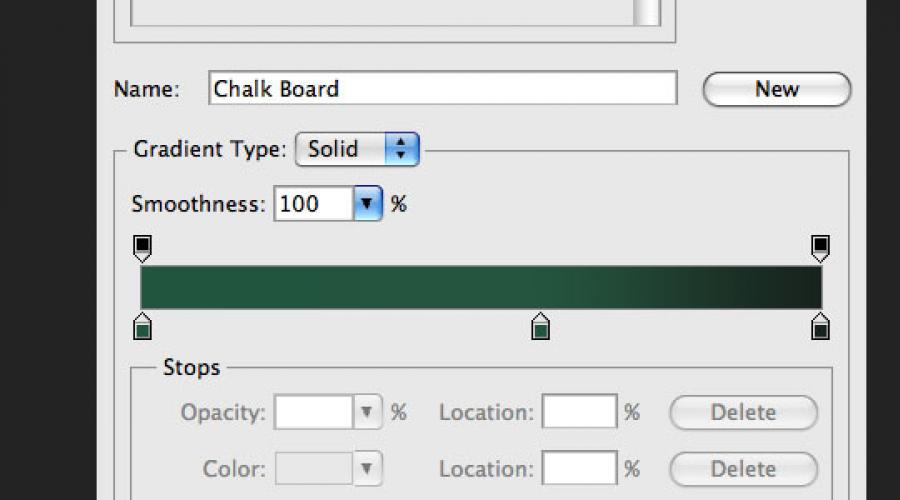
Create a new document in Photoshop (Ctrl + N) The size of 1000x609 pixels. First create a background for the board. Create a new layer (Ctrl + SHIFT + N). Select a tool Gradient (Gradient Tool) (G): Style (STYLE) - RADIAL (RADIAL). Adjust the gradient as shown below.

Make the canvas fill to get such a result:

Step 2.
Add noise to the board you looked too smooth. On the layer with the gradient fill, go to the menu Filter - Noise - Add Noise (Filter - Noise - Add Noise)Use the following parameters:
Number (Amount): 1.6%
Distribution: by Gaussian (Gaussian)

Result:

Step 3.
The following few steps are devoted to creating a wooden frame around the board. To recreate wood texture, I decided to use the filter Fiber (Fibers). I could not find the rotation function in the filter settings, so I decided to create each part of the frame in a separate document and then transfer everything.
Let's start with the creation of the top of the frame. Create a new document (Ctrl + N) The highest width of the first document. The width of the canvas depends on how thick you want to get a frame. The size of my first canvas was 1000x609 pixels. Therefore, I created the second canvas in the size of 45x1000 pixels. Set the color of the fill to the light gray, and the background color on the dark gray. Then apply the filter Fibers (Filter - Render - Fiber) (Filter - Render - Fibers). Adjust the filter so:
Deviation (Variance): 3
Intensity (Strength): 21

Result:
Step 4.
You need to give the texture of the color of the tree. Go to Correction Color Tone / Saturation (Image - Correction - Color Tone / Saturation) (Image - Adjustments - Hue / Saturation). Install the tick Colorize)and enter the following values:
Tone (HUE): 19
Saturation (saturation): 33
Brightness (BRIGHTNESS): -20
Step 5.
Add noise to texture with filter (Filter - Noise - Add Noise) (Filter - Noise - Add Noise): Number (Amount) - 1%. To drag part of the frame, use the tool Move Tool (V). Place the wooden strip in the top of the canvas.

Step 6.
Create the remaining parts of the frame in the same way and insert them into our document.

Step 7.
Choose all the layers of a wooden frame in the layer palette. Right click on any of them and select Combine Layers (Merge Layers). Then click twice on the resulting layer to open the styles window. Apply the following styles:
Drop Shadow:
Blend Mode: Multiplication (Multiply); Color (Color): Black
Opacity (OPACITY): 75%
Angle (angle): -39; Global Lighting (USE Global Light): Included
Displacement (Distance): 11 pixels
Scope (Spread): 0%
Size (Size): 29 pixels
Contour (Contour): Linear (Linear); Anti-Aliased: Disabled
Noise (Noise): 0%

Inner Glow:
Blend Mode: Lightening (Screen)
Opacity (OPACITY): 12%
Noise (Noise): 0%
Color (Color): White
TECHNIQUE: Soft (Softer)
Source (Source): At the edges (edge)
Tightening (Choke): 0%
Size (Size): 5 pixels


Step 8.
We finished working on the frame, now we will deal with the surface of the board. It needs to be made a little grunge and add texture. Load this set of grunge brushes and import them into photoshop. Create a new layer (Ctrl + SHIFT + N) Between the background and layer with the frame. Tool Pipette (Eyedropper Tool) (I) Determine the most dark shade of green and outlines the green area as shown below. Lower Opacity (OPACITY) of this layer to 40%.


Step 9.
Add more shades on the surface of the board. Create a new layer above the layer with grunge brushes. Set the default colors (D) and apply filter Clouds (Filter - Render - Clouds) (Filter - Render - Clouds). Then apply the filter Blur in motion (filter - blur - blur in motion) (Filter - Blur - Motion Blur) With such parameters:
Angle (angle): 18 degrees
Displacement (Distance): 100 pixels

Install Overlay Mode (Blending Mode) This layer is on Multiplication (Multiply) And lower Opacity (OPACITY) up to 30%.

Step 10.
In this step, we will make the creation of old traces from the permanent erasing of the inscriptions with a sponge. Create a new layer over the layer from the previous step. Select a tool Brush Tool (B)And select the "Watercolor Loaded Wet Flat Tip" brush.

Lower Opacity (OPACITY) Brushes up to 30% and black make several smears on the green surface. Some plots need to outline 2-3 times so that they are darker than others.

Install Opacity (OPACITY) This layer is 10%.

Step 11.
Create another layer and repeat the process, but this time use a white brush, and Opacity (OPACITY) Layers - 5%. You must complete with this result:

Step 12.
Find a beautiful handwritten font and write something tool on the board Horizontal text (Horizontal Type Tool) (T). For example, I used the Christopher Hand font. Lower Opacity (OPACITY) layers with inscriptions up to 10%. It turns out the remaining traces of the chalk, which were not good.

Step 13.
Now we will add normal inscriptions on the board. Write something and install Opacity (OPACITY) Text by 70%. Then select one of these brushes. Add a pixel mask to the text layer (Layer - Layer Mask - show all) (Layer - Layer Mask - Reveal All). In the black color, outlines the inscriptions so that the green surface is a bit visible through them. This will help create a realistic appearance, the view of the chalk leaves after herself a heterogeneous trace.


Step 14.
I decided that the board does not prevent the volume and perspective. Add B. low part Boards a small shelf on which chalk will lie. Use the method described earlier and do not forget to apply styles and External Glow (Outer Glow).

Step 15.
In this step, we will create a sponge for erasing chalk. Select the tool and set the Radius to 1 pixel in the settings. Create a shape and place it on the shelf created in the previous step. Convert this rectangle into a smart object (Layer - Smart Object - Convert to Smart Object) (Layer - Smart Object - Convert to SMART OBJECT). Working with a smart object is always more convenient, since you can change the settings of the filters applied or remove them at all.
Set the default colors (D) and apply filter Clouds with overlay (filter - rendering - clouds with overlay) (Filter - Render - Difference Clouds).

Step 16.
Sponge still lacks lighting and texture. Add a couple more filters. First apply the filter Airbrush (Filter - Strokes - Airbrush) (Filter - Brush Strokes - Sprayed Strokes).
Stroke Length): 20
Sprinkling radius (Spray Radius): 25
Stroke Direction: Vertical (vertical)

Number (Amount): 1.96%
Distribution: Uniform (Uniform)
Monochrome: Included

Result:

Step 17.
Now we will work on the top of the sponge. Tool Rounded Rectangle Tool (U) Create a dark gray shape over the base of the sponge, convert it into a smart object and apply noise filter.

Step 18.
To both layers of sponge apply style Drop Shadow (Drop Shadow).

Step 19.
At the end, add a couple of pieces of chalk.
Text written by chalk in paint.net
In this lesson, I will tell you how to make an inscription written in Paint.Net.
The idea of \u200b\u200bthe lesson is borrowed from the English-language site, but somewhat changed, because You can achieve the desired effect of the inscription with chalk it is possible significantly easier and the result will be better. For the inscription chalk, we will need a picture with the texture on which we will do this very inscription. For example, this is suitable for the schoolboard:

Using the board as a background, create a new transparent layer and write an inscription on it. The key disadvantage of the original lesson, they made the inscription to the fat, which disappeared the feeling of reality. Those who studied at school and had experience in communicating with a chalk board know that it is very difficult to do beautiful inscription With the thickness of the letters, like three pieces of chalk. :-D I used the Script font for the inscription, which is almost all systems. However, all parameters are in the figure below:

Apply to the layer with the inscription Standard Paint.NET effect "Adding noise" from the Paint.NET menu effects - noise.

Apply to the layer with the inscription Standard Paint.Net effect "Gaussian Blur" from the Paint.NET menu effects - blur.

Create a copy of the layer with the resulting inscription. Apply to the top copy of the layer the standard Paint.Net effect "dents" from the Paint.NET menu effects - distortion. Figure below, the value of the "scale" parameter was used, equal to the remaining default parameters. The value of the "Scale" parameter may be greater, it all depends on the thickness of the text you do.
Combine these two layers with text.

Create a copy of the layer with the resulting text. Disconnect the visibility of the layer at the top copy, we will need this layer later. For another visible layer with text, set the "Adding" mix mode. Apply the Curved Correction to this layer with the settings as in the figure below:

As can be seen in the figure above, the inscription is already similar to the made chalk, only pale. Now you can enable the visibility of the top copy of the layer with the inscription. Set the mixing mode of this layer as "screen clarification". Adjusting the transparency of this layer, you can change the brightness of the inscription made. For the picture below, the transparency of the layer was installed 180.
Today we will try to make a green school board and write text on it. As always, for the idea of \u200b\u200bthe lesson thanks to Vectips, which implemented it in an illustrator. I embodied it with the help of photoshop. In this lesson there are several curious simple techniques that give a stunning effect. First, let's put over the board, giving it a slightly shabby view in the straight and figurative sense. Then we write the text and using the imposition mode "Dissolve" (Dissolve) will achieve the effect of the inscription made by chalk. Then a little decorate the inscription.
Step 1.
Create a new document in Photoshop, fill it with color # 365722. Immediately make a duplicate layer and turn it off, it will come in handy in the 4th step. 
Step 2.
We take a large soft brush with a size of 250 pixels and color # 7A975F click in the center of the canvas so that it turned out such a light spot. 
Step 3.
Now add noise. "Filter"\u003e "Noise" (noise) "Add noise ..." (Add Noise) with values \u200b\u200bas in the figure below. 
Step 4.
Install the color of the front background - white, the color of the rear background - # 365722. Now use the auxiliary duplicate layer from step 1. Turn on the auxiliary layer and apply the "Filter"\u003e "Sketch"\u003e "Sketch"\u003e "Sketch" (STAMP) with settings, as in the figure below. 
Step 5.
It turned out such an effect. 
Step 6.
Now highlight white color and turn off the auxiliary layer. 
Step 7.
On the new layer, we pour the selection by white and change the imposition mode on the "soft light" (Soft Light). We reduce the transparency of the layer to 10%. 
Step 8.
Now choose a brush. IN standard set "Thick Heavy Brushes" I found a suitable brush. Click F5 and in the dialog box that opens, select the bookmark "Form of the Brushes Print". We put the settings, as in the figure below.

Step 9.
In the "Double Brush" tab, we set the following settings. 
Step 10.
In the "Color Dynamics" tab, we set the following settings. 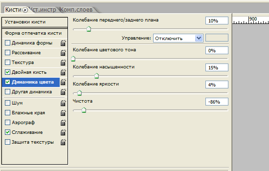
Step 11.
Now on the top menu panel, we put the "opacity" value for the brush - 50% and "Press" - 20%. After that, on the new layer we make several strokes with a brush. 
Step 12.
We change the layer overlay mode with strokes on "soft light" (Soft Light). We reduce the transparency of the layer to 65%. 
Step 13.
Now the Book Antiqua font, size 90 pixels, write the word "design". 
Step 14.
Rastrating the text. Change the layer overlay mode to "dissolve (attenuation)" (DISSOLVE). Layer transparency reduce up to 95%. 
Step 15.
Two times click on the layer and open the layer style, the "Stroke" tab. Install the following parameters. 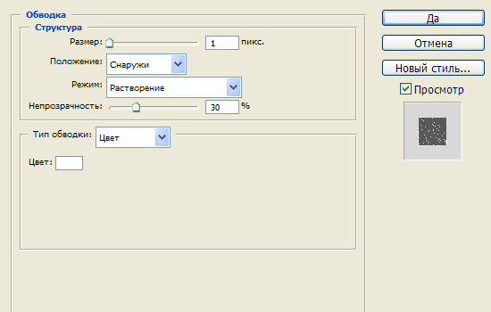
Step 16.
It should turn out so. 
Step 17.
Click on the layer right mouse button and select "Group to SMART OBJECT)" (Convert to Smart Object). And after that, we apply to the text "Filter" (Filter)\u003e "Blur" (Blur)\u003e "Blur in Gauss ..." (Gaussian Blur) with a value of 0.3 pixel. 
Step 18.
Now we write a few more arbitrary words and, using steps from 14 to 17, we achieve the effect of the inscription made by chalk. 
The final
Now add decorative single-pixel strips and, with the help of steps from 14 to 17, we achieve such an effect for them, as in the figure below. 
The typography, drawn by chalk very popular. However, not all are well managed by chalk, and the school board is not in every home you will find. Today we will create a chic typographical effect with the help of remedies and electronic tools. To begin with, we will create the concept itself in Illustrator, then with interesting technique Turn the job in the drawing chalk.

The highlight of this lesson is that we combine the work at the computer and drawing with your hands. Of course, there is a way to do everything in graphic editors, but to achieve so realistic effectAs in our lesson, it is hardly possible.

So, let's begin. Open Adobe Illustrator And create the concept you want to turn into a pattern with chalk. At this stage, we will use the benefits of software that allows us to apply and cancel the actions, while in real life, from strokes so easy not to get rid. Enter your text and select your favorite font.

Convert text to curves using the CMD / CTRL + SHIFT + O key combination, then right-click on the text and select URGROUP / ungrade to split the inscription on individual letters.

Stretch selection over each word or word group and press CMD / CTRL + G to group them.

Select the first word group and select Effect\u003e Distort & Transform\u003e Free Distort / Effect\u003e Distorting and Transform\u003e Arbitrary Distortion. Raise the bottom right point above to distort the text group.

In fact, such a similar distortion of the text is usually undesirable, being a kind of designer tactlessness, but in our case the work will be practically handwritten, so we can afford it. Scaling the text vertically to press it a bit.

We take over the next group from our text. Highlight it and select Object\u003e Transform\u003e Shear\u003e Transform\u003e Tilt menu. Specify the angle that coincides with the angle of the previous group.

Draw a thin rectangle under the text and apply a Shear transformation to it, repeating the end angle of the text. Duplicate the rectangle and pay the second text group. Pen / Pen Tool Draw a triangle to fill the empty space in the upper right corner.

Highlight the third group of text and select Effect\u003e Apply Free Distort / Effect\u003e Apply Agricultural Distortion to apply the effect with the same parameters that we have chosen earlier.
Textually change the color of the text to make it more convenient to fit the third group under the size of the first.

Open the Appearance / design palette and click on the FREE Distort effect / random distortion. Move the upper left point so as to create a parallel rectangle. Then move the bottom right point back to the original position.

You can duplicate any items drawn earlier and reflect them to achieve symmetric design and fill empty places.

Scaling the next group of words so that it coincides with the width with our design. Position the group so that between it and the previous text there is the same distance both between the other elements.

Complete concept last word, scaled and aligned by the rest of the elements. With narrow rectangles, make the design more interesting.

Draw a rectangle around work. Specify it the lack of fill and stroke at 7pt. Copy (CMD / Ctrl + C) rectangle, then paste a copy to foreground (CMD / CTRL + F). Holding alt, scaling a copy by making it less. Reduce the stroke thickness up to 2PT.

Highlight one of the biggest words, copy it (CMD / CTRL + C), then specify the object fine white stroke with rounded corners and alignment inside.

In the menu, select Object\u003e Expand Appearance / Object\u003e Disassemble, then click on the Right-click group and select UNGroup / Raggroup to split the group into separate characters.

Alternately allocate each letter and press the MINUS Front / minus button in the Pathfinder / circuit processing palette. After that, you must remain only internal parts of the letters.

Grouple everything that remains, change the color of the stroke for them on white, then press CMD / CTRL + B to insert the previously copied text to the background.

Somewhere in the document Draw a small black square. Press CMD / CTRL + C and CMD / CTRL + F to create a copy, then reduce the copy of the original (turn on Smart Guides / quick guides to do everything for sure). Specify a smaller figure white fill color, highlight both objects and drag them into the Swatches / Samples palette.

Apply this sample to the internal fragments of letters to give them a steep vintage style.

Use this technique to arrange if desired and other text, also make the latest strokes to complete the design.

Highlight all the elements of typography, group them and reduce Opacity / opacity to about 15%.

Print work. The design should be barely visible on paper, thanks to reduced opacity. Now find the old good pencil.

In small strokes, start carefully to outlines work. This step will allow us to make work in the style of performance from an electronic effect.

After you circled all the work, scan it. The work looks the same as created in Illustrator, but now it looks like hand-drawn due to inaccurate, non-electronic strokes. Who knows what you were described? We will not tell anyone)

Open the scanned job in Adobe Photoshop and select Image\u003e Adjustments\u003e Invert / Image\u003e Adjusts\u003e Invert. After that, select In the Image\u003e Adjustments\u003e Desaturate / Image\u003e Correction\u003e Dispute to remove collection from work.

In the menu, select Image\u003e Adjustments\u003e Levels / Image\u003e Correction\u003e Levels and move the runner of light shades to the beginning of the histogram.