Create realistic chalk lettering in mixed media. Realistic inscription with chalk on a green board
Read also
This Photoshop tutorial shows you how to create a green board and chalk lettering on it.
Step 1
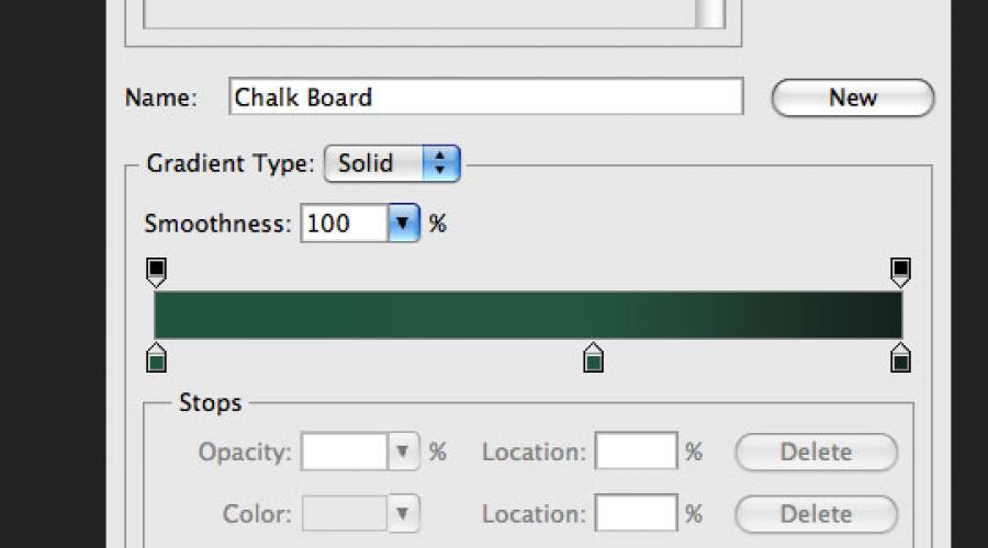
Create a new document in Photoshop (Ctrl + N) size 1000x609 pixels. First, let's create a background for the board. Create a new layer (Ctrl + Shift + N)... Select a tool Gradient Tool (G): Style (Style) - Radial (Radial). Adjust the gradient as shown below.

Fill the canvas to get this result:

Step 2
Add noise to make the board look too smooth. On the layer with a gradient fill go to the menu Filter - Noise - Add Noise, use the following parameters:
Amount: 1.6%
Distribution: Gaussian

Result:

Step 3
The next few steps will focus on creating a wooden frame around the board. To recreate the wood texture, I decided to use the filter Fibers... I couldn't find the rotation function in the filter settings, so I decided to create each part of the frame in a separate document and then transfer everything.
Let's start by creating the top of the frame. Create a new document (Ctrl + N) height equal to the width of the first document. The width of the canvas depends on how thick you want the frame to be. The size of my first canvas was 1000x609 pixels. Therefore, I created the second canvas with a size of 45x1000 pixels. Set the fill color to light gray and the background color to dark gray. Then apply the filter Fibers (Filter - Render - Fibers)... Set up the filter like this:
Variance: 3
Strength: 21

Result:
Step 4
We need to give the texture the color of the wood. Go to correction Hue / Saturation (Image - Adjustments - Hue / Saturation)... Check the box Tint (Colorize) and enter the following values:
Hue: 19
Saturation: 33
Brightness: -20
Step 5
Add noise to the texture with a filter (Filter - Noise - Add Noise): Amount - 1%. To drag part of the frame, use the tool Move Tool (V)... Place the wood strip at the top of the canvas.

Step 6
Create the rest of the frame in the same way and paste them into our document.

Step 7
Select all layers of the wooden frame in the layers palette. Right-click on any of them and select the item Merge Layers... Then double click on the resulting layer to open the styles window. Apply the following styles:
Drop Shadow:
Blend Mode (Blend Mode): Multiplication (Multiply); Color: Black
Opacity: 75%
Angle: -39; Use Global Light: Enabled
Distance: 11 pixels
Spread: 0%
Size: 29 pixels
Contour: Linear; Anti-aliased: Disabled
Noise: 0%

Inner Glow:
Blend Mode: Screen
Opacity: 12%
Noise: 0%
Color: White
Technique: Softer
Source: Edge
Choke: 0%
Size: 5 pixels


Step 8
We have finished working on the frame, now we are going to work on the surface of the board. It needs to be made a little grungy and textured. Download this set of grunge brushes and import them into Photoshop. Create a new layer (Ctrl + Shift + N) between the background and the border layer. Tool Eyedropper Tool (I) Determine the darkest shade of green and paint over the green area as shown below. Downgrade Opacity this layer is up to 40%.


Step 9
Let's add more shades to the surface of the board. Create a new layer above the grunge brushes layer. Set default colors (D) and apply the filter Clouds (Filter - Render - Clouds)... Then apply the filter Motion Blur (Filter - Blur - Motion Blur) with the following parameters:
Angle: 18 degrees
Distance: 100 pixels

Install Blending Mode this layer on Multiplication and lower Opacity up to 30%.

Step 10
In this step we are going to create the old marks from the constant erasure of the lettering with a sponge. Create a new layer on top of the layer from the previous step. Select a tool Brush Tool (B), and select the "Watercolor Loaded Wet Flat Tip" brush.

Downgrade Opacity brushes up to 30% and with black paint some strokes on the green surface. Some areas need to be outlined 2-3 times to make them darker than others.

Install Opacity this layer by 10%.

Step 11
Create another layer and repeat the process, but this time use a white brush and Opacity layer - 5%. You should end up with a result like this:

Step 12
Find a beautiful handwritten font and write something on the chalkboard with the tool Horizontal Type Tool (T)... For example, I used the font "Christopher Hand". Downgrade Opacity layer with inscriptions up to 10%. There will be leftover chalk marks that have not been well erased.

Step 13
Now we are going to add the normal lettering to the board. Write something and install Opacity text by 70%. Then select one of these brushes. Add a pixel mask to the text layer (Layer - Layer Mask - Reveal All)... Paint the lettering in black so that the green surface is slightly visible through them. This will help create a realistic look, leaving a patchy chalk mark.


Step 14
I decided that the board would benefit from the dimension and perspective. Add to lower part a small shelf on which the chalk will lie. Use the method described earlier and don't forget to apply styles and Outer Glow.

Step 15
In this step we are going to create a chalk erasing sponge. Select the tool and in the settings set the Radius (Radius) to 1 pixel. Create a shape and place it on the ledge created in the previous step. Convert this rectangle to a smart object (Layer - Smart Object - Convert to Smart Object)... Working with a smart object is always more convenient, since you can change the settings of the applied filters or delete them altogether.
Set default colors (D) and apply the filter Overlay clouds (Filter - Render - Difference Clouds).

Step 16
The sponge still lacks lighting and texture. Let's add a couple more filters. First apply the filter Airbrush (Filter - Brush Strokes - Sprayed Strokes).
Stroke Length: 20
Spray Radius: 25
Stroke Direction: Vertical

Amount: 1.96%
Distribution: Uniform
Monochromatic: Included

Result:

Step 17
Now let's work on the upper part of the sponge. Tool Rounded Rectangle Tool (U) Create a dark gray shape above the base of the sponge, convert it to a Smart Object and apply a noise filter.

Step 18
Apply a style to both sponge layers. Drop Shadow.

Step 19
Finally, add a couple of chalk pieces.
In Photoshop. Use the Crop Tool (C) to crop the image to get rid of the rounded corners and black background.
Go to the Levels adjustment (Image? Adjustments? Levels) and change the values as shown below. This will make the surface of the board darker.


Step 2
Load the Blokletters font into the shared library, go to the Window menu? Character and set up the font as shown below. Write "Back to School" on the chalkboard. The lettering should be in two layers. See the second screenshot below.


Step 3
Select the Brush Tool (B), open the brushes palette (Window? Brush) and adjust as shown below.


Step 4
Hide the text layers by clicking on the eye icon.

Right click on the text layer and select Create Work Path.

Pick the Direct Selection Tool, set the foreground color to white and create a new layer on top of the others. Name it "Chalk".

Right click on the path and select Stroke Path.

In the window that appears, select Brush. This means that the path will be stroked with the brush that we configured earlier.
As a result, you will see a chalk inscription. Press Enter to get rid of the outline. Keep in mind that the brush size may vary depending on the font size.

Step 5
To stroke each letter, create a path and select it with the Direct Selection Tool.

Before doing the stroke, set the foreground color in the toolbar. Do not press Enter until you have circled all the letters.

I used the following colors:
S - # f5989d
c - # fff799
h - # bd8cbf
o - # fdbd89
o - # 79bcde
Chalk typography is very popular. However, not everyone is good at chalk control, and school board not in every home you will find. Today we will be creating a gorgeous typographic effect with the help of available tools and electronic instruments... First, we will create the concept itself in Illustrator, then using interesting technique Let's turn the work into a chalk drawing.

The highlight of this lesson is that we will combine working at the computer and drawing with your hands. Of course, there is a way to do everything in graphic editors, but to achieve such realistic effect, as in our lesson, is unlikely to succeed.

So, let's begin. Open up Adobe illustrator and create the concept you want to turn into a chalk drawing. At this stage, we will enjoy the benefits of software that allows us to apply and undo actions, while in real life, it is not so easy to get rid of the strokes. Enter your text and choose your favorite font.

Convert the text to curves using the CMD / Ctrl + Shift + O key combination, then right-click on the text and select Ungroup / Ungroup to split the text into separate letters.

Stretch the selection over each word or group of words and press CMD / Ctrl + G to group them.

Select the first group of words and from the menu choose Effect> Distort & Transform> Free Distort / Effect> Distort and Transform> Free Distortion. Bring the bottom-right point higher to distort the group of text.

In general, such a distortion of the text is usually undesirable, being a kind of design tactlessness, but in our case the work will be almost handwritten, so we can afford it. Scale the text vertically to shrink it a little.

Let's take on the next group from our text. Select it and from the menu choose Object> Transform> Shear / Object> Transform> Shear. Pick an angle to match the bevel angle of the previous group.

Draw a thin rectangle under the text and apply a Shear Transformation to it, repeating the angle of the text. Duplicate the rectangle and frame the second group of text with it. Using the Pen Tool, draw a triangle to fill the empty space in the upper right corner.

Select the third group of text and from the menu choose Effect> Apply Free Distort / Effect> Apply Free Distort to apply the effect with the same parameters that we selected earlier.
Temporarily change the color of the text to make it easier for you to fit the third group to the size of the first.

Open the Appearance panel and click on the Free Distort effect. Move the top-left point so that it is parallel to the rectangle. Then move the bottom right point back to the original position.

You can duplicate and mirror any of the previously drawn elements to achieve a symmetrical design and fill in empty spaces.

Scale the next group of words to match the width of our design. Position the group so that there is the same distance between it and the previous text as between the rest of the elements.

Completing the concept the last word scaled and aligned with the rest of the elements. Use narrow rectangles to make the design more interesting.

Draw a rectangle around the artwork. Give it no fill and a 7pt Stroke. Copy (CMD / Ctrl + C) the rectangle, then paste the copy onto foreground(CMD / Ctrl + F). Hold ALT and scale the copy to make it smaller. Reduce the stroke weight to 2pt.

Select one of the largest words, copy it (CMD / Ctrl + C), then give the object a thin white rounded stroke and align it inward.

Go to Object> Expand Appearance, then right-click the group and choose Ungroup to expand the group into individual characters.

Select each letter in turn and press the Minus Front button in the Pathfinder panel. After that, you should only have the inner parts of the letters.

Group all that remains, change their stroke color to white, then press CMD / Ctrl + B to paste the previously copied text into background.

Draw a small black square somewhere in the document. Press CMD / Ctrl + C and CMD / Ctrl + F to create a copy, then shrink the copy to half of the original (turn on Smart Guides to make everything accurate). Point to a smaller shape White color fill, select both objects and drag them to the Swatches palette.

Apply this swatch to the inner letter fragments to give them a cool vintage look.

Use this trick to style other text if desired, and add finishing touches to complete the design.

Select all the typography elements, group them and lower the opacity / opacity to about 15%.

Print the job. The design should be barely visible on paper due to the reduced opacity. Now find a good old pencil.

With small strokes, begin to accurately outline the work. This step will allow us to make the electronic effect work in a freehand style.

After you have traced all the work, scan it. The artwork looks the same as it was created in Illustrator, but now it looks like it was drawn by hand due to inaccurate, non-electronic strokes. Who knows that you sketched it? We won't tell anyone)

Open your scanned job in Adobe Photoshop and go to Image> Adjustments> Invert / Image> Correction> Invert. After that choose Image> Adjustments> Desaturate / Image> Correction> Desaturate to remove color from the work.

From the menu choose Image> Adjustments> Levels and move the highlight slider to the start of the histogram.
Step 1
Open Adobe Illustrator and use the Horizontal Type Tool (", this, event," 320px ");"> Horizontal Type Tool) (T) and write "2013". I used the font "Pistilli Roman".
Step 2
From this set, select curls and create an ornament around the numbers.


Step 3
Create a new document in Photoshop (Ctrl + N) 2880x1800 pixels in size. Insert a blackboard image into it.
Step 4
Transfer the ornament to this document. Then create a layer and fill it with black. Merge both layers (Ctrl + E).
Step 5
Set the Blending Mode to Lighter Color.
Step 6
Apply the Angled Strokes filter to the label layer:Direction Balance
Stroke Length
Sharpeness

Step 7
Add a mask and use a black brush with 30% opacity to paint over the text.
Step 8
Apply the following styles to the label:External glow: Mode - Lightening.

Casting shadows: Mode - Lighter.

Step 9
Set the Blending Mode of the label layer to Dissolve.