Composition line in square. Fundamentals of the composition: Geometry in the photo
141991 Photo from scratch 0
In this lesson you will learn: Fundamentals of the composition. Semantic and decorative frame layout. Composite techniques: perspective, rule of the third, golden section, diagonals. The main and secondary objects of the composition. Basic errors beginner photographers.
What is the composition? Composition (from Lat. Compositio) means compilation, compilation, combination of various parts into a single integer according to any idea. This refers to the thoughtful building image, finding the ratio of its individual parts (components), forming ultimately a single integer - a complete and finished image.
Why is the right composition important? In order to better pass in the photo, the idea is used by special expressive agents: lighting, tonality, flavor, point and moment of shooting, plan, angle, as well as the pictorial and various contrasts. The reflection of live, real life will not be adequate without complying with certain rules. How, for example, transfer the movement or fleet of moment? This requires knowledge of the laws of the composition, otherwise your photos will turn into random clutches and will not be interesting to others.
The general meaning of the correctly built composition of the frame is that we are easily and easy to consider a photo. At the same time, we get aesthetic pleasure, we see a logical connection between objects in the frame, admire the details of the image. It happens on the contrary, we are surprised or shocked, everything is not clear to us, but in this case it is correct - or intentionally wrong - the composition conveys the creative idea of \u200b\u200bthe author through the photo.
Scene Center and Equilibrium
Any good photo should have a certain main object, sometimes it is called semantic or scene center. This is why the author climbed into the mountains, overcame the desert or simply distracted on time from fun in the circle of friends to remove the camera and press the button. This center can be "I'm on kebabs", and there may be a snow-covered top, a lonely tree, a human face or simply graceful bending of lines in an abstract still life.
In simple domestic photos, the plot and geometric center often coincide, that is, the main object is right in the center of the picture. Family albums are crowded with such cards, and scroll through them, and even more so consider photos interesting only to the closest relatives. If the photographer seeks to do something more than a snapshot "I am on the background of the pyramids," then you need to be prepared for the fact that the time and effort will have to spend more.
Before pressing the camera shutter button, decide on semantic Center And find it in the surrounding space, highlight mentally, which is the main thing most interesting for you. Perhaps, at first it will not be easy and will have to work head (well, turn in different directions, look around), but then, as experience gaining experience, your look will find interesting stories.
 We go further. There is a very old and simple rule, allowing you to almost always succeed. Sometimes it is called rule of Arret. It allows you to harmoniously balance the image, giving it the dynamics and visual naturalness. What is his meaning? The frame space is mentally divided by two horizontal and two vertical lines on equal parts. Of the three horizontal and three vertical bands, a certain grid is obtained with points of intersection of lines.
 The most important elements of the frame are recommended to be located along these lines or at the points of their intersection. The fact is that such asymmetry of the image is perceived more naturally and in many cases makes it possible to effectively use the negative space around the main subject.
 The usur of the third is widely used in various types of images. For example, in the landscapes of the horizon line often placed along the upper or lower line of the third, and next to one of the vertical lines reflect the object to which the attention of the attention (wood, building, and so on) will be attracted.
 When creating portraits, a person can be removed from the center to avoid unnecessary similarity with the "Photo of the passport". To attract attention to the eyes, it is worth choosing such a composition so that one eye is located on one of the upper intersections of conditional lines.
 For many centuries, artists also enjoy the concept for building harmonious compositions. "Golden section". Close concept to the rule of the third. It was found that certain points in the picture composition automatically attract the attention of the viewer. There are only four such points, and they are located at a distance of 3/8 and 5/8 from the corresponding edges of the plane. After drawing the grid, we received these points in the locations of the lines.
$ Image8-left $ A person always emphasizes its attention at these points, regardless of the format of a frame or picture.
 There are also secondary lines that must "lead" a look to the plot center. Under the secondary lines, not only concrete lines, but also a series of objects or parts located one by one may be understood. That's what it is diagonal rule. According to the rule of diagonal, important elements of the image must be installed along the diagonal lines. A diagonal composition with a direction from the left lower angle to the right uppermost calmer than built on the opposite, more dynamic diagonal.
 Linear elements, for example, roads, waterways, coastal traits, fencing established diagonally, usually make landscape more dynamic than those located horizontally.
Equilibrium in the picture - what is it for?]
The composition is balanced or unbalanced. What does it mean? Imagine that you carries in one hand heavy bag. Your body will be an unbalanced composition. Taking into another hand the same heavy bag, you make the composition of your body balanced. The fact is that any unbalanced composition looks random, and the balanced composition is harmonious, and it seems that no change is impossible. In equilibrium, everything is important, even the direction of movement of objects or their visual weight.
 The easiest way to balance the composition is to arrange the object of shooting in the center of the image. However, as we just considered above, this is not the most successful solution. If you move the object to the side - the equilibrium is broken. One part of the snapshot becomes no matter how harder and visually outsourcing the other. Frame as if wishes to turn clockwise.
 To fix the unbalanced composition, you must enter a picture into the empty part of the image. It should be noted that in the photo the weight is replaced with a volume (flu), color or associations with heavy or light objects. The colors in which objects are painted, also affect their pictorial "weight": red and its shades are heavier than blue, bright colors are heavier dark.
 You can also balancing, from the point of view of the composition, the figure of the model due to a variety of movements. If, for example, the model makes the gesture of hand in one direction, then it can be composite to the gesture of the leg or turn the head to the other side. That is, the gesture in one direction of any part of the body is balanced by the gesture in the other side of the hand, legs, head or bending of the case.
 You can apply one of the most amazing methods of the composition - a developing movement that balances the snapshot. This psychological effect involves the presence of free space in the direction of motion or glance. It is only in the frame to leave free space where the movement develops, the composition is immediately aligned.
 In addition, the developing movement can be replaced by the direction of view. However, there are also different views, and for them it takes a different free space in the picture. Calm, good-natured or half a hand requires some free square. But the fierce, fatal, liquefying-much more. The view aimed at himself does not require a place at all.
Do not forget about the psychology of the viewer: for example, human faces with pronounced emotional states, like a magnet, attract our attention.
Council. Move from left to right to us seems faster than right to left, and the object located on the right side weighs more than the left. The object located at the top of the frame, "weighs" is more than exactly the same subject at the bottom of the frame. A lonely small element with a frame edge, located outside the main lines, composite "weighs" is more than a large object that is located in the center or is located on the axis passing through the composition of the composition. It can be said that the "lever" rule is valid: the farther from the center of the balance - the greater the "weight" of the element in the composition.
Importing Element - Background . Our view is elected, and often an inexperienced photographer sees only its main object, but does not notice the many distracting parts in the background or next to the plot center. Clean the frame from unnecessary parts! Look around and select a suitable background. Perhaps these passing random people will now move over the edge of the frame. The branches of trees that "grow" in humans from behind the head and interfere with the object to perceive the object, can be removed, slightly mixing aside, and so on.
 In fact, the choice of the back plan is one of the main tasks of the photographer, and if you initially did not occur with the choice of the object, then there may be anything as you like. Look around, perhaps these bushes are not so good, as you think, bright flowers are very beautiful, but distract attention, and the carpet above the sofa, where guests are sitting, too distinct (by the way, the traditional mistake of amateur photographers, like a trash in the back Plan).
The camera, in contrast to the eye, impartially fixes everything, and as a result, in a picture, a certain vinaigrette from the secondary, minor and most importantly - distracting parts can be obtained in a picture instead of an important event. Background objects should not take a look from the main thing, and if your main object is dark, the background is desirable to choose lighter, and vice versa: the light object is well released on a dark background. At the same time, no need to forget about the exposure amendments.
Perspective. A photograph on which you can feel the depth of space, immediately attracts attention. Such pictures look better, they are more interesting to consider. Alternation of plans - front, middle and far - gives photos naturalness.
For tourist photos, try to choose the background not too late or bright items, pay attention to how the background is lit. If your shooting object is in the shade - the background should not be brightly illuminated by the sun of buildings or architectural monuments. Better if the background is somewhat darker than the main object.
 Try to mentally distribute your composition plans, please note that in addition to the foreground, the lens will see objects behind your plot center and even further on the horizon. Pay attention to all intersecting lines and back plan items. Very often intentional manipulation by the background is used by photographers as a separate expressive technique.
 Rhythm. Another important expressive remedy is a rhythm, that is, an image in a snapshot of the same type of parts, shapes or silhouettes. Our whole life is the alternation of days and nights, the seasons, so rhythm helps to understand the incompleteness of the choice, and a gradual decrease in the same or similar shapes - from large in the foreground to small ones - again emphasizes the perspective. A large number of items: houses, silhouettes, trees, with similar or even the same forms can be found in an imaginary line, which will also look at the plot center and give it more important.
Composite errors beginner photographers
Everyone gets invaluable experience, overcoming difficulties and failures. All allow mistakes. That is what teaches not to step on the same rake in the future. But, naturally, no one wants to fill the bumps, therefore it is more correct to learn from other mistakes and use the experience of professionals.
Consider typical compositional errorswho allowed everything to ever holding the camera in their hands. These errors are found both at beginner photographers and those who have some luggage of knowledge and experience.
Cropped parts of people or attractions. To enable the snapshot correctly, you just need to adapt to your camera and carefully ensure that the shooting object falls into the entire entire.


Violation of human body proportions. Wrong angle can distort the natural proportions of the body. When shooting from above, a person will seem with a big head and short legs. When shooting, it will be the other way around below. If this picture is obtained is not your goal, follow the angle and proportions.

Out of the horizon. Many make a mistake, holding a camera while shooting slightly tilted. The horizon line in the pictures should be parallel to the lower and upper edge of the picture. Many cameras can display a grid on the screen that helps to align the frame.

In the frame of an extraneous object. This error often arises due to the fact that the frame is not built. Before making photos, you need to think about what exactly it should be in the picture, evaluate the surrounding space.

Unbalanced composition. An inexperienced photographer does not suspect the existence of the rules of the golden section, thirds, guide lines, etc., and why need they need to know - especially. The location in the center of the frame is perhaps the most famous and most common mistake. There is nothing terrible in the location of the object in the center, but such a frame is simply bored, there are no dynamics, plot, movement. Of course, sometimes such a composition is justified.

Unnoticed details on the background.The portrait on which from the ear of the model sticks out an arrow of a tower crane, and flag flutters on the top, they have a full right to exist, moreover, they are original. But in many cases it is not the originality that you expect from the picture. Sometimes after shooting surprise, as you did not notice in the viewfinder, that this pillar (garbage tank, an apple grizzle, a bottle, cigarette ...) spoils the frame. But it is already late, and not everything can be fixed using the editor.

Empty composition.In the frame there is too much empty space that does not carry any useful information. View of the viewer is torn in this void, not knowing what to stay. Such a frame reminds the famous picture of the best in the world of Carlson - "very lonely red rooster."

Overloaded composition. In the frame there are a lot of objects - a photomusor, why they are needed - it is not clear, but the diversity is sometimes impressive. The actual shooting object is lost on their background, it is almost impossible to keep attention on it.
There are many more mistakes that photographers allow, but to start learning the proper photographic technique, you need to remember the basic rules, and always pay attention to the little things.
Results: The composition helps the photographer correctly build a frame, in accordance with the idea, through visual images to convey its idea to the viewer and photographic language to tell something about the world around. I got acquainted with the basic rules for building a frame and typical errors of beginner photographers.
Practical task.
1. In almost all the cameras in the viewfinder (on the screen) there is a grid showing the lines of the rules of the third, and allows you to pre-assess the correctness of the composition, but most often it is mistakenly turned off with newcomers. Turn on the mesh mapping. Use the instructions for your camera.
2. Browse your photos taken, for example, in your extreme holidays. Rate the correctness of their composition, find errors. Check these pictures in the editor if the space on them allows you to improve the composite construction.
Imagine that the sheet plane is absolutely not filled with any image elements. Simply said a blank sheet. How is it perceived by us? Naturally, the sheet plane does not bear any information, it is perceived by us as a non-delayed, empty, not organized. But! It is worth only to apply any spot, or a line, a stroke and- this plane begins to revive. This means that our visual elements, any stain, line, barchats come into spatial bond, forming any semantic violin. It is easier to say the plane and any element on it begin to interact, keep a dialogue between themselves, and begin to "tell" something about something.
So we get the most primitive composition, which is even difficult to call, but it is already it.
Further. We and you have one universal tool given to us by nature, these are our eyes, our eyesight. So, our eyes sees and perceives the world around us in proportions and proportions. What does it mean? Our vision is able to feel harmony, and what is not harmonious. Our eye is able to find the difference between the inconsistency of the sizes of individual parts and all the whole, or vice versa, to see complete compliance. Vision is capable of feeling a combination of colors that do not irritate the eyes or vice versa, it can be absolutely disharmonic. I will say more, our natural flair has already from the very beginning, you want it or not, seeks to feel the feeling of harmony in everything. And subconsciously obliges to combine the objects and their parts so that no part of the composition turns out to be alien or disproportionate. It is necessary only learn to listen to your feelings And to understand what way to achieve harmony, then there is a good composition. Anyone.
Go ahead. Take some form, for example, a circle and try to affect it in various places of the sheet plane. We can see, feel that in some cases it will occupy a more stable position, in the other - unstable. Figure Left: See how our vision works - it would seem, for a circle, the most stable place is the coincidence of its center with the geometric center of the sheet plane (spending lines of the corner into the angle of the sheet we get a leaf center at the intersection of these lines). However, this is not all. Because of the optical illusion (the eye is overgrown with the upper and underestimates the lower part of the plane) the circle is perceived slightly shifted down. Feel how the circle is attracted to the base of the square? The circle is not felt distinctly in the middle, nor below, and this is not understanding its position, disharmony is felt. How to achieve harmony? What position should there be a circle that we perceived it in the plane of the sheet harmoniously? Naturally, it needs to be shown a little up. See the picture on the right. Does the stable position of the circle feel? He ranks exactly his place in the square. Thus, our simplest composition will be more harmonious, which is significant.
Understanding: Plane and subject form some conditional spatial bond, which we can adjust.
Our plane originally has a certain conditional structure, even if there is no element on it yet. The plane can be divided into axis horizontal, vertical, diagonal. We get the structure - see the drawing on the left. In the center of the plane (geometrical center), all the forces of this hidden structure are in a state of equilibrium, and the central part of the plane is perceived actively, and non-central parts passively. So we feel. Such perception of conditional space, so seeks to find peace our eyesight. Understanding it is pretty conditional, but right.
The eye seeks to see the harmony in what is observed by the center of our composition, which seems more active for him, everything else is more passive. This is what can only give us a study of one clean sheet plane. Moreover, this is what can only give us a study of one square form sheet plane. But the principle is the same. This is what concerns the structure of the sheet plane.


But this would be absolutely not enough to disqualify the plane or make a composition of one element on the sheet. It is boring and no one needs to nor you nor the viewer. There is always more, more diverse and much more interesting.
Now let's try to make another composition, but already with several participants. See the drawing on the left. What do we see what we feel? And we feel that our composition is not harmonious, because it is not balanced separate parts. The items are strongly shifted to the left, leaving empty, unnecessary, unsuitable space in the composition on the right. And the eye strives to always even balance and achieve harmony. What do we need to do here? Naturally, balance parts of the composition so that they harmoniously accumulate one large composition and were part of one whole. It is necessary to do so that our vision is comfortable.
Look at the drawing on the right. So you feel harmonious? I think yes. What does it mean? In the visual perception of the elements and the sheet plane and when analyzing their relationships: there is an effect of the internal forces of the structure of the plane on the nature of the behavior of the visual elements. What does it mean? Our compositions in composition elements interact with conventional diagonal, vertical and horizontal axes of the plane. We have achieved a stable visual equilibrium of all components of the composition relative to the geometric center. Even if no figure is here in the middle, they balance each other, forming a center together where the vision expects it, on this and look at this drawing more comfortably than the previous one.
And if you add a few more elements, then in this case, they must be somewhat weaker in size or tone (or color) and in a certain place, which is visually not to shoot down the geometric center of the composition, otherwise you have to change the location of the elements to achieve harmony Again, there is a harmonious perception. It concerns the concept geometric Composition Centerwhich we have now introduced into learning.
It is always necessary to strive for stable visual equilibrium of all components of the composition in various directions - up and down, right and left, diagonally. And the composition should be harmonious from any position, in any turn, turn over its footpath, or 90 degrees, it should also be simply visible, without any hint of discomfort. And it is easier to believe that the geometric composition of the composition is at the intersection of diagonal lines or a little higher, it is in this place of the eyes after viewing the composition itself, no matter how it is, ultimately stops and finds a "rest", soothes names in this place Even if there is no subject. This is a conditional place. And the harmonious composition is considered that when it is no longer necessary to make new elements or remove any of it. All those who participate in the holistic composition of the current "persons" are coented with one common idea.
Basics Composition - Static Equilibrium and Dynamic Equilibrium
The composition should be harmonious and separate sections should be balanced. We step further and disassemble the following concepts:


Static equilibrium and dynamic equilibrium. These are ways to balance the composition, ways to create harmony. Methods are different, as they affect our vision in different ways. Suppose we have two compositions. We look at the drawing on the left: what do we have? We have a composition in which the circle and stripes participate. Here is the static equilibrium of the circle and strips. How is it achieved? Firstly, if you look at the hidden structure of the sheet of the composition, it can be understood that it is built primarily on the horizontal and vertical axes. More than static. Secondly: Static elements - circle and bands are used, the circle is balanced by strips and does not fly out of the plane and the conditional geometric visual center is located at the intersection of diagonals, also the composition can be considered from all sides, without giving reason to identify disharmony.
Now we look at the drawing on the right. We see a dynamic equilibrium of several semicircles and circles with the separation of dominant color. How is the dynamic balance achieved? If you look at the hidden sheet structure, then besides the horizontal and vertical axes of the construction of the songs, you can clearly see the use of the diagonal axis. Its presence, it is used to produce a red circle, which in this composition is a dominant, a dominant spot, a plot to which the eye draws attention to the first. We introduce the concept composite Center.
Composite Center. Dominant

Composite Center, Dominant, how to understand this: in the composition of the left there is a certain compositional center, or dominant, which is a string composition and which are subject to all other elements. You can say more: all other elements enhance the importance of dominants and "play out" to it.
We have the main acting personmennant and secondary elements. Secondary elements can also be divided by significance. More significant - accents, and less significant- secondary elements. Significance is determined only by the content of the history, the plot of the composition, and so all the elements of the composition are important and must be coented with each other, "twisted" into one.
The composition center depends on:
1. His size and magnitude of the remaining elements.
2. Positions on the plane.
3. Forms of an element that differs from the form of other elements.
4. The textures of the element that differs from the texture of other elements.
5. Colors. By applying a contrast (opposite color) to the color of secondary elements (bright color in a neutral medium, and vice versa, or chromatic color among achromatic, or warm color with a common cold range of secondary elements, or dark color among light ...
6. Studies. The main element, dominant - more worked, than minor.
Composite and geometric composition centers

We continue ... This dominant-striking active element is located atnjob not in the center of the sheet, but its weight and activity is maintained by a plurality of secondary elements located diagonally, opposite this dominant. If you have a different diagonal, then on both sides of it, the "weight" composition will be conditionally the same. The composition is balanced both vertically and horizontally and diagonally. Elements are used that differ in activity from the previous composition is more active and more active in form. Although it is elementary, according to the conditional grid and the structure of the composition is simple, but besides this, the composition has a dynamic balance, as it leads the viewer by a specific trajectory.
Note: The composition on the right atnev is not created with the help of paints on paper, but I really liked it, and the essence, by and large, it does not change this as a composition. We continue ...
You say, where is the geometric center of the composition? I answer: the geometric center of the composition where it should be. Initially, it may seem that it is where the dominant is located. But the dominant is more accent, the lattice of the composition, the-to-there is a composite center. Nevertheless, we do not forget that there is also a hidden structure of the composition, the geometric center of which is located as in the composition on the left. The first viewer turns his view to composite Center, dominant, but after its consideration, and further after the review of the whole composition, your eye still stopped in geometric center, right? Check yourself, follow your sensations. He found "calmness" there, the most comfortable place. From time to time, he again considers the composition, paying attention to the dominant, but then again calms down in the geometric center. Therefore, it is called such an equilibrium-dynamic, it makes a motionless attention not scattered evenly throughout the composition, but goes on a certain go, which created an artist. Your eye will find a movement in the composite center, but will not be able to calm down there. And it is with a successful construction of the composition, but for the correct use of the geometric center, it is harmoniously visible from any turn. A composite center - a dialogue with the viewer begins to lead a composition, this is a composition of the composition, which allows you to control the viewer's attention and direct it in the desired direction.
Static composition and dynamic composition


So we came to the following terms that you need to consider with you. These terms differ in meaning from static equilibrium and dynamic, meaning: can be equalized by any composition according to character in different ways. So ... what is static composition? This state of the composition in which the elements balanced among themselves generally impress it sustainable immobility.
1. The composition, which is based on visually clearly observed the use for the construction of a hidden sheet structure. In the static composition, there is a conditional order of construction.
2. Objects for static composition are selected closest in form, by weight, by texture.
3. There is some softness in the tonal solution.
4. Color solution to be built on the nuances - pinned colors.


Dynamic composition, accordingly, it can be built on the opposite. This state of the composition, in which elements balanced to each other, impress it movement and internal speakers.
I repeat: but, no matter how the composition was not, always need to strive for the stable visual equilibrium of all components of the composition in various directions, up and down, to the right and left, diagonally.
And the composition should be harmonious from any position, in any turn, turn over its composition with legs, or 90 degrees, common masses and color / tonal stains, it should also be simply visible without any hint of discomfort.
Fundamentals of the composition - Exercise
Additional exercises can be performed by a gouache, as an applique, colored pencils and other materials with which your soul will wish to work. You can perform starting from the exercise that you will seem most easily or interesting to you, and to the most difficult.
1. Sign in the square plane are somewhat simple on the form of items. This is the principle of the composition of a simple landscape motive.


2. Of the simple stylized motifs of natural forms, follow a sketch of a closed composition (not beyond the picture) enclosed in the sheet format. The closed composition is tightened only in the space that you use full punishment. In the compositions there is a move in a circle.


3. Organize according to the principle of the dynamic composition (asymmetric location of figures on the plane) several triangles and circles, varying the color, lightness of the shapes and the background.


4. Applying the principle of membership of the elements of the composition, balance in a rectangular format several shapes of different configurations. On this principle, perform a simple composition on an arbitrary topic.


5. Of the simple stylized motifs of natural forms, applying the principle of membership of the elements, follow the sketch of the open composition. Open composition, this is a composition that can be developed further wide and in height.

6. Dismember the sheet plane on the conditional structure by sensation and comprehend on its basis the composition: the solution is black and white.


Expressive compositions
Expressive compositions in decorative and applied art include line, point, spot, color, texture ... These means are at the same time and elements of the composition. Based on the tasks and goals and given the capabilities of a certain material, the artist uses the necessary expressive means.

The line is the main forming element that transmits the most accurate nature of the outlines of any form. The line performs a double function, being simultaneously the image tool and the expression means.
There are three types of lines:
Straight: Vertical, horizontal, inclined
Curves: circles, arc
Curves with variable radius of curvature: parabolas, hyperbolas and their segments
The expressiveness of the associative perception of lines depends on the nature of their drawing, tonal and color sound.
Lines transmit:
Vertical-desire top
Inclined instability, fall
Loars-variable traffic
Wavy-uniform smooth movement, swing
Spiral-slow rotational motion, accelerating to the center
Round-closed motion
Oval-aspiration form to focus.
Thick lines come forward, and thin retreats into the depths of the plane. Performing composition sketches create combinations of certain lines, stains that stimulate the manifestation of its plastic and color properties.

Point - as one of the expressive means is widely used in many works of decorative and applied art. It contributes to the identification of the texture of the image, the transmission of the conditional space.
The stain is used for the rhythmic organization of angry ornamental motives. The stains of various configurations organized into a certain composition acquire artistic expressiveness and, emotionally affecting the viewer, they cause him a corresponding mood.
Artists in their works are often used as fine elements. geometric figures: Circle, square, triangle. Compositions of them can symbolize the movement of the time, the rhythm of human life.

The rhythmic organization of ornamental motives from the inholes (stains of abstract configuration, silhouettes of geometric figures), combined into composite structures, becomes a means of artistic expressiveness.
Still products composition
1. Sport: a person in the first second begins to perceive the composition as a silhouette image on a specific background: Silhouette area, contour line drawing, compactness, tone, color, surface texture, and so on.

2. Symmetry and asymmetry: A effective means of achieving equilibrium of the composition is a symmetry - the pattern of form elements relative to the plane, axis or point.

Asymmetry - the harmony of the asymmetric composition is achieved harder, it is based on the use of a combination of various patterns of constructing the composition. However, the compositions constructed on the principles of asymmetry are not at all inferior in aesthetic value symmetrical. When working on its spatial structure, the artist combines symmetry and asymmetry, focusing on the dominant pattern (symmetry or asymmetry), uses asymmetry to allocate the main elements of the composition.
3. The proportions are the quantitative relationship of individual parts of the composition among themselves and with a whole subject to a certain law. The composition organized by proportions is perceived much easier and faster than the visually not organized mass. The proportions are divided into modular (arithmetic), when the relationship of parts and the whole is composed by repetition of a single specified size, and geometric, which are built on equality of relationships and manifest themselves in the geometric similarity of the form members.
4. Nuance and contrast: nuance relations - minor, weakly pronounced differences in the size, drawing, texture, color, location in the space of the sheet. As a means of the nuance composition can manifest itself in proportions, rhythm, color and tonal relationship, plastic.
Contrast: It consists in a sharply expressed opposition of elements of the composition. The contrast makes the picture noticeable, allocates it among others. Contrasts distinguish: direction of movement, size, conditional mass, shape, color, light, structures or textures. During contrast, the direction is horizontal opposed to the vertical, the tilt on the left to the right to the right left. In terms of contrast, the size is highly opposed to low, long-short, wide-narrow. In the contrast of mass, a visually heavy element of the composition is located near the lung. In the contrast of the form "hard", angular shapes are opposed to "soft", rounded. In the contrast of light, light surface areas are opposed to dark.

6. Rhythm is called a certain orderliness of single-character elements of the composition created by repetition of elements, their alternations, increases or descending. The simplest pattern, on the basis of which the composition is built is the repetition of elements and intervals between them, called a modular rhythm or metric repeat.
The metric row can be simple, consisting of one element of the shape, repeating at equal intervals of space (a), or complex.
A complex metric series consists of groups of identical elements (B) or may include individual elements other than the main elements of a series in form, dimensions or color (b).
Significantly revitalizes a combination of several metric rows, combined into one composition. In general, the metric procedure expresses static, relative peace.


A certain orientation can be given a composition, creating a dynamic rhythm, which is based on the patterns of geometric proportions by increasing (decreasing) the dimensions of such elements or on a natural change in the intervals between the same elements of the row (A - D). A more active rhythm is obtained by simultaneously changing the magnitude of the elements and intervals between them (E).
With an increase in the degree of rhythm, the composite dynamics of the shape in the direction of thickening of the rhythmic series increases.
To create a rhythmic series, you can use a natural change in color intensity. In the conditions of metric repeat, the illusion of the rhythm is created as a result of a gradual decrease or an increase in the intensity of the element color. With the changing sizes of the elements, the color can enhance the rhythm if its intensity increases simultaneously with an increase in the size of the elements, or visually balance the rhythm if the color intensity decreases with an increase in the size of the elements. The organizing role of the rhythm in the composition depends on the relative size of the elements constituting the rhythmic range, and on their quantity (to create a number you need to have at least four or five elements).
Warm bright colors are used to identify active elements of the composition. Cold colors visually remove them. The color actively acts on the human psyche, is able to cause a wide variety of feelings and experiences: to delight and disappear, cheer and coagulate. Color acts on a person regardless of his will, as we receive up to 90% of the information by sight. Experimental studies show that the smallest fatigability of the eye occurs when the color is observed, relating to the middle part of the spectrum (yellow-green area). The colors of this area give a more stable color perception, and the extreme sections of the spectrum (purple and red) cause the greatest fatigue and irritation of the nervous system.
According to the degree of impact on the human psyche, all colors are divided into active and passive. Active colors (red, yellow, orange) act excitedly, accelerate the life-width processes of the body. Passive colors (blue, purple) have the opposite effect: soothe, cause relaxation, reduced performance. Maximum performance is observed under the action of green.
Naturally the need of a person is color harmony = submission of all colors of the composition of a single compositional intent. All variety of color harmonies can be divided into nuissary combinations based on the convergence (identity of the tonality, light or saturation), and contrasting combinations based on contrasting.
There are seven variants of color harmony built on similarity:
1. Equal saturation with different lightweight and color tone;
2. Equal SFLOT with different saturation and color tone;
3. Same color tone with various saturation and lightness;
4. identical light flows and saturation with different colors tone;
5. identical color tone and lightlota with different saturation;
6. Same color tone and saturation with different lightness;
7. Same color tone, lightlock and saturation of all elements of the composition.
With a changing tonality of harmony, it can be achieved by combining two main and intermediate colors (for example, yellow, green and mustard) or with a contrast of the tonality. Contrast combinations are made up of additional colors (for example, red with cold green, blue with orange, purple with yellow ...) or from triad, including colors equidate on color circle (for example, yellow, purple, green-blue, red, green and blue-violet). Color harmony form not only combinations of chromatic colors but also saturated chromatic with achromatic (blue and gray, brown and gray and so on).
Exercises more ...
1. Perform the sketch of the natural motive of the line and the stain


2. Perform a thematic composition using graphics tools expressions, stain, point

3. From freely posted in space of items, make a balanced composition of the still life, without resorting to promising reductions in objects and spatial plans

8. Dismember the circle plane included in the square (black and white solution), and from the dissected circles to compose a rappoportic composition. You can do the same with other geometric shapes.
Artist and composition
Now it will be not talking about how to make a composition, but rather about the forces encouraging it. These forces are much stronger and more workable than you thoroughly and attach many hours to study the technical moments of its creation, but to take into account in the process of at least a drop of your soul. This is a strong motivation that prompts. You are the artist, regardless of what knowledge and skills have and at what stage of development are. You are the artist, creative personality. Before creating a composition, any, you drive the idea, you think, feel emotions, watching her creation still inside yourself. Some of us she dreams in a dream, some of us day from day are under the influence of this magical process, sometimes he just prevents us from living like all ordinary people, because we will create it from the very beginning. Any composition, any creation is the sublimation of those sensations and experiences that accompany the artist and grow in it in his mind. And now, one day, at one point, you understand that it is it, creation, it can now be born and you understand, finally what to do. And the composition is born. Now nothing can stop your creative process. And by and large, the composition is the mood of the artist, thoughts, the same idea that he splashes on the lifeless plane of a sheet or canvas, forcing them to live his own, a kind of life, not like everyone else. And even if the artist is not very strong in the study of the laws of compilation of the composition on the sheet, the creative power of creation is many times stronger, everything else is a hiring. Do not be afraid to express your thoughts and sensations. Cuddling and simple, mysterious and evil, joyful and fantastic .... no one will tell about your thoughts better, only you yourself.
The site administration is respected to the rights of site visitors. We unconditionally recognize the importance of confidentiality of personal information of visitors to our site. This page contains information about which information we get and collect when you use the site. We hope that this information will help you take conscious decisions regarding personal information provided to us. This Privacy Policy applies only to the site and information collected by this site and through it. It does not apply to any other sites and will not apply to third parties from which links to the site can be made.
Automatically collected information not related to personal data
Sometimes we can collect information about you who are not related to personal data. Examples of this kind of information can serve as the type of web browser you use, the type of operating system, as well as the domain name of the site, by means of a link from which you got to our site. The information we receive on the site can be used to facilitate the use of the site, including, but not limited to: the site organization is most convenient for users in the way; Providing the ability to subscribe to the mailing list on special offers and topics if you want to receive such notifications; The site collects personal data (hereinafter the personal data) that you provide voluntarily when ordering a phone call or place an order on the site. The concept of personal data in this case includes information that defines you as a specific person, for example, your name, phone number. The site will not collect data that allows you to identify your identity (such as yours, such as your surname, address, phone number, email address) if you yourself voluntarily give us such data. In the case of providing you with personal data, it will keep such information about you only for communication with you. In addition, we use standard web server accounting logs to count the number of visitors and evaluate the technical capabilities of our site. We use this information in order to determine how many people visits the site and organize pages most convenient for users in the way, to ensure the compliance of the site used to browsers, and make the content of our pages as useful for our visitors. We record information on movements on the site, but not about individual site visitors, so no specific information on you personally will persist or be used by the site administration without your consent.
Sharing information
The site administration under no circumstances sells and does not give up your personal information on how to use any third parties. We also do not disclose personal information provided by you, with the exception of cases provided by the legislation of the Republic of Belarus.
Denial of responsibility
Remember, transfer of personal information when visiting third-party sites, including partner companies, even if the website contains a link to the site or on the site there is a link to these websites, does not fall under the actions of this document. The site administration is not responsible for the actions of other websites. The process of collecting and transmitting personal information when visiting these sites is governed by a document of protecting personal information or similar on the websites of these companies.
Contact Information
If you have provided your personal data and want such information to be changed or excluded from our databases, or if you want to know what personal data about you we have, you can send us a request to the address. We will make every effort to respond to your request.
Changes on the site
We reserve the right at any time and without notice to close or change any service on the site.
"It's not reasonable to violate the rules before you learn to comply with them."
TS Eliot, interview with Paris Review (number 21, 1959)
There are a number of "Rules of Composition", which we can use to enhance our images. The most widely known ones were formulated by centuries with artists working in various visual environments, from architecture to painting and photography. And although we all knows the saying "The rules are created to violate them," the advantages of a preliminary understanding of what exactly you are going to violate are obvious.
In this article, we will consider three such composite rules with illustrating examples, and we will discuss why they can be considered useful creative instruments.
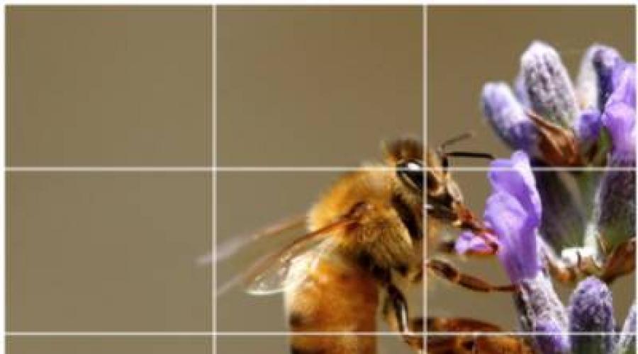
Rule of tratta
"The rule of the third" is probably the most popular technique from the famous artists of visual arts. Simply put, the idea is that significant compositional elements must be placed along the imaginary lines, which share the image on a third, horizontally and vertically. Elements of particular interest can be placed at the intersection of these lines to create a more expressive and dynamic composition, as demonstrated on the pair of images below.
The composition is perfectly centered on the sand dune.

Here the crest of the dunes and the horizon is located along the imaginary lines, breaking the image on the grid 3 x 3.
The rule of the third is for the first time formalized in the literature by the artist John Thomas Smith in 1797. However, examples of art objects in which this rule was applied can be found in artistic traditions from the most ancient times. The art of East Asia is especially known to the use of asymmetric compositions.
So, why does the use of the third rule helps to create interesting images?
Asymmetry
With any of the technician discussed in this article, we strive to identify certain elements of the image and set the balance between the elements.
The formation of the composition according to the "thirds" often introduces asymmetry in a frame that helps to make the image of the feeling of dramaticness, which may be absent in the perfectly symmetrical picture.
In the image below you can see that the eyes of the model and the horse are located along the imaginary grid. The horse's right eye is at the intersection of two lines. Eyes obviously are strong compositional elements. Our view naturally attracts to the eyes of others. The location of important elements like these - whether it is part of the body or product for sale - along these lines helps to attract attention to them.

Pay attention to the location of the eye model and horses along the mesh lines separating the frame into three parts on both sides. When shooting people or animals, eyes are usually a good composite element for highlighting.
Before we continue, I should note that despite the obvious advantages of using the Rule of the third with the initial construction of the frame, you can still use it with post-converting, making a swapping. In fact, the fastest way to train yourself to "see" a third is to spend some time on an experiment with cropping your already existing pictures and compare both versions.
Dynamic balance
In addition to the fact that the usur of the third is useful to determine the location of small parts, such as the model's eyes, it can also be used with large elements affecting the total balance in the composition. The landscaped image at the beginning of the article is a good example of whether the third is a rule can be used to configure the position of the horizon line and the main geological elements.
Here is another example of the application of this rule to create a balance in the dynamic composition. In this image, the model takes only the center and the right-hand third image. The extreme left parts are a negative space, ensuring the creation of a sense of movement through the contrast and progression of the tonal image values.

Take a look at the composite balance between the body of the model and the negative space. They are completely covered by one of the extreme columns of the grid, respectively and divide the average. Also note the position of the foot and the knee of the model, which are located along one of the lines. Pay attention to the point on its edges in which the difference drop is visible.
Golden cross section
Try to imagine how the same image looked in the case if the model would be located right through the center of the frame. The composition would have lost a lot not only in its dramaticness, but also in the feeling of the dynamics.
Another visual concept of originally, and still used today, came to us from the art of ancient Greece. She is known called golden cross section (as well as golden proportion, division in extreme and middle relation). We will discuss the underlying mathematical calculations by a little later, but its essence, as in the case of the arbitration rule, is to divide the image to rectangular segments.
These "golden rectangles" have proportions that, according to the ancient Greeks, were especially harmonious and pleasant to the eye. The location of the compositional elements of particular importance either inside or on the intersection of rectangles data can help highlight them and create a well-balanced image, like what you see below.

This frame has a pleasant balance between the main object and the surroundings. The composition was drawn up in accordance with the Rule of the Golden Section, which I will explain below.
Calculations based on the Rules of the Golden section are less obvious than those used for the third rule, so that it is slightly less widely known among artists than, let's say among mathematicians or engineers. But to get acquainted at least with the basics of the concept.
The golden section is approximately 1: 1.6, or more precisely, 3/8: 5/8. In the image below you see two segments, a. and b.. Section a. 1.6 times longer than segment b.. And combined segment a.+ b., also 1.6 times longer than segment a.. So the proportions of segments a. and b. represent a golden cross section.

Visual representation of the elements of the golden section (thanks to Wikimedia).
Golden rectangle (depicted below) - This one, short (A) and long (a + b) side of which are in the ratio of 1: 1.6 to each other. Any golden rectangle can be further divided by a line that breaks the long side in the same ratio. This is what is done on the illustration below to create a segment. b.. You can continue this division to get all the smaller and smaller rectangles, one inside the other.

Golden rectangle (thanks to Wikimedia).

The vertical line, located about 3/8 distances from the left edge notes the edges of our first golden rectangle.

The horizontal line, placed by about 3/8 distances from the top edge, creates a second golden rectangle.
So what exactly works, speaking about the composition? Let's take a closer look at the photo with which this section begins. Since the ratio of 1: 1.6 visualize is not so simple, we can instead to consider it as 3/8: 5/8, which means that we strive to divide the frame on 3/8 along one of the parties (a little less than half) . This is what is performed in the first image below, from the left edge, a vertical line was performed about 3/8 of the latter.
Having created the first golden rectangle, we can repeat the process and outline also the second, smaller, inside the first one, as you can see on the second frame above. The most dramatic illuminated part of the body of the model is located inside our first rectangle. Most of her face is in the second. This shows that by conclusing the compositionally important elements inside these rectangles, we can attract attention to them. Also, as in the case of the rule of the third, this approach creates an asymmetric composition that serves to direct the viewer's view.

You can continue to divide frames on more and smaller rectangles, adding vertical and horizontal lines in the sequence, in which the gold cross section 3/8: 5/8 is observed. In this image, the smallest rectangle (blue) is located exactly close to the chamber of the model of the model.
Diagonal
Artists have long intuitively realized that the use of diagonal elements is another way to create a drama in a one-dimensional composition. The diagonal lines guide the look through the image and help to create a sense of movement. In landscape photography, diagonals are often formed from roads, rivers, walls or other "linear" items.

This image contains brightly pronounced diagonals, formed by the models of the model and the flowing material used in the shooting. These elements look at the viewer through the image.
When shooting people can be used silhouettes of hands, legs or backs of the model. It is important to understand that compositional diagonals are not limited to explicit forms or edges of the subject. The concept of diagonals can be used in the method of location of items in the frame, in many ways in the same way as in the rules that we discussed above.
How it works? Draw imaginary lines that come from the corners of the frame under 45 degrees, as shown below, and place significant items along these lines. In the first image below, pay attention to the eye of the model, its left foot and the camera lens at its feet are located exactly on the diagonals built from the angles of the image. The umbrella handle lies at an anchor point, where two diagonals intersect.

Image for illustration of the diagonal method

The same scene, but with another, not "diagonal", the way of cropping.
The second image is taken from the same shooting, but without compliance with the diagonal method. The frame looks like "close", the photoosum is located too close to the edge of the picture. The image lacks the foreground, compared with the number of vertical space above the model.
The Dutch photographer Edwin Westhoff formulated the "method of diagonals" as a composite rule, encapsulating this idea. He has a very, in which his approach is explained in more detail.
Application of these rules
When you know how to direct the attention of the viewer to individual elements of the image, it is suggested that it is necessary to try to allocate. How to understand what elements of the scene these rules should be applied?
Think about the focus points in the image. Are you trying to draw the attention of the viewer to a certain landscape feature? The eye of the model? Product? Composite elements should not be limited to such obvious things as flower stamens, or jewelry, speaking of product advertising. Think about the use of color changes and textures or negative and positive space in relation to these rules.
As in the case of any technique, to master it, it is necessary to constantly practic. Start with the rules of the third (it is easiest to visualize it) and try making the image through the viewfinder or the LCD display, remembering about it. This is a great way to learn how to see the compositions and start learning the technique.
The rules of the golden section and diagonals are most likely to be easier to practice through crop processing. Few of us (if at all someone) will be able to present rectangles invested in each other during shooting, for example. Many popular graphic editors even make it possible to impose special grids on the frame for cropping on these compositional techniques, which greatly facilitates their use.
Of course, these rules are only a sample of a variety of techniques available at your disposal to obtain a pleasant composition. Others are formulated based on the idea of \u200b\u200bcolor balance, selective focus, the ratio of the foreground to the rear, crop, geometry ... The list can be continued. The rules represented by me are a good starting point for critical comprehension of the composition.
I highly recommend these rules as useful tools to create dynamic and interesting images. But, as in the case of any creative activity, they should be perceived as proposals, and not as a strict dogma.
Yes, they should be consciously apply for some time, but do not let them be the only voices to which you listen to during your creative process. Moreover, it is understanding the theory underlying these rules, you can sometimes create amazing images, intentionally violatingthem. I will cover this topic in my next article. Stay with us.
Article author: Thomas Park- Fashion photographer, photo checker and teacher from Seattle, Washington. To familiarize yourself with his works, please visit the site. .
Models : Nicole Cooper, Lissa Shawan, Beth K., Amelia T., Carren S. Style and Makeup : Tarin Hart, Daniel @ Pure Alchemy, Doone Tannell, Michael Hall, Amy Gillespi, Ashley Gray, Yulia Ostrich. Beth expresses the gratitude of the seattle models. Clothing: on Nicole -Kyra. K. and vintageAnn. Taylor, Beth -Neodandi., on Amelia -Wai- Ching., on carrane -Cloak, Dagger. NYC. andEugenia. Kim..