Lesson summary from "warm and cold colors". Warm and cold colors Image of winter in purple blue shades Presentation
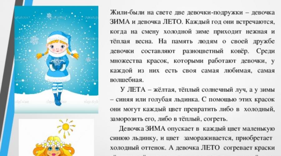

Once upon a time, there were two girls-friends - a girl WINTER and a girl SUMMER. Every year they meet when the cold winter is replaced by a gentle and warm spring. In memory of their friendship, the girls make up a multi-colored carpet. Among the many colors that girls work with, each of them has its own favorite, most magical.
SUMMER has a yellow, warm sunbeam, and winter has a blue or blue piece of ice. With the help of these paints, they can turn each color either into cold, freeze it, or into warm, warm it.
The WINTER girl puts a small blue piece of ice in each color, and the color freezes, acquires a cold shade. And the girl SUMMER warms the colors with a warm yellow ray, turning them into warm ones. Warm colors are always compared to the sun and are called sunny, and cold colors - with ice and are called cold.

Icebreaker Arctic .


Kamerova Valentina Mikhailovna

The main colors
Composite colors

Color circle
LOOK at the color wheel and determine where the colors are warm and where are cold?

Warm colors
Cool colors

But there is a dispute between the girlfriends. Girlfriends cannot decide in any way how to call green - warm or cold.
Why do you think?
How can you get green?


Consider two landscape photographs.
Which of these landscapes is "warm" , and which one is "cold"? Why?

Artists also use combinations of warm and cold colors in their paintings.
Arkhip Kuindzhi "Elbrus in the evening".

Jan van Goyen "Landscape with dunes".

Remember the fairy tale "The Little Humpbacked Horse" and imagine the feather of the Firebird, which remained in Ivan's hands when it escaped
She is a wonderful bird. All of flame-fire. Raises wings smoothly The tail spreads like a fan, Yahont's eyes are burning - Amazing outfit. Darkness wins, gloom. The black cloud is the first enemy. And the feather of that wonderful bird In a moment the desire will be fulfilled It will bring happiness to people.

Imagine a glowing feather that shines in shades of yellow-orange and red-orange. The brightness and richness of the warm colors of the magic feather is enhanced if you place it against the background of a cold sky, i.e. surrounded by purple, blue, blue.
Warm and cold colors next to each other help each other sound brighter, as if louder.


Practical work .
Firebird Feather Image
Choose the character of the stroke to work with.
For example, for the background - a brushstroke "rain" or "speck".
And for the image of the feather of the Firebird - a smear "wave".


Our world has never been monochrome, it contains a huge number of tones and color transitions. Experts say that a person can distinguish about two percent of the shades of what is available to the eyes of birds and some insects. Instead of an outdated and imperfect system of decomposing white light into seven basic color bands, artists, designers and makeup artists have developed their own table of warm and cold colors, because for painting and coloristics, the energy of perception, tone and shades have long become more important than the color itself.
Why do I need a color table
To be precise, the seven basic, fundamental colors in nature exist only in our perception for our vision. Coloristics really proved that for the human eye there are only three basic color components - yellow, red and blue, plus additional white. Any color or shade can be obtained from these three constituents, and the addition more or less hot than the background color can make it warm or cold.
In the colourist, there is a clear division of colors into three groups:
- Warm colors include yellow, red and orange;
- The cold group includes blue, blue, purple;
- Green can be equally attributed to both warm and cold at the same time, but, according to experts, green color is a relative of white, that is, completely balanced.
For your information! This division into warm and cold is rather arbitrary, it would be easier to use the concept of free energy. But the problem is that the shades of warm and cold content must be systematized and, most importantly, selected according to compatibility, based on human perception, and not on the basis of these devices.
A person does not have additional sensory organs with which one could taste the shade "to the tooth", there is only a receptor sensation of warmth and cold, which we are trying to use when classifying into cold and hot bases.
Using the cold and warm color chart
The practical application of gradation for cold and warm colors is based in part on human psychology based on several rules of mutual influence:
- The definition of "cold" or "warm" occurs only on the basis of one's own psychological experience and a person's stereotype. So, for example, white and blue are associated with ice and snow, so their combination can be considered cold;
- Contacting two zones of pronounced warm and cold colors on the same color field is a mutual equilibrium influence. For example, with the contact of blue and red colors, the first becomes softer, warmer, the second emotionally becomes more piercing and harder;
- Mixing color bases with each other with the addition of white allows you to control the visual temperature of the color.
For your information! The table, using the last two points, tries to describe the mechanism of how you can make the perception of the shade warmer or colder, since the associative method does not give a 100% result.
The same combination of white and blue in different people can cause completely different associations. For some it is cold blue ice and snow, for others it is a hot blue sky around a white sun. Therefore, we switched from psychology to the temperature of the color matrix.
How to change the color temperature
The easiest way to illustrate the effect of changing color temperature on the three most important colors for us, yellow, green and red.
For warm yellow, you can increase the temperature only by adding shades with a lower energy, for example, red, as in the table.

Warmer than base yellow include, for example, honey yellow, dandelion or sunflower.


For a transition to colder tones, add green or blue.

Red is energetically warmer than yellow, making it harder to control its temperature. The energy gradation of different shades of red is the most difficult to perceive.

To make the red colder, you have to shift its background towards purple with the addition of blue and gray.

Warming red is much easier with the addition of yellow.

Green color changes in temperature saturation much easier, since it can be obtained by mixing two components with different temperatures - yellow and blue. The procedure for giving the necessary energy is actually reduced to strengthening one of the color components.
Color in painting is a very important and complex concept. This follows from the physical nature of light and from the structure of the human vision system, from the process of color perception. It has long been known that there are no two people who see the same objects and landscapes in the same way, but with all the richness of colors, there are general principles in the color sensations of artists.
Dividing the painterly palette into warm colors and cold colors is one such concept.
Splitting the spectrum
The great physicist Isaac Newton (1643-1727) was the first to figure out the color composition of sunlight. The beam, passing through a glass prism, decomposed into seven basic shades. Subsequently, scientific developments led to the creation of a color wheel of twelve primary colors, from which, by mixing, you can get that color variety that surrounds us, that richness of shades that has long inspired painters. This color wheel bears the name of the Swiss artist and scientist Johannes Itten (1888-1967).

It is customary to divide the color spectrum and the color wheel into two parts - from green to red are warm, from blue to purple - cold. Green is considered by some to be a cold color, while others allocate a special concept for it - neutral.

This division is understandable to everyone, everyone agrees with it, but the objectivity of the reasons for such a division has been argued for a long time, putting forward their own versions.
The main criterion is temperature associations
Of course, the first thing that can be accepted when discussing the origin of the division into warm colors and cold colors is natural associations. Yellow, red, orange are the colors of the sun, fire. It is not for nothing that there is a phrase in the Russian language that explains the heating of the metal: to heat it red hot. Such temperature changes in color can be seen in a fire or in a fireplace, although some gases during combustion can turn into seemingly cold colors: how not to remember the bluish combustion of domestic gas fuel. Nevertheless, bluish and bluish colors evoke logical sensations of coolness: this is the color of the sky, water, ice, snow.
Day-night, summer-winter
The "temperature" of the color is clearly connected with the time of day: the rising sun, warming the world, paints the sky in a blazing range: red, pink, orange shades, and the coolness of the night is felt more clearly in the bluish moonlight, which gives the natural environment a muted and dull color, although the evening dawn - sunset - can also flare up with a hot gamut.
It is interesting that before the onset of cold weather, in the pre-winter, the warm colors of summer flash brightly in the fiery colors of autumn, to be replaced by the bluish and bluish color of snow, ice and cold sky.
Bottom line: the defining meaning of the concept of color "temperature" has an emotional component, which makes it more subjective, although agreement with the generally accepted division into warm colors and cold colors among all objects dealing with color characteristics is global.
Close - far away
Since the Renaissance, a well-developed theory of aerial perspective has emerged, which is based on another emotional and psychological characteristic of warm and cold colors: an object painted in a cold color seems to be located farther than yellow, red, orange or their shades. Not even a landscape, but just a table containing warm and cold colors can give an idea of this.

It is clearly seen how one of the titans of the Renaissance Titian Vecellio (1488-1576) uses this property of color in the painting "Bacchus and Ariadne".

The master clearly divides the color space diagonally into two parts in full accordance with Itten's color wheel, which will appear after four and a half centuries. Cold and warm shades of colors are used to build the vast space of the painting. Warm colors dominate in the foreground, the bluish whitened colors of the sky, the sea and the earth receding into the distance are in the background, and on the border there is the greenery of the trees, which according to all theories is considered neutral, and the cold drapery of the main character and the warm color of the cloak of the central character make the color scheme is refined and harmonious.
Everything is relative
It is necessary to understand that the “warmth” of colors in painting is not an absolute concept, that is, it cannot be measured, and this property can be correctly assessed only in comparison with another color.

The use of spectral, unambiguously warm or definitely cold colors is an exotic thing in painting, paintings from planes that are significant in terms of area, painted with the same color scheme, are rather conceptual, for example, an abstract painting by Mark Rothko.
In more traditional painting, the relationship of colors of different "temperature" occurs at the level of a combination of small strokes, due to optical mixing, making neighboring colors warmer or colder. It is impossible to understand which colors are warm and which are cold, considering the areas of the pictorial space containing them separately from the environment.
Shade is more expensive than color
One of the most obvious qualities of high artistic skill is the ability to see and apply on the canvas those millions of shades that are contained in every element of the nature around us. The ability to distinguish warm notes in cold colors and vice versa gives a special expressiveness to the image. It is important to mention here the principle of color modeling of volume: if light colored with a warm color falls on an object, the shadow should be cold and vice versa. Not all painters agree with him, but this law is applied very widely.
Some researchers say that the expression "warm and cold colors" is incorrect. The table shows colors that are very rarely used without mixing with other shades, and for a more accurate definition of colors, you should say "warmer" or "colder". For example, Prussian blue and ultramarine are shades of the blue sector from the cold part of the color wheel, and each of these colors will be clearly colder than any shade of red, but even a novice artist will say that azure is warmer than ultramarine.
The use of complex color combinations and shades obtained by mixing can enrich the palette, even if it contains predominantly neutral colors. So, you can make the green color, warm or cold, to the desired "temperature" by adding the necessary paint from the blue or red colors to it.
Saturation and purity
In the process of creating paintings, artists take into account some of the properties of sensations of warmth or coolness in color. So, in order to "raise the temperature" in the desired area of the painting space, an experienced painter uses less pure and less saturated shades that will approach achromatic white or gray. Accordingly, the purest and richest shades are colder.

This definition goes back to the issues of psychology: we consider colder everything that looks stricter, more correct, laconic, more symmetrical, more logical, etc. The more sincere and warm always contains some kind of incorrectness, incompleteness, incompleteness. This is how one can characterize not only painting, but also architecture, design, printing and other similar branches of art.
Theory is just a help
The historical experience of those masters of the past who used warm and cold colors in painting shows the importance of this aspect of color perception. Knowledge about him, but only in combination with experience and talent, helps in creativity and contemporary artists.
WARM AND COLD COLORS
Goals: to acquaint students with individual works of painting; give the concept of warm and cold colors; learn to make up the harmony of warm and cold colors; to show variable color possibilities with a limited palette; develop brushwork skills; foster motivation for learning activities.
Equipment: slides or reproductions of paintings by K. F. Yuon "March sun", M. A. Vrubel "Demon defeated", A. P. Ryabushkin "Wedding train in Moscow", A. E. Arkhipov "Girl with a jug", R. Kent "November in northern Greenland" color wheel.
Vocabulary: warm and cold colors.
During the classes
I. Organizational moment.
1. Advice.
2. Verification of students' readiness for the lesson.
3. Completion of the task.
– What is drawn here?
PREDO LAGAEME ANSWERS:a glass of water, a pencil, a box of paints.
4.Smarting
II. Lesson topic message.
Teacher. You already know that color is one of the most expressive means in painting. But color has many secrets. You learned that colors can be primary and composite in previous lessons. Have you heard that color can be warm and cold? No?
Then I will now reveal this secret to you.
III. Communication of theoretical information.
Teacher. Let's take a look at the already familiar color wheel. The color wheel can be divided into two parts so that one includes red, orange, yellow, yellow-green colors, called "warm" because they are associated with the sun, fire, and the other - bluish-green, blue, blue, purple, called "cold", as they remind of ice, water, air distance.
The concepts of "warm" and "cold" colors are conditional, since the perception of colors of the same group is relatively (blue-green color, located next to yellow-green, seems cold, and compared to blue - warm). Consequently, any warm color compared to an even warmer one can turn out to be cold and, conversely, a cold color next to a colder one can be warmer.
Why do we need to know which colors are warm and which are cold? It turns out that knowing this property of color, you can convey a feeling of warmth or coolness in a drawing. Look, for example, at the painting by the American artist R. Kent "November in Northern Greenland". Cold colors here create a feeling of frost at the first glance at her.
We can also convey mood with color, because warm colors look more fun and festive.
To make a color warmer, you need to add, for example, a little yellow to it. And if you need to make a cooler shade, then add blue or blue to this color.
IV. Conversation on the works of painting.
Teacher. In world painting, most artists painted with the entire color palette, including both warm and cold colors. However, the creativity of some painters is characterized by a certain range - warm or cold. So, for example, if we recall the work of artists Rockwell Kent, Vasily Ivanovich Surikov, then we can say that they are masters of cold color, but Sylvester Shchedrin, Rembrandt wrote their works with a warm color palette. Let us compare the landscape of Konstantin Fedorovich Yuon (1875-1958) "The March Sun" with the painting by Mikhail Alexandrovich Vrubel (1856-1910) "Demon Defeated".
In both works, you see blue colors. But in the landscape of KF Yuon, a piercing, some kind of ringing blue of the sky, snow covered with a crust of crust, as if warmed in the rays of the morning sun. Look at the long shadows from the trees, the boys on horseback. The blue color in this case also warms up from the addition of pink to it, turning it into a blue-lilac.
And here M.A.Vrubel, in order to convey the tragic image of the restless and, in the end, defeated hero - the Demon, uses cold blue colors. The painting of this artist is generally characterized by the intensity of color, not so much conveying the real properties of objects as embodying the feelings of Vrubel himself. Therefore, there are no sonorous shining spots of color, everything here is built in a dark tense colorful scale of only cold blue and black tones, all yellow tones are muted with gray and greenish, and reds are given only in their coldest violet shades.
Let's compare the red colors in the works of Abram Efimovich Arkhipov "Girl with a jug" and Andrei Petrovich Ryabushkin "Wedding train in Moscow". Warm red tones in the portrait of AE Arkhipov tell us about the artist's attitude to the heroine portrayed. Can you tell me how the painter treated the model?
Student. Looking at the portrait, we can say that the author sympathized with the heroine, admired her. There is a feeling that she is next to us and we know her.
Teacher. In contrast to this work, in the painting "The Wedding Train in Moscow" A. P. Ryabushkin uses colder reds. How do you feel about the characters in this case?
Student. We look at the picture and simply contemplate the described event with interest and perceive it as if from the outside, as spectators.
V. Updating students' knowledge.
1. RECOMMENDATION.
Teacher. Today you will create a drawing on the theme of "Fantastic Forest" with a limited palette, that is, using different shades of only one green paint.
Choosing which colors you will work in - cold or warm, remember that the drawing is done only in one of them. Mixing warm and cold colors is not allowed.
In addition, we must remember that working in warm colors does not mean using only yellow. In a colorful spot, there may be shades of brown, ocher and other colors.
And what kind of forest you will have depends only on your imagination. For someone, a fantastic forest will resemble an impenetrable jungle, someone will grow unprecedented trees with unprecedented fruits in the forest, and someone, perhaps, will draw an ordinary, well-known plant that it will look fantastic, fabulous, unreal ...
2. Stages of work about t and dr and sunk about m.
Teacher. But no matter what you draw, the order of work remains the same. The artist begins his work with the fact that mentally sees the future picture as a whole and strata and so on a piece of paper so that it is expressive, highlights the main and secondary in the drawing.
Then a red line is made, in which the details of objects are drawn with thin lines, their proportions are proportioned.
After that, on the palette, select the tint for each detail of the picture.
And at the end of the work, with the tip of a thin brush, sprinkle out small details of the drawing.
Vi. Practical work.
Assignment: to make a drawing on the theme "Fantastic forest" with a limited palette (watercolor, gouache).