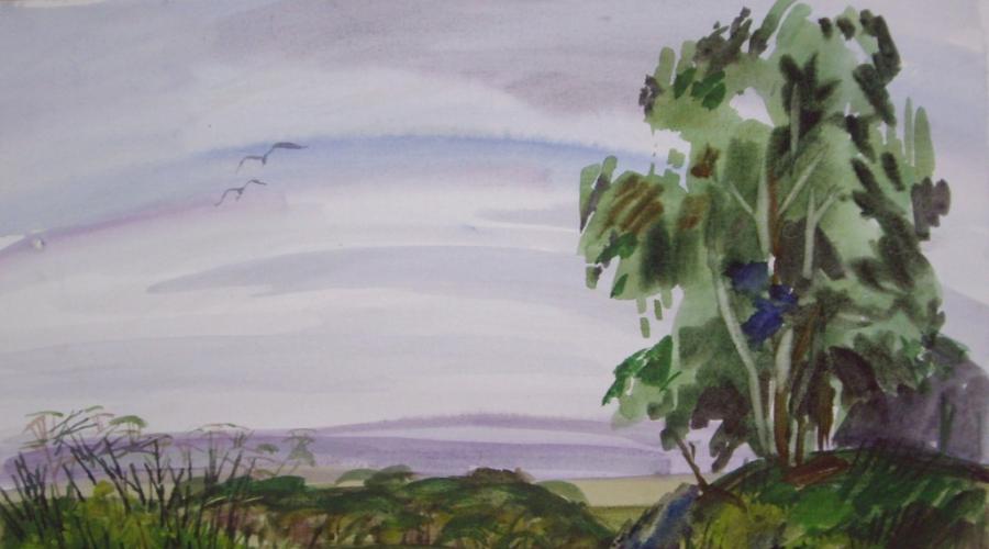
Etudes for painting with watercolors. Short-term watercolor sketches from nature
Summer is a great time of the year. A riot of colors and fragrances inspires to tackle paints and brushes. This tutorial is about a watercolor sketch with wildflowers.
The first thing that a novice artist sees when looking at a bouquet of wildflowers is a lot of small twigs, leaves and a variety of flowers. And immediately panic! How can all this be drawn ?! Do not worry, . And so, let's get started ...
First step. Make a harmonious bouquet: arrange the flowers in a certain order. Small higher and further... They create background... Flowers by bigger and brighter should be on foreground... Therefore, cut them so that the buds do not overlap the background. Place a table lamp to illuminate the bouquet. This will create more contrasting shadows.
To work on a watercolor sketch, we need:
- Watercolor;
- Watercolor paper;
- squirrel or synthetic brushes (No. 2, No. 5, No. 10)
- oil colorless crayon (it allows you to leave white paper, creating a film on the surface)
- Water in the container;
- Napkin (wipe brushes)
Step back from the edges of the sheet by 3-4 cm. This way you will get margins that you cannot step over. This will help keep the "air" in the picture. Sketch with a simple pencil preliminary drawing... Do not press down on the pencil to avoid ruining the top layer of the paper when correcting. Fit the composition into an oval or triangle geometric shape.
Consider the whole composition. Take a look at the entire bouquet. Squint and you will see a blur. Drawing all the colors at once creates fragmentation in the composition. Pick large flowers and focus on them, studying the shape and color. They are.
background drawingBefore starting to work with paints, prepare a selection of colors on the palette cold and warm shades that are present in our bouquet. We reserve the places on the edges of the petals that we want to leave white with colorless chalk. Starting with the background... On the right we have a lamp shining for a still life, so warm ocher tones prevail. We use violet, emerald and ultramarine in the shadows. Then we move on to the colors themselves and outline warm pink, yellow and light green shades. Add shadows on the petals with a thin glaze layer of ultramarine color, thus creating the shape of the flower. Make sure that the bouquet does not appear a lot of details and traced small details in the background. It must be written generalized, preferably wet, when the paint flows from one color to another, creating unique shades. So the drawing turns out not to be painted, but alive.
draw wildflowersWhen finished working with the main large shapes, add nuances with a thin brush: stems and leaves in the foreground. The sketch is ready, now it can be used in the future to paint a still life with oil paints
When Berg said the word "homeland", he grinned. He didn't understand what that meant. The homeland, the land of the fathers, the country where he was born - in the final analysis, does it really matter where a person was born. One of his friends was even born in the ocean on a cargo ship between America and Europe.
Where is this person's homeland? Berg asked himself. - Is the ocean really this monotonous plain of water, black with the wind and oppressing the heart with constant anxiety?
Berg saw the ocean. When he studied painting in Paris, he happened to be on the banks of the La Manche. The ocean was not like him.
The land of the fathers! Berg did not feel any attachment either to his childhood, or to the small Jewish town on the Dnieper, where his grandfather had gone blind behind a shoe and a boot's awl.
My hometown was always remembered as a faded and poorly painted picture, densely covered with flies. He was remembered as dust, the sweet stench of garbage dumps, dry poplars, dirty clouds over the outskirts, where soldiers - defenders of the fatherland were drilled in the barracks.
During the civil war, Berg did not notice the places where he had to fight. He shrugged his shoulders mockingly when the soldiers, with a special light in their eyes, said that, they say, we would soon take away our native places from the whites and give our horses water from our dear Don.
Trembling! - Berg said gloomily. - People like us do not and cannot have a homeland.
Eh, Berg, dry soul! - the soldiers answered with a heavy reproach. - What a fighter and creator of a new life are you when you don’t love the earth, eccentric. And also an artist!
Perhaps that is why Berg did not succeed in landscapes. He preferred portrait, genre and, finally, poster. He tried to find the style of his time, but these attempts were full of failures and ambiguities.
Years passed over the Soviet country like a broad wind - wonderful years of labor and overcoming. Years have accumulated experience and traditions. Life turned, like a prism, a new facet, and in it, fresh and at times not entirely understandable for Berg, old feelings were refracted - love, hatred, courage, suffering and, finally, the feeling of homeland.
One day in early autumn, Berg received a letter from the artist Yartsev. He called him to come to the Murom forests, where he spent the summer. Berg was friends with Yartsev and, moreover, did not leave Moscow for several years. He went.
At a remote station behind Vladimir, Berg switched to a narrow-gauge train.
August was hot and calm. The train smelled of rye bread. Berg was sitting on the step of the carriage, breathing greedily, and it seemed to him that he was breathing not air, but amazing sunlight.
Grasshoppers screamed in the glades overgrown with dried white carnations. Tsolustanki smelled of unwise wildflowers.
Yartsev lived far from the deserted station, in the forest, on the shore of a deep lake with black water. He rented a hut from a forester.
The son of the forester, Vanya Zotov, was taking Berg to the lake - a stooped and curious boy.
The cart knocked on the roots, creaked in the deep sands.
The Orioles whistled sadly in the copse. A yellow leaf occasionally fell on the road. Pink clouds stood high in the sky above the tops of the mast pines.
Berg lay in the cart, and his heart was pounding and dull.
“Must be from the air”? - thought Berg.
Lake Berg suddenly saw through a thicket of thinned out forests.
It lay obliquely, as if rising to the horizon, and behind it shone through the thin mist thickets of golden birches. The mist hung over the lake from recent wildfires. Fallen leaves floated in the tar-black transparent water.
Berg lived on Lake Berg for about a month. He did not intend to work and did not take oil paints with him. He brought only a small box of Lefranc's French watercolors, preserved from Parisian times. Berg treasured these paints very much.
For days he lay in the glades and looked with curiosity at the flowers and herbs. He was especially struck by the euonymus - its black berries were hidden in a rim of carmine petals.
Berg picked rose hips and fragrant junipers, long needles, aspen leaves, where black and blue spots were scattered across the lemon field, fragile lichens and withered carnations. He carefully examined the autumn leaves from the inside, where the yellowness was slightly touched by a light leaden frost.
Olive swimming beetles were running in the lake, fish were playing with dim lightning, and the last lilies lay on the calm surface of the water, as if on black glass.
On hot days, Berg heard a quiet trembling ringing in the forest.
The heat rang, dry grasses, beetles and grasshoppers. At sunsets, flocks of cranes flew south over the lake, and Vanya said to Berg every time:
It seems that birds are throwing us, flying to the warm seas.
For the first time, Berg felt a stupid offense - the cranes seemed to him to be traitors. They abandoned this desolate, forest and solemn land without regret, full of nameless lakes, impassable thickets, dry foliage, the measured hum of pines and the air smelling of tar and marsh mosses.
Freaks! - observed Berg, and the feeling of resentment for the emptying forests every day no longer seemed to him funny and childish.
In the forest, Berg once met his grandmother Tatyana. She dragged herself from afar, from Zaborye, picking mushrooms.
Berg wandered through the thickets with her and listened to Tatyana's leisurely stories. From her, he learned that their land - the forest wilderness - had been famous from ancient times for its painters. Tatiana called him the names of famous handicraftsmen who painted wooden spoons and dishes with gold and cinnabar, but Berg never heard these names and blushed.
Berg spoke little. Occasionally he exchanged a few words with Yartsev. Yartsev spent whole days reading, sitting on the shore of the lake. He didn't want to talk either.
It started raining in September. They rustled in the grass. The air warmed from them, and the coastal thickets smelled wild and sharp, like wet animal skin.
At night the rains unhurriedly rustled in the forests along the deaf, who knows where leading roads, on the plank roof of the gatehouse, and it seemed that they were destined to drizzle all autumn over this forest country.
Yartsev was about to leave. Berg got angry. How could you leave in the midst of this extraordinary autumn. Berg felt Yartsev's desire to leave now just as he had once the flight of the cranes — it was treason. What? Berg could hardly answer this question. Treason to forests, lakes, autumn, finally, a warm sky drizzling with frequent rain.
I stay, ”Berg said sharply. - You can run, it's your business, and I want to write this autumn.
Yartsev left. The next day Berg woke up from the sun.
There was no rain. The light shadows of the branches trembled on the clean floor, and a quiet blue shone outside the door.
Berg met the word "radiance" only in the books of poets, considered it lofty and devoid of clear meaning. But now he understood how exactly this word conveys that special light that comes from the September sky and sun.
A spider web flew over the lake, every yellow leaf on the grass burning like a bronze ingot with light. The wind carried the smell of forest bitterness and wilting herbs.
Berg took paints and paper and, without even drinking tea, went to the lake. Vanya transported him to a distant shore.
Berg was in a hurry. The forests, obliquely illuminated by the sun, seemed to him to be heaps of light copper ore. The last birds whistled thoughtfully in the blue air, and the clouds dissolved in the sky, rising to the zenith.
Berg was in a hurry. He wanted all the power of colors, all the skill of his hands and a keen eye, all that trembled somewhere in his heart, to give to this paper, in order to depict the splendor of these forests, dying majestically and simply, at least in a hundredth share.
Berg worked like a man possessed, singing and shouting. Vanya had never seen him like this. He watched Berg's every move, changed the water for his paints and handed him porcelain cups of paint from the box.
The deep gloom passed in a sudden wave over the foliage. Gold faded. The air grew dim. A distant formidable murmur rolled from edge to edge of the forests and froze somewhere over the burnt-out areas. Berg did not turn around.
The thunderstorm is coming! - Vanya shouted. - We must go home!
Autumn thunderstorm, - Berg answered absently and began to work even more feverishly.
Thunder cracked the sky, the black water quivered, but the last gleams of the sun still wandered in the forests. Berg was in a hurry.
Vanya pulled his hand:
Take a look back. Look, what a fear!
Berg did not turn around. With his back he felt that wild darkness, dust was walking behind - the leaves were already flying like a downpour, and, fleeing from the thunderstorm, frightened birds rushed low over the small forest.
Berg was in a hurry. Only a few strokes remained.
Vanya grabbed his hand. Berg heard a rapid rumble, as if the oceans were coming towards him, flooding the forests.
Then Berg looked around. Black smoke fell on the lake. The forests swayed. Behind them, like a leaden wall, a downpour rustled, cut by lightning cracks. The first heavy drop clicked on my hand.
Berg quickly hid the sketch in a drawer, took off his jacket, wrapped it around the drawer, and grabbed a small box of watercolors. Mist hit my face. Wet leaves whirled around and covered my eyes with a blizzard.
Lightning split a nearby pine tree. Berg is deaf. A downpour fell from the low sky, and Berg and Vanya rushed to the boat.
Wet and shivering from the cold, Berg and Vanya reached the hut an hour later. In the gatehouse, Berg discovered that a box of watercolors was missing. The colors were lost - the magnificent colors of Lefranc. Berg searched for them for two days, but, of course, found nothing.
Two months later, in Moscow, Berg received a letter written in large, clumsy letters.
“Hello, Comrade Berg,” wrote Vanya. - Write down what to do with your paints and how to deliver them to you. As you left, I looked for them for two weeks, searched everything until I found it, only caught a bad cold - because it was raining, but now I walk, although still very weak. Daddy says that I had pneumonia in the lungs. So you don’t get angry.
Send me, if possible, a book about our forests and all sorts of trees and colored pencils - I really want to draw. We already had snow falling, but melting, and in the forest, where under a tree, you look, and a hare is sitting. In the summer we will be waiting for you in our native places.
I am staying Vanya Zotov ”.
Together with the letter, Vanya was given a notice of the exhibition - Berg was supposed to participate in it. He was asked to tell how many of his things and under what name he will exhibit.
Berg sat down at the table and quickly wrote:
"I exhibit only one watercolor sketch, made by me this summer - my first landscape."
It was midnight. Shaggy snow fell outside on the windowsill and glowed with magical fire - the reflection of street lamps. In the next apartment someone was playing Grieg's sonata on the piano.
The clock on the Spasskaya Tower beat rhythmically and far away. Then they started playing Internationale.
Berg sat for a long time, smiling. Of course, he will give Lefranc paints to Vanya.
Berg wanted to trace in what elusive ways a clear and joyful sense of homeland appeared in him. It matured for years, decades of revolutionary years, but the last impetus was given by the forest edge, autumn, the cries of cranes and Vanya Zotov. Why? Berg could not find an answer, although he knew that it was.
Eh, Berg, dry soul! - he remembered the words of the soldiers. “What a fighter and creator of a new life you are, when you don’t love your land, eccentric!
The fighters were right. Berg knew that now he was connected with his country not only by reason, not only by his devotion to the revolution, but with all his heart, as an artist, and that love for his homeland made his smart, but dry life warm, cheerful and a hundred times more beautiful. than before.
Library
materials
Syktyvkar, Russia
(from work experience)
annotation
This article discussesthe possibilityof watercoloras an arttechnologyand methodsstylingmotif, as a method offormingthe futurecreativityof the artist.
The author analyzes thetechnicaltricks andways of workinginwatercolors andcopyrightsare offeredrecommendationsfor the implementation ofwatercolor sketchesto withstandgraphicallyexpressivestyle ofwork.
Keywords:
watercolor, paintingtechnology, techniques, means of expression, plein airwatercolor, watercolorsketch; artisttips;
The academic course of "painting" in the system of professional training is aimed at mastering the techniques of various painting technologies in the process of studying the theory of color science and coloristics. In the classical teaching of "Academic Painting", it was advisable to start with the study of the technology of watercolors, and therefore, in the practice of teaching, students began to perceive "watercolors" as a technology of painting and, accordingly, training is based on the practice of mastering painting techniques... It is not popular today to start a course in mastering painting techniques with mastering the technology of watercolors, since the technology requires patience, perseverance, and attentiveness from students, which is not always easy for students and is difficult to assimilate in the educational process. Nevertheless, watercolors used in the process of teaching painting can form ways of creative thinking in students, if included in the training course educational tasks that allow interpreting the picturesqueness of watercolor techniques into graphically expressive spots and lines that enhance the content of the "motive" image.
Arthur Fonvizin.
Bibliography
1.Magic watercolor by Arthur Fonvizin. Access code
Application
Torlopova N.G. Gingerbread house. 2007, boom. watercolor

Torlopova N.G. Old birch. 2007, boom. watercolor

Torlopova N.G. ISBA. 2013, boom. watercolor

Torlopova N.G. Obyachevskie gave 2007, boom. watercolor
Find material for any lesson,
indicating your subject (category), class, textbook and topic:
also you can choose the type of material:
Brief description of the document:
Natalia Gennadievna Torlopova
Syktyvkar, Russia
GRAPHIC INTERPRETATION OF WATER-WATER STUDY
(from work experience)
annotation
The article examines the possibilities of watercolors as an artistic technology and methods of stylizing a motive as a method of shaping the creativity of a future artist.
The author of the article analyzes the techniques and technical methods of working in watercolors and offers the author's recommendations for the implementation of a watercolor etude, allowing to maintain the graphically expressive style of the work.
This article discusses the possibility of watercolor as an art technology and methods styling motif, as a method of forming the future creativity of the artist.
The author analyzes the technical tricks and ways of working in watercolors and copyrights are offered recommendations for the implementation of watercolor sketches to withstand graphically expressive style of work.
Keywords: watercolor; painting technology; technique; means of expression; watercolor plein air; watercolor sketch; artist advice;
watercolor, painting technology, techniques, means of expression, plein air watercolor, watercolor sketch;artist tips;
The academic course of "painting" in the system of professional training is aimed at mastering the techniques of various painting technologies in the process of studying the theory of color science and coloristics. In the classical teaching of "Academic painting" it was advisable to start with the study of the technology of watercolors, and therefore, in the practice of teaching, students began to perceive "watercolors" as a technology of painting and, accordingly, training is based on the practice of mastering painting techniques. It is not popular today to start a course in mastering painting techniques with mastering the technology of watercolors, since the technology requires patience, perseverance, and attentiveness from students, which is not always easy for students and is difficult to assimilate in the educational process. Nevertheless, watercolors used in the process of teaching painting can form ways of creative thinking in students, if included in the training course educational tasks that allow interpreting the picturesqueness of watercolor techniques into graphically expressive spots and lines that enhance the content of the "motive" image.
Watercolor is an interesting but complex artistic technique. With the help of watercolors, you can create wonderful pictorial sketches that convey a slight nuance of color and have gentle transitions from one color to another. The classical techniques of watercolor painting allow subtly betraying the picturesque space and sculpting the volume of the depicted objects with an illusory transfer of materiality.
Watercolor was originally a graphics technology: it was used for illustrations of manuscripts and books, architectural projects and sketches of art products. And today she is popular among graphic artists for creating illustrations and easel graphic sheets. In the practice of contemporary artists working with watercolors, it is not so common to find a pictorial solution to an etude, which technically represents a variety of shades and color nuances of a plastic spot. To make a sketch more picturesque, artists often use the "raw" technique, which allows the paints to flow freely over the paper, freely flow and mix, creating softness and greater associativity of the color used. But it is not a fact that only wet paper helps to solve painterly problems. There is an example of a different approach in the history of watercolors. These are watercolor works of an outstanding Russian artistArthur Fonvizin.“Some artists and art critics believe that Fonvizin painted his watercolors on a wet surface of paper. This is not true. The artist did not work on pre-moistened paper, when he completely depends on the whims of paint spreading on wet paper. " Despite the fact that the artist worked in the “dry” watercolor technique, which involved careful thought over the sequence of overlaying paint layers, as a result, the freshness and sonority of color, the immediacy of execution and the apparent lightness of the watercolor spot were preserved. Some incompleteness of his work gives the impression of a particular brevity and expressiveness.
Artistic work in watercolors presupposes high performance quality and requires virtuosity and courage from the artist to master the art material. For many artists, watercolor remains their favorite technology in realizing their creative potential. If, in the educational process with students, watercolors are used not only for its pictorial potential, but also for its real graphic capabilities, setting in educational sketches the tasks of interpreting a pictorial spot into a graphically expressive image of the elements of the depicted "motive", then this gives us real ways of forming students' creativity ... These can be tasks: to limit the color palette to 3 colors; taking into account the associative features of the shape of a colored spot; taking into account the tone of the spot and its position, for solving spatial plans; the solution of the etude with lines that are different in technical performance and the nature of the pressure, or lines that vary from the nature of the equipment used (brush, poke, palette knife, bristle brush, comb ...), etc.
Among the artists of our republic, one can name several names who, of course, give preference to this technology in their creative activity and use its technical capabilities in accordance with their personal method of interpretation. These are Vladimir Kokachev, Tatiana Vasilyeva and Vitaly Trofimov. Thus, the works of V. Kokachev, executed in the "raw" technique, give the impression of soft plasticity, lightness and unusually cheerful, because the author is not afraid to introduce pure color into the picture. Tatiana Vasilyeva's watercolors are poetic and subtle in nuances of color, contain a kind of author's: gentle, lyrical and feminine interpretation. Vitaly Trofimov's watercolor landscapes are energetic, powerful with their wet fillings and at the same time saturated color of the elements, skillfully organized in a restrained northern color, conveying the impression of monumentality and significance determined by the limited palette of colors used by the artist. That is why his watercolors are strong in that they realize the artist's most favorite theme - a unique circumpolar landscape. Every artist knows how to find adequate techniques in watercolors that correspond to their personal perception of the world around them. Their works live on the verge of the types of "painting" and "graphics".
For the artist to gain practical experience in watercolor, in addition to working in a training workshop, going to the open air may be more useful. The rapidly changing light environment limits the time for performing the etude, during the execution of which the artist's experience and knowledge are focused, which intuitively lead the artist's hand and instantly interpret the observed into an artistic image. Due to its unpredictable fluidity, plasticity, lightness of tone, combined with a variety of techniques and various equipment, it is possible to perform an etude, both by means of pictorial color, and to solve its image using means of graphic sketching. A graphic sheet can also be created from memory in a workshop on the basis of a pictorial watercolor sketch, created in the open air, which will allow you to think out the composition of the work, the course of its implementation, so to speak, directing and building an "image".
The watercolor sketches we perform in the open air can be defined as the genre of "reportage graphics". Quick sketches capture a landscape or architectural motive, the state of light or color richness of the natural environment, almost like “photo reports” from the scene. But almost every motive created in the process of observing the natural state and performed with watercolors brings its own personal, emotional experience. An album with sketches and sketches preserves in memory what was seen by an indifferent viewer: landscapes and architecture, sights and features of the landscape. In a sketch, the artist can capture the momentary impression of the time of day or season, which can be expressed by the choice of a palette of paints, the color or nature of the spots in the images, or their combinations. Also, the state and content of the work is influenced by the emotional impulse that the artist experiences when perceiving this or that landscape through which he is currently traveling. The light state of the environment changes so quickly that in the open air there is no need to strive to make long sketches. The process of performing a watercolor etude is completely optional, we strive to convey only an exact "copy" of the observed phenomenon or the chosen landscape motive, or the color of the environment. In the process of working on the sketch, there is a one-step interpretation of what he saw in the image on the sheet. The shape and configuration of the spots enhances the artistic image that the artist creates. His choice of color and color-tonal solutions, the variety, or vice versa, the limited shades enhance and concretize the depicted. The formed outline of color combinations and spots brings aesthetics to the finished sketch. The time for the performance of the etude is as short as possible, it is performed within 20 - 30 minutes, therefore it requires the performer to maximize concentration of attention during observation. After filling the main spots of the motif with color, the first layer is allowed to dry. Details are finished dry, while changing the size and nature of the brush, or other equipment is used (palette knife, dry bristles). The described technique of performing etudes reflects our individual style and authorship of the performing style in plein air watercolor sketches. Such a decision does not arise out of nowhere; this requires the technical and creative experience accumulated in watercolor.
Numerous experiments to consolidate the theory of color science and painstaking study of compositional means and techniques of the audience when performing various still lifes helped to form their own watercolor graphic handwriting.
The sequence and some techniques of working with watercolors when creating a sketch of a landscape motif, stylistically generalized into a graphic sheet, we will try to reveal in this article and offer some recommendations for students to master such an experience.
What defines our watercolor sketches as graphic images? The means of expressiveness of graphic art are a tonal spot, a line and a dashed manner of obtaining a spot, which largely depends on the temperament of the artist. Images in the graphic sheet have expressive tonal gradations and clearly identifiable silhouettes or outlines. In the process of writing a landscape motif, the initial moment of thinking over the order of superposition of color spots is very important: large and medium, which determine the large tonal relationships of the depicted. Then, the scale of the elements, their shape and dynamics of silhouettes, the arrangement of combinations of spots in a given format are assumed, so that their stable balance is obtained. And only after that we start sketching. The drawing must be thorough and detailed enough. In it, we immediately solve the problems of the general composition of the motive, taking into account the scale of large masses of the landscape: sky, earth, panoramic objects and images, elements that determine the compositional center and the idea of the motive. When working on a landscape drawing, you should not actively use the eraser, which damages the surface of the sheet. When performing a long, multi-session etude, it is best to make a preliminary worked out cardboard on thin paper and carefully transfer it to a torchon. If the sketch is performed in one session, then we recommend drawing the drawing with diluted ultramarine using a thin brush.
Before starting to work in paints, it is necessary to moisten the entire surface of the sheet with water with a sponge in order to get rid of excess glue, dust or excessive dryness of the torchon. Work in color should start with the lightest tones and finish with dark, warm and dense colors and semi-dry brushes.
For each individual work, we limit the group of paints, the so-called color palette: it is better to limit it to 4-5 colors. Colors, which, thanks to their varied mixing, allow you to create both tonal richness and holistically combine the elements of the motive into the necessary and uniform color. In order to achieve a wealth of color contrasts and highlight the compositional accents of the motif, paints of warm and cold tones are always present in the selected group of paints.
When working with watercolors, it is very important to observe the technology of mixing paints and the sequence of their imposition on the worksheet. Each subsequent layer is applied over the thoroughly dried previous one. It takes us from twenty minutes to an hour to perform an etude of a landscape motive, haste in work, paradoxically, is unnecessary, and even harmful. Why is it so important for beginners to follow the technological chain in watercolor? This is due, first of all, to the technical features of watercolor and the preservation of its main property - transparency.
Traditionally, we start working on a landscape sketch by filling the sky, while trying to immediately create the possible graphics of the clouds, if any. Or with a wide brush filled with color, we dynamically play and pour the color over the surface we define as the sky. While the paint glides freely on wet paper, it is possible to complicate the color scheme when adding other colors, such as ocher or pink. When working on a spot of the sky, you should work with a brush quickly and carefully to leave areas of white paper in some places to solve the light, pattern or highlights of some areas of the clouds, sky.
When working on a sketch, one should also take into account the spatial features of warm and cold tones, which help to correctly solve the tonal tasks of pictorial plans. Therefore, you can take a lot of blue on the brush (ultramarine, FC, cerelium or cobalt, depending on the state of the day) and while the paper is wet, outline the background line with a dynamic horizontal stroke. Details are not needed here, it is important to get a contrast between the sky and the earth line.
The graphic style of the etude is also characterized by the way or with what techniques we introduce color spots into the space of the format being developed. Aerial perspective requires a competent use of the spatial qualities of color: the tonal development of plans requires the use of blue paints and colors diluted with water in the background image; and warm, with strong color contrasts, images of large elements in the foreground image of the etude. The silhouettes of the motif elements depicted by us are clearly revealed by the technique of flatly filled and stylized spots, without conveying the illusion of volume. The color of the spot in the sketches will never turn out to be uniform and monochromatic, because this will not allow the watercolor itself to be made - fluid and mobile. In the first stage of registration, we fill the format completely, with lighter tones and colors, which will then allow us to enter the foreground elements in the next step, according to the previously written color pad. One of the important features of watercolors is manifested in the receipt of a color spot that is clearly detectable on paper, even with a low color saturation. Therefore, it is not necessary to achieve the actually observed tonality and chromaticity of the depicted objects (you can take a couple of tones lighter or, conversely, darker). But the light-tonal relationship between the large elements of the landscape and in the transmission of lighting and the volume of details must be observed as accurately as possible.
After determining large color-tonal relationships, when there are practically no areas of white paper left, we begin a more detailed study of individual expressive silhouettes: the most expressive and characteristic details of the landscape motif are introduced: houses, trees, herbs, etc. (see "Old Birch"). Their spots do not have to have a dense uniform plane, the color in it can be distributed from light to dark, or vice versa. In the spot itself, filling with various shades is possible, but a single tonality. It should not be forgotten that the color of the etude is conditional. All this makes it possible to correlate this spot with a specific image, for example, the crown of a tree can have one spot, which is enriched with various shades in a free "a la prima" manner in one step, but no more than 2-3 colors. At this stage of the work, we are helped by the previously thought out organization of the composition of the sheet: the direction of the main elements and details, the selection of important and characteristic details. The work is carried out with medium-sized brushes, fills are made when they are richer, and when they are more transparent. The shade of the color of the object is achieved both by mixing several paints, and by a pure color diluted with various amounts of water. This is acceptable in graphics. You can very carefully inject solutions of gaseous soot, since this paint allows you to muffle the very bright tone of the spot or take it into the depths of the etude space. To clarify the spatial relationships in the study, it is useful to use diluted ultramarine or emerald paints, which have the subjective quality of removing the image deep into the format and have the qualities of glaze.
To form the tonal masses of landscape elements in the work, you should use the various technical potential of artistic brushes and equipment. For heaven and earth: wide flute brushes or large round brushes. For details - the finest thread first numbers "squirrels" and "columns", fan or even bristle brushes. For large-format sketches, you can also use a sponge. For graphics and detailing of elements, you can use the following techniques: "spraying", "poking", "scratching" with a comb, knife, back end of the brush or palette knife; to create a texture or a kind of graphic design, the technique of "embossing" is used: when a fragment of textured materials (knitwear, corrugated cardboard, leather, etc.) is applied to a wet paint surface. The choice of the technique is not fundamental, it is prompted by our emotional mood in work and the material at hand.
To complete the etude, you can once again pay attention to the graphic linear study of details in order to give the landscape a stylistic graphic completeness. The work is done with thin brushes. You can also draw lines that clarify the shape characterizing some of the small details of the images. The openwork of the picture can be suggested by the silhouette fill itself or by the outline of the main elements of the landscape image. The introduction of such a technique softens the excessive contrast of the silhouette and gives the drawing softness and plasticity. The fine-tuning, thus, of the etude is characteristic of the work performed by several sessions.
In some works, we omit this stage. This happens when, in the course of the initial development of color-tonal relationships, almost immediately, laconic and characteristic color spots are obtained, clearly outlining the necessary elements of the motive and accurately characterizing them. Such sketches reflect the "a la prima" method, well-known in pictorial practice. In this case, drawing with small brushes is appropriate for working out the details of the foreground.
Based on the described practical experience, a number of recommendations can be made. A watercolor sketch of a landscape in a graphic manner is, without fail, the solution of the following problems:
1. observation of image objects, highlighting the characteristic and typical in them;
2. creation of clear spatial plans (far, middle and foreground);
3. adherence to the technological chain in working with watercolors;
4. obtaining a beautiful and expressive silhouette, performed with watercolor fill;
5. working out the technique of filling the silhouette spot of the image object, creating a combination of spots that are thin in color and transparency;
6. graphic revision - lines of the motif and elements drawing, made with thin brushes.
Bibliography
1. Magic watercolor by Arthur Fonvizin. Access code http://mizrah.ru/post155983442/
Leave your comment
To ask questions.
One of the most remarkable things about Maine is its rocky beaches, littered with pebbles of a wide variety of shapes, colors and sizes. This year I finally decided to capture this multicolored stone in watercolor. And this is what I did ...
Would you like to know how I managed to create these curious textures on the rocks and this wavy frame? Read on and find out everything!
One evening at low tide, my friend and I went to the beach to do a couple of sketches.

While my friend was diligently drawing me, I concentrated on the pile of stones under my feet.

First, I sketched the general outlines of the stones with a pencil.

I then traced the drawing with a black fountain pen and applied the first layer of watercolor over the wet.

I tried to achieve color variety, alternating darker shades with bright and contrasting ones.

In some cases, I waited for the paint to dry slightly and added a little more, slightly darker shades. This is how the stains turned out, with the help of which I can then create a texture on the stones.

That's all I had time for on the beach. The sun was already setting and I had to cook dinner, so I packed my things and headed home.
At home in the workshop, I continued painting and focused on creating textures. I slightly wetted the gray cobblestone in the upper left corner, and took a couple of dark, earthy shades of watercolors, a black watercolor pencil and a paint sprinkler. Holding the spray gun over the stone, I rubbed the pencil lead against it a little, like on a grater, so that the pigment particles get into the drawing.

Having slightly soaked, they stuck to the paper and began to resemble the texture of granite.

(When the paper is dry, excess pigment particles can be removed by turning the sheet upside down and tapping lightly on the back side)

I used the same technique on the gray stone in the lower left corner of the drawing, but this time I took a round brush and lightly touched the pencil chips with it in several places to soften the effect a little and give the stone a personality.

When I wanted to give a pebble a speckled look, I made such specks, applying the tip of a round brush to the paper ...

And then she smeared the paint a little with her finger so that the specks did not look so orderly.

This method is very effective for creating speckled texture.

As I moved forward, I added new layers of watercolor on top of the dried base layer to make the colors deeper and to outline the shadows. I applied a little salt to some places.

After the salt dried, it created an expressive texture that was just perfect for the granite stone.

This is how the drawing looked early on, when I just started adding textures ...

When I wanted to add texture to the stone, but was worried about paint splashing on adjacent stones, I used masking tape to isolate it.

I cut a piece of film (about 2 cm larger than the stone on each side), placed it on the area I was going to work with, and using a slicer, carefully cut the film around the stone (be careful not to cut the paper).

Then I removed the cut-out piece of film from this area.

I covered the surrounding parts of the sheet with strips of paper. Now that all the paper around is protected, you can add texture in any way. For example, here I applied paint with a wrinkled plastic wrap ...

I sprayed paint on this cobblestone, and then blotted some of the splashes to lighten them while leaving others intact.

When all the edges are covered with plastic, it becomes easy to apply paint to small stones with a sponge.

After finishing the sponge and splatter, I removed the film.

After I was satisfied with the textures and shadows on the rocks, I added drop shadows. When I took the photo to sketch on the beach, the sun was already setting and the shadows cast were very expressive. Now, I decided to allow myself a little creative freedom and turned back the clock by making the shadows shorter. (I apologize, I forgot to take a picture of the step with shadows).
The last steps were to add cracks and grooves to some of the stones.

and a splash of white opaque watercolor on this naked.

Using water-thinned opaque white paint, I painted light streaks on one of the larger stones. I didn't want the white paint to stand out too much.

The picture is finished! The most difficult thing was ahead of me, I had to decide what to do with the surrounding white space.

I decided to make a frame out of paper duct tape. I tore the pieces of green ribbon lengthwise into two halves so that the edges turned out to be uneven and wavy.

Then I glued the pieces of tape at a distance of about 5 mm from the drawing, with the edges outward, so that they intersect at the corners. (Before using the masking tape, be sure to stick it a couple of times on some fabric, this will make it less sticky, and save you the risk of tearing the paper if you have to peel it off.)

I cut the top layer of tape in the corners with a slicer at a 45 degree angle.

Then she cut off the extra piece of tape protruding from the edge.

It turned out to be a neat corner.

It's time to paint the remaining space around the edges. Since I was going to write on wet, I put paper towels under this sheet to keep the paint off the sketchbook. Mixing the same shades that were used for the stones, I began to generously paint around the edges of the painting.

It was very important to maintain the correct consistency. Colors should flow smoothly from one to another, but not completely blend. I tried to achieve such an effect so that all the shades were clearly distinguishable and echoed with the colors of the stones, and did not merge into a messy mess.

After the edges were dry, I removed the adhesive tape and found that in some places in the corners the paint still flowed under it. Damn it!

Don't panic! I collected some of the paint with a dry brush, and what I could not remove, I simply painted over with white opaque watercolor.
You could now continue working on the design of the frame. To make my work easier, I needed a piece of dense window mesh. I just put it on the paper and drew straight lines across it with a pencil, diverging from the center of the sheet to the edges at a distance of about 5 mm from each other.

This method is convenient to mark parallel lines without long, painstaking measurements.


The only problem was that once I broke my pencil on the grate, but in any case, this happened much faster than if I had used a ruler.
I traced each line with a fountain pen ...


The lines in the corners were hand-drawn.

Everything looks great, but I decided to go further. As always!

I stuck a strip of masking tape 1 cm from the edge of the paper to use as a guide.

Then I drew lines from the ribbon to the edge of the paper between the lines I had already drawn to darken the frame around the edges.

Completed work!
I was tempted to add more detail (draw another thin line around the picture), but decided to leave more space. Had to remind myself that free, breathing space is always good. It is not at all necessary to fill it with something.
When I look at this colored painting, it takes me back to Maine. I am reminded of happy hours on the beach, chatting with a friend, the soft sound of waves lapping on the shore and a sense of absolute calm. Drawing allows me to get a sense of the moment when I'm in the process and takes me back to those wonderful times when I look at the finished work. Many pleasant memories have found shelter between the pages of my albums.
MASTER CLASS "Watercolor landscape"
Painting lesson in open-air classes for teachers and pupils of 3-4 grades of the Children's Art School on the topic: Sketches by the water.
Ponomareva Lyubov Innokentievna, teacher, MAOU DOD "ODSHI No. 3", Moscow region, Bratsk, Irkutsk region.Master - class for pupils of the Children's Art School of 3-4 classes (14-15 years old) and teachers.
Purpose: visual aid, gift.
Target: Acquaintance with the basic methods and techniques of sequential execution of a landscape etude in watercolor.
Tasks:
Improving skills and abilities in performing a landscape etude in watercolor.
Development of creativity.
Fostering love and interest in depicting nature.
Materials: Watercolor ("St. Petersburg", "Neva", "Black River" or "Leningrad"); round brushes, squirrel No. 3, No. 6; watercolor paper, water jar, palette, pencil.

Hello dear colleagues and art lovers!
My master class is called "Watercolor Landscape".
Landscapes are performed in open-air classes, and are of great importance, since they contribute to the visual and practical study of the laws of light-air perspective, the acquisition of new knowledge in the development of watercolor techniques and the methodological sequence of work.
We choose the motive of a landscape with water and learn to write a reflection.
There are two main watercolor techniques - glaze, or multi-layer painting, and "a la prima" - raw, as well as derived from them numerous combined techniques aimed at revealing the effect, multi-structure and imagery of the object.
We paint the landscape using the traditional multi-layer painting technique. This technique involves the sequential layering of paint layers after the previous layer has dried. Moreover, the first layers are transparent, the subsequent ones partially overlap them, gradually darken and saturate the color system of the work. You cannot immediately paint with dark and bright colors, because in the absence of white in watercolors, it is quite difficult to highlight something, and watercolors are fresh, light, transparent materials, derived from the word “aqua”, which means water. The color is compiled with a lot of water, so a round, squirrel brush is used that holds water well, and watercolor paper absorbs it well.
Stages of work.
1. The motive of the landscape is not very complex, so we draw immediately with a brush, with a cold or warm color.

2. Make a watercolor fill of the background-sky with a brush No. 6 from top to bottom, using ultramarine and ocher for this, since on a sunny day there are warm shades in the blue of the sky.

3. Cover the bushes and river banks with a light and warm green color. Better if the green color will be obtained as a result of mixing. As you know, in a watercolor box you are offered not colors, but paints. To get a color, you need to mix at least two paints.

4. In this sketch, the dominant colors are blue, brown, ocher, green. All subsequent stages of work are performed on the dried out previous layer. Determine the penumbra of the shrub in the background.

5. Strengthen the penumbra of the background, taking into account that the lighting is overhead, and the bushes are large hemispherical volumes.

6.Write the reflection in the water. This river has a very weak current, so the reflection is almost mirror-like. As a rule, it is always darker and warmer than real objects. We paint the reflection with vertical strokes, mirroring the shape of the bushes.

7. We write water, with the sky reflected in it, in a darker color.

8. Enhance the foreground with brighter shades of green, not forgetting, however, the transparency of the watercolor.

9. In the shade of shrubs, look for shades of cold color. We begin to write ate in the background. In relation to the shrub, they are much darker.

10. If they are dark, almost flat, since they are far away, write them with a thinner brush.

11. Increase the shadow in the bushes and the water in the foreground, which gives a sense of space.

12. Show the reflection of fir trees in the water, increase the contrast and color density in the reflection of the bushes.

13. We emphasize the branches in the bush, clarify the reflections of the foreground.

14. The sketch is ready. Success in creative work!